The original BBC Television Service was launched on November 2nd, 1936, and was taken off air at the outbreak of war in September 1939, returning in June 1946.
In December 1953 the first ident, nicknamed the “Bat’s Wings,” was introduced, an elaborate mechanical contraption constructed by designer Abram Games, which featured a tiny spinning globe in the centre, surrounded by two spinning “eyes,” with lightning flashes to either side.
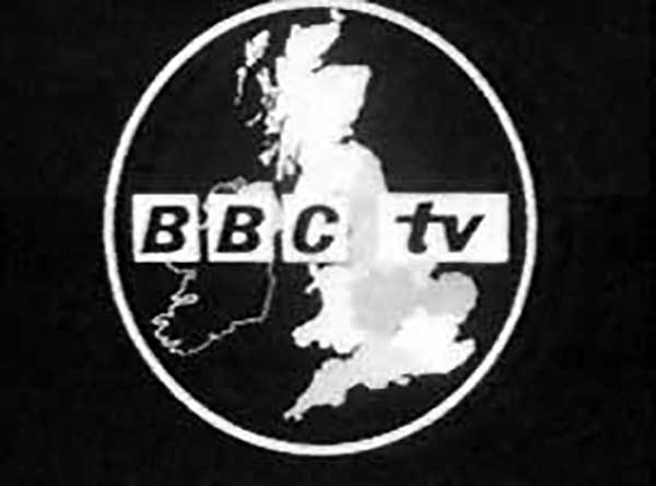
The model was temperamental, and broke down shortly after it was filmed. By the early 1960s the Bat’s Wings had been superseded by the “BBC tv” logo within a circle, beneath which would appear a map of Britain split into the BBC’s broadcast regions.
Perhaps the channel’s most famous emblem, the logo over a globe, appeared in its first guise on September 30th, 1963. The first such ident featured the continuity announcer speaking over a rotating globe while a “BBC tv” caption appeared along with the announcement, “This is BBC Television.”
The globe was changed on September 5th, 1981, to the double-striped BBC1 logo, sitting below a lime green and blue globe on navy blue background.
In 1988, the BBC launched a new logo designed by Michael Peters. The previous logo was modified by sharpening up the parallelogram edges, setting them to an angle of 17 degrees without reducing the size of the spaces between the boxes.
February 1991 saw a new virtual globe, designed by Martin Lambie-Nairn’s branding agency, Lambie-Nairn, who had first made an impact with Channel 4’s original 1982 ident. The idents were based on a filmed model, composited and enhanced on computer. The ident consisted of a figure “1” inside a rotating transparent globe surrounded by a swirling smoky atmosphere above the BBC’s corporate logo — the bold italic letters BBC within three rhomboids, sitting above the three flashes introduced in Michael Peters’ refinement.
There were various reproduction issues with the diagonals in the logo, as well as the costly full-colour print required with the coloured bars beneath. Lambie-Nairn’s solution was introduced in October 1997. Straightening up the boxes and letters removed the problems associated with diagonals and those associated with disappearing lines. The shape of the boxes was kept retain equity, and the typeface used was Gill Sans, made by Eric Gill.
In 2021, the BBC began to phase in the first modification to its corporate logo in 24 years. Closely based on its predecessor, it maintains the basic form of the existing logo used since 1997, but the blocks have more space between them and slightly smaller lettering. The typeface was also changed from Gill Sans to the BBC’s corporate font Reith Sans.
More BBC logo history here:


Comments
An interesting analysis of a logo’s evolution. What struck me most is that the core of the logo – the boxed BBC letterings, withstood the test of time and the evolution in the what was fancy at the time. Maybe that’s one thing that makes this logo so familiar and eye catching. Another thing that struck me was in the additional reading… At one point, in 1967, the BBC2 logo (the blue with the white dot) was really futuristic and well ahead of its time. It quickly “degenerated” though in the 70’s.
Before I studied design I thought the BBC logo was outdated, past its prime, and a terrible idea to being with to boot.
Now that I know more and have my own taste in design, I feel it’s a logo that will continue to just be what it is. A decent logo.
‘begin’ not ‘being’… (that’s what I get for editing twice and checking once)
bring back the bat wings!
Im actually surprised they went from the fairly classy bat wings to the terrible 62 logo.from there it seems to go downhill , although i think the current logo is fairly successful.thanks for the post , interesting to stack them up next to each other.
I bet the ‘Bat’s Wings’ logo would be a real pain to reproduce clearly on a fax, mug, etc. I don’t think they will be bringing it back anytime soon. It is cool looking though. Kind of Art Deco.
Personally I love the 67 version, not that great for brand application through different media but I suppose back then it didn’t really matter. Thing is these days a solid brand strategy seems to win out over weak logo designs, the words make more sense in the boardroom than the visual. BUT we aint bitching here, great post again David!! Batwings lightening bolts kinda make feel warm inside.
I think the new BBC logo does what all good logos should:
It works well in B+W
It is Memorable
It works well at small sizes
I bet this logo would still be legible at 4mm in length!
Cat, I’ve always liked the simplicity of the three boxes, and how adaptable they are. The website favicon, though. Detail becomes lost at 16×16. Hope you’re well.
Daniel, I imagine the 62 logo was easier to reproduce than the bat wings. Perhaps one reason for the change.
Peter, with you on the art deco similarities.
“Some detail becomes lost at 16×16”
Agreed.
“Hope you’re well”
I’m still working through the process.
@David, yeah, a little, but still legible with good eye-sight, lol.
Excellent insight. The one by Michael Peters looks very calm and classic.
You know I think every single version of it is a good solid design without breaking away from it’s core look and feel.
Except for the 1988 version – which you can forgive, as this was a time of extreme bad taste in all matters of design, lol ;)
I’m a little bit dodgy about the 1962 version as well.
Here’s hoping this new week brings a new lease of well-being, Cat.
Amanda,
Are there some other 1988 designs you had in mind for bad taste? Could make for a nice blog post. ;)
Just for completeness the 1997 version was designed by Martin Lambie-Nairn with guidelines by the now no more Rodney Fitch (both design businesses as opposed to individuals).
Good of you to add those details, Nick. Thanks a lot.
I am not familiar with the ones before 1988 so interesting to see. Would be great to see the other channels logo development too, I think bbc2 and channel 4 are doing great things, also, not a channel, but noticed the F1 logo the other week when watching the racing, thought it was fab, wish I had thought of it!
Hi Freya, the Channel 4 branding is superb. I particularly like how the style guides can be downloaded through their website.
I am a bit confused due to conflicting dates between here and here? I need some information for an assignment and this confused me. Thanks.
So many errors in this article it’s untrue! The BBC did not begin using a single logo to distinguish between channels – when the straight BBC blocks began to appear in 1958 (on end credits but not all the time), they still only had one channel. They still only had one channel when the UK Map ident launched in 1960 – a full 4 years before BBC2 started in 1964 – and that was 13 years after the Festival of Britain, not the year after.
The BBC1 COLOUR globe was introduced in November 1969, not in 1967. Being confused where with when BBC2 went colour which was in June 1967, but was not indicated on screen as such itself until 1969. Until BBC1 went colour, BBC2’s presentation used the same ‘fat 2’ logo as in its B&W days but put through a colour keyer to add a single background colour and make all the white elements another single colour. And this choice of colours varied as they tried different combinations.
Thank you, Mark. I’ll update asap.