Skip to the content
Logo Design Love
Toggle menu
About
Book
About
Book
Subscribe
Designs
Super Logo Design
SELA
Logo Trend Report
100 Days
The World Games logo
Zelman Meats
Shoop
The Hidden Factor
Logo Rhythm
Wonka
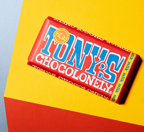
Tony’s Chocolonely
Game+Logo
Logo Rewind
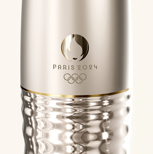
Paris Olympics logo
Uovo
Older