Much of the following information is courtesy of CN.
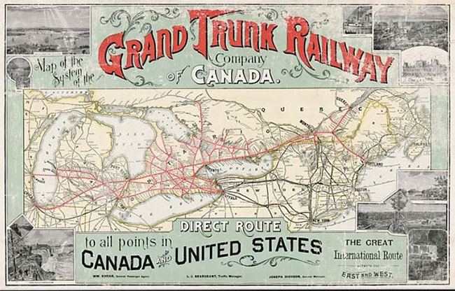
1852: Grand Trunk Railway
CN’s logo dates back to the birth of Canada’s first major railroad, the Grand Trunk Railway (GTR), a line that eventually joined others to form CN.
![]()
Built originally to link Montreal and Toronto in the 1850s, GTR saw its future as an international railroad serving markets on both sides of the Canada-U.S. border — a feat that it accomplished within a decade.
1883: Intercolonial Railway
Built during the 1870s, the Intercolonial Railway (ICR) was another railroad that eventually joined others as part of CN. It linked Nova Scotia and New Brunswick with Quebec.
![]()
Its logo proudly dubbed the line the “People’s Railway” and adopted the moose as its trademark due to its superiority in the animal kingdom and, in turn, its ability to hold its own against all rivals in its domain.

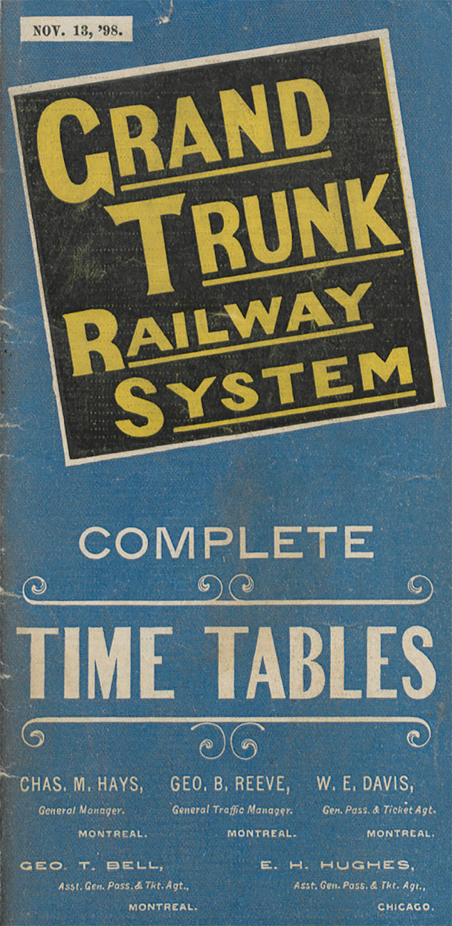
1896: Grand Trunk Railway System
Under new general manager Charles Melville Hays (a victim of the Titanic), the Grand Trunk Railway adopted a more aggressive management style — and a new logo to express the change.
![]()
Hays set about modernising and expanding the British-owned railroad, renaming it “Grand Trunk Railway System” to reflect its far-flung interests.
A version of the logo was the so-called “tilted wafer” — the company name on a square tilted nine degrees downward to the left, presumably an eye-catching device to convey motion. However, the logo’s simple lines didn’t please everyone. One observer thought it was “the most prosaic” of the major Canadian railroad logos.
1899: Canadian Northern Railway
The Canadian Northern Railway resulted from the ambitions of two energetic, small-town-Ontario rail promoters, William Mackenzie and Donald Mann.
![]()
After acquiring a couple of small Manitoba lines in the mid-1890s, Mackenzie and Mann incorporated the Canadian Northern in 1899 and began expanding rapidly both east and west.

By October 1918, Canadian Northern had fallen victim to its own ambitions and economic forces beyond its control. Beset by declining revenue, rising costs, and lack of capital during World War I, it teetered for a time on the brink of bankruptcy. The railway was taken over by the Canadian Government in August 1917 — only to become one of CN’s constituent lines in 1919.
The logo of Canadian Northern Railway would serve as a prototype for CN’s logo during the first few years of its existence. Essentially, CN took the easy way out and simply replaced the “Northern” in the Canadian Northern logo with the word “National.”
1905: Grand Trunk Pacific
At the turn of the century, Canada was riding high on an economic boom. Confined to eastern Canada, the Grand Trunk Railway under expansion-minded Charles Hays felt boxed in and longed for a piece of the action.
Meanwhile, the Government was convinced that Canada needed and could easily support at least one more transcontinental rail line. A second coast-to-coast railroad would also break Canadian Pacific’s monopoly in the west.
![]()
So Grand Trunk and the Government got together to construct a third east-west line. GTR incorporated a subsidiary, the Grand Trunk Pacific Railway (GTP), in 1903, which would run between Winnipeg and Prince Rupert. The Government, meanwhile, would build the eastern portion, known as the National Transcontinental Railway (NTR), from Winnipeg to Moncton.
Grand Trunk Pacific’s logo was derived from its parent’s logo, featuring the “tilted wafer.” It bore the words “The Only All-Canadian Transcontinental Route” — perhaps an act of one-upmanship over rival Canadian Pacific, which reached its eastern terminus via the state of Maine.
 Grand Trunk Pacific farmland ad 1913, via Ben Bradley
A similar tilted wafer with the slogan “The Transcontinental Line” was also used to identify the GTP/NTR system. But like Canadian Northern, GTP came to grief during the economic turmoil of World War I. The Canadian Government nationalised the property in 1919.
1915: Canadian Government Railways
The term Canadian Government Railways (CGR) was a catch-all phrase used to describe a group of railroads owned by the government of Canada in the early part of the 20th century.
Each of the railroads making up CGR was managed independently. In 1915 the group included:
- The Intercolonial Railway (Government-owned since its inception in 1867)
- The National Transcontinental Railway (also Government-owned from its start in the early 1900s)
- The Prince Edward Island Railway (taken over soon after Prince Edward Island joined Confederation in 1873)
- The yet-to-be-completed Hudson Bay Railway (a Government-propelled project all along)
- To these ranks the Canadian Northern Railway was added in September 1917, shortly after a Government takeover
![]()
Canadian Government Railways had a simple logo, but apart from that unifying device, the line had a shadowy existence with very little real substance or organisation.
1919: Canadian National Railways
The name “Canadian National Railways” first appeared officially on December 20, 1918, when the Government authorised that term as a descriptive name for the various properties that made up Canadian Government Railways — principally, Canadian Northern, National Transcontinental and Intercolonial.
Six months later, on June 6, 1919, Parliament passed legislation to incorporate the Canadian National Railway Company Limited — and CN was born. The following year, the Grand Trunk Pacific was added to the line-up, giving the new railroad two transcontinental networks.
![]()
With so many component parts, each with its own strong identity, CN struggled to craft a single, recognisable face to show the world. During the first few years, it took the easy way out and used two different logos, each one mimicking the trademark of a predecessor railroad. Equipment and sign painters simply replaced the “Northern” in the Canadian Northern logo and the “Government” in the Canadian Government Railways logo with the word “National.” A practical and economical solution, perhaps, but it did little to foster a clear conception of the new railroad in the public’s mind.
The two logos CN used during this period were usually printed in black or white according to the desired contrast with the background.
1923: Canadian National Railways
The finishing touch to the creation of Canadian National Railways came early in 1923 when the Grand Trunk Railway joined the system after a Government takeover some three years earlier. That event quickly led to a unified corporate image for the new railroad, one it would display with few major alterations for 38 years.
![]()
CN abandoned the stop-gap solutions of its first few years and introduced a single design to represent the entire company. But like the two earlier versions, the new logo reflected CN’s parentage — this time, the Grand Trunk and its familiar “tilted wafer.”
At first, CN used a square-shaped wafer, just as GTR did. Then, in 1927, the square became a rectangle, presumably to accommodate longer yet fewer words.
The red used in the logo was CN No. 10, which is close to Pantone 200c. The lettering was gold on equipment, for which there is no good Pantone equivalent. In print, however, the yellow employed to represent gold was close to Pantone 115c.
1943: Canadian National Railways
During much of the first decade, President Sir Henry Thornton had led the company with great panache, expanding into fields as diverse as radio broadcasting, resort hotels and ocean liners. Then came the Crash of 1929. While business plummeted and hostile politicians clamoured for an end to the publicly owned system and its “extravagance,” CN stumbled through much of the Dirty Thirties.
But when World War II broke out in 1939, CN seized the opportunity to demonstrate its value to the nation. It performed prodigiously in the war effort, turning handsome profits as well.
![]()
The first significant change to CN’s logo came in 1943, 20 years after it had been adopted. In a sense, the modified logo symbolised the railroad truly coming into its own and hitting stride after two decades of struggling to define its role.
Buoyed by patriotism and a new sense of mission, CN superimposed the tilted wafer on a maple leaf, creating a new logo with built-in flexibility. First applied to a new batch of boxcars in 1943, the logo featured “CNR” above the wafer, while the slogan “Serves All Canada” replaced “Canadian National” on the wafer.
Variations on the theme would appear in later years — different colour schemes and alternate slogans, such as “Canada’s Largest Railway.” CN continued to use an unadorned wafer for some applications, but for the most part, the instantly recognisable maple leaf and the nearly ubiquitous slogan “Serves All Canada” became synonymous with Canadian National.
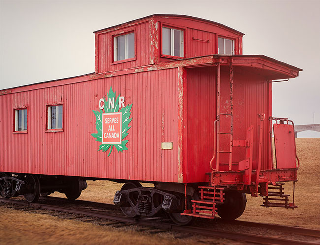
The maple leaf was Green No. 12, for which Pantone 363c is a good match. The rest of the logo usually appeared in white against whatever the background colour was: brown on boxcars (Pantone 174c) or orange on cabooses (Pantone 166c).
1954: Canadian National Railways
Emerging exhausted from the extreme demands of World War II, CN badly needed modernising and energising if it was to hold its own against growing car and truck competition. Donald Gordon, who became President in 1950, was just the man for the job.
Gordon transformed the railroad from the ground up, replacing steam with diesel power, introducing computer technology, restoring the worn-out freight car fleet, and recruiting and training a highly skilled management team.
![]()
CN was changing rapidly — but the changes were happening largely beneath the surface, virtually invisible to the public eye. Yet CN initiated just one relatively minor modification to its corporate symbol during the 1950s, barely reflecting the immense progress underway.
In 1954, to mark the arrival of new passenger cars equipped with unprecedented amenities, CN eliminated the wafer’s tilt and redrew it as a straight square on the maple leaf. As changes go, it was hardly dramatic — but it did have the virtue of being easier to apply to CN’s mammoth locomotives and railcars.

The maple leaf was CN Red No. 10 (Pantone 200c), the wafer was black, and the lettering simulated gold (Pantone 115c).
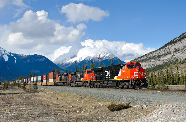
1960: CN
The story begins in 1959 when a revitalised and confident CN surveyed Canadians’ attitudes to see how it measured up in the public mind. The findings came as a great shock: when people thought of CN, they pictured an “old-fashioned,” “backward” organisation, hostile to innovation — the very opposite of what the company was trying to achieve.
Dick Wright, head of public relations at the time, firmly believed that “seeing is believing.” If CN had a fresh new trademark, he reasoned, people would be more likely to think of it as the customer-friendly, technologically advanced railroad it was rapidly becoming. Wright commissioned New York designer James Valkus to study the problem. Valkus became convinced that what CN needed was not just a new trademark but a complete overhaul of its visual image — from locomotive paint schemes and building exteriors right down to the sugar packets used on passenger trains.
A new logo would be the heart of the redesign program. It had to be perfect from both an aesthetic and a practical point of view. It had to communicate the essence of the new CN: powerful, progressive, dynamic. Valkus assigned the challenge to Allan Fleming a young and highly regarded Canadian graphic designer. After experimenting with countless possibilities, Fleming hit on a particularly inspired design while sitting on a New York-bound airplane. He quickly sketched the idea on a cocktail napkin — and CN’s logo was conceived.
![]()
![]()
![]()
It was a dramatic contrast to the existing image. Out went the maple leaf, out went the time-worn wafer. Indeed, out went the “CNR.” Fleming had come up with a way of combining the “C” and the “N” in a harmonious, evocative manner. Abolishing the “R” made the logo bilingual (“Canadien national” as well as “Canadian National”). Without the “R” for “Railways”, the logo could be used as a unifying mark that would also serve the many non-rail businesses CN ran at the time — hotels, telecommunications and ferry services, to name a few.
![]()
Fleming avoided literal symbols — no animals or vegetables allowed — because they tend to show their age very quickly. As Fleming put it: “A literal drawing in 1944 of an object — even a plant leaf — looks in 1954 as if it was drawn in 1944. After five, 10 or 15 years, that symbol would have to be revised. In fact, CN itself has had that history up to now — of constantly revising its trademark bit by bit — and every time it has been revised the one before it is out of date, and it costs a lot of money and a lot of hard work to keep ahead of the game.”

While conceptualising the future, Fleming drew on the past for the kind of image that would convey timelessness. Studying the Christian cross and the Egyptian symbol for life, he borrowed the idea of using a line of single thickness. “The single thickness stroke is what makes the symbol live,” Fleming later said. “Anything else would lack the immediacy and vigor.”

The continuous flowing line symbolised “the movement of people, materials, and messages from one point to another,” Fleming said. As the eye moves from “C” to “N,” the image suggests fluidity and motion. “It’s a route line that incidentally spells CN,” Fleming explained.
More about Fleming’s mark in the CN visual identity guidelines (PDF).


Comments
I love to read about how logos evolved over time as that provides me with insight about where I can take my logos. I am not a professional but love doing this. Thanks for the insight.
I’m surprised you did not include the Duluth Winnipeg & Pacific Railway logos in this history. The DW&P has a rich history as part of the US properties of the CN & its line from Ranier, MN to Duluth.
They’ve certainly gone through a series of logos, haven’t they? It’s still remarkable that they are still using the “noodle” after 50 years.
I wrote a blog post about the logo they applied to certain locomotives to commemorate 15 years after privatization and referred to this article.
Did Fleming also design the passenger car colours?
So good that CNN stole it.
I worked on the CN ferries for eighteen years and I often heard that the CN Sign on the stack of The William Carson was first made by a CN employee, using a paper clip. Is this just a myth or was I misinformed? I am writing a book of my life and travels around the globe, which includes my years with CN from 1965-1983. I have lots of pictures from the earlier days, from the CN Museum with their written of course. The title of my book is THROUGH THE EYES OF A PORTHOLE.
Mr. Piercey, Have you completed your book? I would love to see some of your photographs. My Grandfather was an engineer with CN from 1955-1993. I am curious to see if your two paths had crossed.
I really despise that ugly worm… bring back the 1954 logo.
Can anyone provide history on CN Express Messaging service. When did it start and stop?
Thanks! Very interesting and well illustrated article.
Does anyone know when CN introduced its CN.ca moniker on freight cars?
I have a red blanket with a square “Canadian National System” box logo, but I can’t seem to find out when that logo started to be used. Anyone know?
http://www.cnwedd.com/
I thought maybe they got into the wedding game for a second.
CN passenger carriages were painted in a kind of dark green paint once. I’m trying to identify such a train pictured at Hornepayne train station, Ontario. It looks like the 1950s. But, I’m not sure ! Anyone know the years during which this colour scheme was used by CN?
I really love the old Maple Leaf designs but as good commercial arts goes, the CN noodle is timeless as has been the basic diesel colour scheme as well. As you state in your article, CNR struggled with their imagery every 10 or 15 years but since the noodle there’s been no change and not one that could be anticipated in the future either. Their competition (CP) is still struggling every 10 to 15 years after having thrown out the PacMan.
One thing about this logo that impresses me even further is that it is one of a few that in its turn inspired the logos for numerous other railway logos. There’s the old-fashioned winged wheels (popular in Scandinavia), the British Railways two-way arrow-track logo that inspired several others with the same idea, including Israeli Railways’ Star of David riff off that design, and then the truly numerous letters-as-rail route designs that took the CN logo as their inspiration.
Good article. Graphic design history is a true weakness of mine, so thanks for the lift. Also, found your article while doing research on my great granddad who retired from CN in 1931 after 45 yrs, working up from a carpenter to Superintendent of Buildings and Bridges. His surviving artifacts include rail passes he used traveling around Canada and US… nothing graphically significant but interesting nonetheless.
Re Eyes of a Porthole comment. MYTH. Logo was the work of Allan Fleming with influence from James Valkus, Designs were provided to CN Ferry operations and applied faithfully to funnels. Actually they were metal cut-outs mounted away from the funnel structure to permit easy re-painting, something that had to be done often in marine life to protect from rust. Lorne Perry