
“The once iconic brand was deemed dull and lifeless by consumers and business customers alike. The power of the portfolio could only be fully leveraged by aligning it under a single-minded story that could rally various businesses and over 300,000 employees world-wide behind a unified strategy and behaviours.”


You can, and should, view the full result here on the Moving Brands website. Watching the videos gives a taster of the massive scale of the project.
—
Update:
The case study and all videos have been taken off the Moving Brands website, as discovered via Identity Works, with the following statement shown:
“We have removed the HP case study per the request of HP, in order to clarify the distinction between the aspects of the work that were setting a creative vision for the brand but were not implemented in the market, and the aspects which reflect the actual in-market applications of the Identity and Design System. The ‘Progress mark’ logo is not the go-forward direction for HP.”
—
Wonderfully done, regardless of whether the new design is fully implemented.
Discussed elsewhere on Brand New and Creative Review.


Comments
I really love what they’ve done here. Even more iconic now and I didn’t think that was possible.
hp now looks like bp to me and a few others I have shown. Something needs to be done with the inital ‘h’ to make it look look more like a ‘b’. I like the simplicity of it all but it simply doesnt work!
Yeah, but what about FIAT? Ha! But generally… it’s so simple anyone could think of it… I think it’s too simple, even simplistic. I understand the awe, though.
This is just amazing so simple and clean and shows how well known this brand is. Brilliant!!
David
I agree whole heartedly that this is a very impressive, in-depth brand identity project with some fascinating insights. Your selection of images really showcase the strength and depth of the work – I especially like the stationery and its presentation case and the application of the design concept to touch screens.
I had read an article about this redesign earlier today on the ‘Brand New’ section of UnderConsideration.com (http://www.underconsideration.com/brandnew/archives/a_new_hp_so_close_yet_so_far_away.php).
I was very impressed with both Moving Brands application of the identity and the videos showing the research and presentation work they undertook.
I would worry that the ’13° angle’ concept is not robust enough to get the buy-in of the majority of the employees and and customers of hp – it strikes me as being very easy to dismiss as just another example of designers selling the ’emporer’s new clothes’:
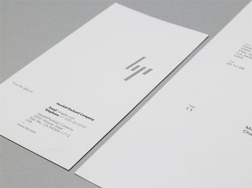
However, Moving Brands application of the 13° angle concept brillantly ties everything together – the stationery; setting the angle of the open screen in side profiles of laptops consistently at 13°; the colour texture designs at 13°; the pattern of the air vents in the casing of the products; etc.
It really does suggest to me that my clients and I would both potentially benefit hugely from me being more adventurous in how much I simplify the central element(s) of identity design and how far I carry the concept into presentation and packaging material, etc.
Moving Brands are quoted as saying:
The defining signature of the system is the 13° angle. 13° represents HP’s spirit as a company, driven forward by ingenuity and optimism about the future and a belief in human progress. It also refers to the world of computing by recalling the forward slash used in programming. 13° exists within the brand identity, in the graphic language, product design and UI.
I like it ….
But ….
I think the entire ‘slants make letters’ is too familiar. Like Man Power job placement services (among numerous others) use it. I understand HP has a history with the slant which makes it more appropriate for them … I just don’t see it as uniquely iconic. The implementation is where the distinction will come and I think they’ve done a good job with that. The 13° thing I’m not sold on. It’s elegant and can translate dynamically but it doesn’t have the weight to become singularly identifiable as HP. It’s simple to an ambiguity.
I also think that using the slant or slash as a visual cue and frequent design element on the products could in fact diminish the iconic power of it as it stands alone. Perhaps it references the brand too frequently thus competing with it more than amplifying it.
That’s my gut reaction. I like it, no doubt.
This logo is a MAXART. I love it. Very, very creative.
I fined the evolution very interesting, what I wonder those is how many more times it will change, I feel like a good, scratch that, a GREAT brand identity should be able to stand the test of time.
Other than that, I really love it… visually.
I’m sorry… I love clean and simplistic design, but this is just another my[____], soulless, cold and probably cost a fortune and ripped people off with a 500 page doc justifying it, a-la Pepsi re-brand.
Come on guys, at this rate every logo will be a dot. Let’s not suck the soul out of beautiful corporate identity. Analysis paralysis, strikes again people need to get out more seriously. Read this quote and be honest….what a load of corporate nonsense:
13° represents HP’s spirit as a company, driven forward by ingenuity and optimism about the future and a belief in human progress.
I’m a brand designer and have been for 10 years. I don’t profess to knowing it all, because I don’t, but I do like to keep two feet on this rock of ours without getting lost in this strange language that is used to make people seem more important than they really are.
13 degrees…..jesus.
Really like the brand extending to the rest of the collaterals, quite smart. Though I initially read it as “LIP” or is it just me?
The Moving Brands team took the brand and it’s branding to a very special place. I’m still trying to pick my jaw off off the ground, that project has gone straight to my pool room:)
@swati : no it’s not just you, watch this french watch logo : http://bp2.blogger.com/_HZxjZs9ytRU/SJY1eIKCBQI/AAAAAAAAEQU/jjwUMwqfWP0/s400/Canvas+Lip+Logo+a.jpg
I can’t say I care for this design very much. It reminds me a good bit of the old Plessey Company logo, but lacking its elegance in execution and concept.
Also, and this might be due to context, but I see the word ‘logo’ more than the initials ‘hp’ when I look at that design.
@James Totally agreed. The worse the logo, the more ‘justification’ needed to sell it. This isn’t terrible, but it is ambiguous which never helps. And non-designer customers who don’t see this video won’t be making the whole 13 degree connection.
Other reports I’m seeing say that Moving Brands released this now since HP passed on the entire proposal.
Post updated following this statement on the Moving Brands website:
Tony Spaeth of Identity Works mentioned the fact that HP CEO Meg Whitman has been on-board for only eleven weeks (or so):
I hope the videos of the project are put back online at some point, and that the money invested by HP isn’t wasted with the decision to ignore the identity proposal.
I can tell a girl is attractive in less then 1 second and thats my view over logos aswell. And I also think that more often a one man work can surpass in creativity a group/agency work. They should be hired for implementation. HP needs some sexyness if she truly wants to stand out.
Does HP become Lip?
It’s difficult to comment because aside from the over simplistic logo I have no idea what the overal branding is. It feels like ti’s been created for designers who think minimal in everything is the best way forward, which I disagree with.
few things what make the logo a great failure as a hp’s logo.
– minimalistic outlook
– lip
– liji
– bp
– bji
– four slanted lines, are they letters?
– thumb up, middle finger down
– barb wire
Did they really accept that design? o.0 It doesnt fit to Hewlet packard. I dont say the old logo was so eye candy design but it was memorable and recognized. This new one is taken too far from the hp’s long built brand identity. Sure ppl will learn to remember the new outlook but still this is how traditions will be raped. (sry bout grammar errors)
My 1st printer ever was an Hp. I was 7 and it was 1991 and that logo has stayed in my head ever since. Their re-branding is beautiful and definitely adds a stark, modern update to the brand. Though their old logo was pretty progressive for 1941… all of the best and memorable elements of the logo were referenced.