The London Underground logo is ubiquitous in England’s capital city, and the shape of the design has been imitated for a raft of different businesses around the world. But who was Edward Johnston, the designer behind the mark? And how has the logo evolved through the years? Here’s a brief overview.
Edward Johnston (1872–1944), the son of Scottish settlers, was born on his parents’ remote ranch in the province of San José, Uruguay. This is why you’ll find the Underground logo in La Patria, an archive of Uruguayan graphic design. The Johnston family returned to England when Edward was just three years old.

In 1913, Johnston met Frank Pick (1878–1941), commercial manager of the London Underground Group. This meeting ultimately resulted in the commissioning of Johnston’s standard block lettering for the London Underground logo. The first roundel logo, known as the “bullseye” or “target,” consisted of a solid red disc crossed, at its equator, with a blue bar on which the name of the station was written in somewhat clumsy white sans-serif lettering. Pick knew the symbol was a good one, but not good enough.

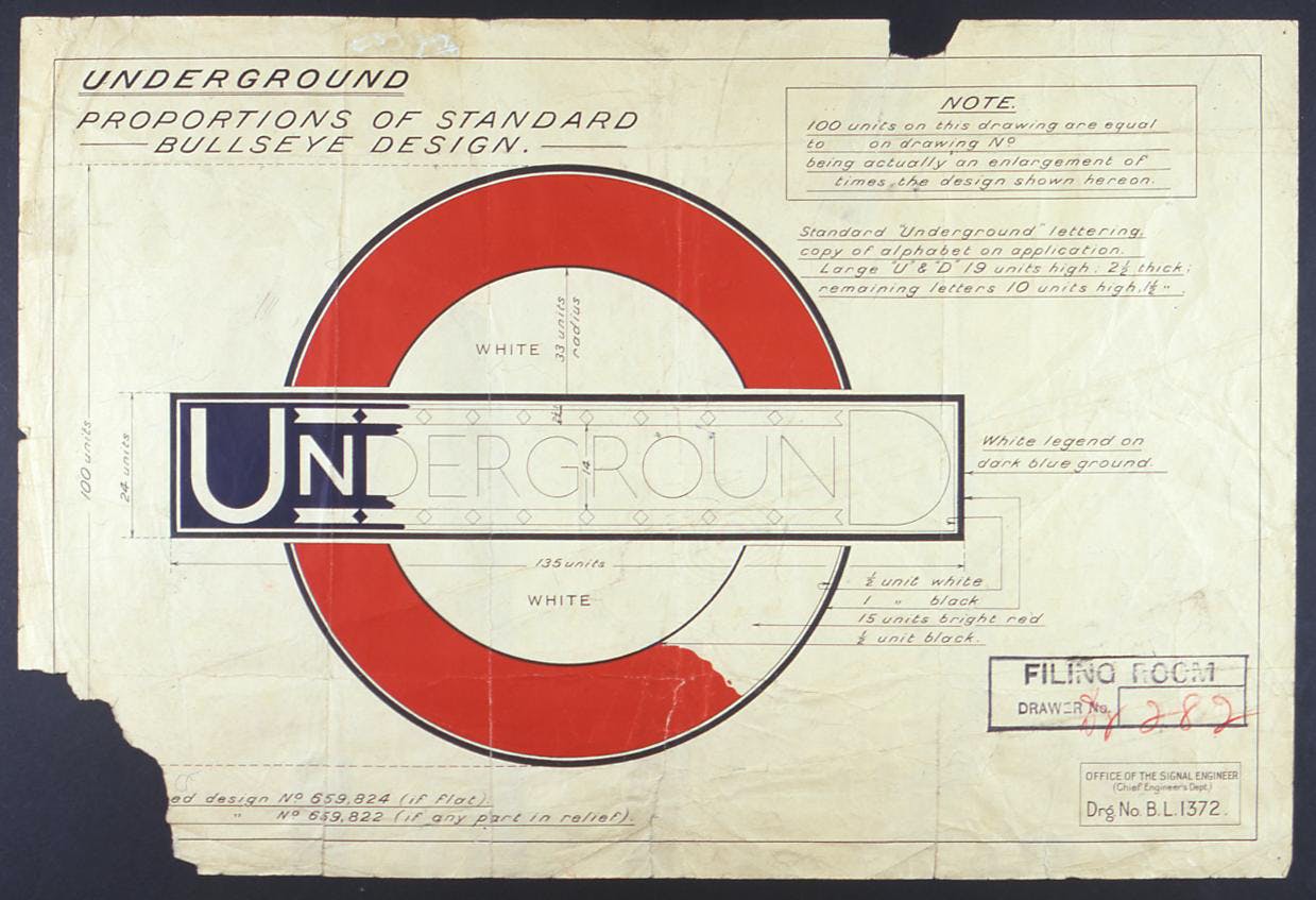
At the turn of 1916-17, Pick asked Johnston to redesign the trademarks for the Underground Group, including the bullseye logo that Pick had first initiated in 1908. By 1917, Johnston refined the logo to the now familiar branding of the bar and circle we still see today, recognised the world over.
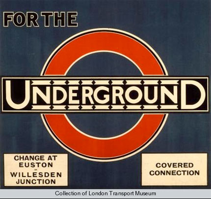

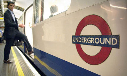
Over 100 years, the roundel has become the unifying symbol for London’s transport services, and is widely recognised as a London icon.
Info elsewhere:
- Edward Johnston, the man behind London’s lettering, on London Transport Museum
- Symbol of life in modern London, on guardian.co.uk
- 100 Years of the Roundel, on CR Blog
- London Underground, on Wikipedia
- 100 artists celebrate 100 years of Tube logo, on Transport for London




Comments
Really great logo, it is also one of the city’s identity icons. I can’t imagine London without it.
I have a real love for the underground logo, I lived in London for 5 years and its sad but the underground is one of the things I miss. I know its smelly, hot, and always breaking down but I miss that experience for some reason.
The logo itself is timeless I’m really surprised that they haven’t done more with it in terms of further merchandising as much weaker brands have with a lot of success with furthering their reach.
They have done more with the London tube logo, they have put it on t-shirts and other merchandise.
I love this. I went to the Transport Museum at the weekend – it really is fascinating how London moves around. More than 4.5m people every day use the tube, buses and trains… That’s impressive!
Re: Gareth Coxon – I moved away from London and returned… And yes, one of the things I missed the most was the tube!
A real iconic classic – past, present and future – simplicity is its success.
I love this phase in a logo’s life: when all typographic elements can be removed while still being easily recognizable. The London Underground logo has reached this point and it does so with simplicity and strength.
The London Underground logo is definitely one of the most widely recognised and instantly recognisable designs in the world. Having undergone little change since its original conception, with only the font being updated, it has to be one of the most successful logo designs in the world.
It’s simplicity, clarity and ability to be used on numerous materials has allowed the design to have widespread usage. It’s interesting to see the variations of it for other transport services, and particularly the usage of various colour for each service. The design has now become so synonymous with London that you see it in fashion and art, as you can instantly recognise its identity.
I would like to see more about its design process and the comments regarding the logo design. It is without doubt one of the most successful logos in use today, I’d be interested to see what other designs are still currently in use.
This raises interesting questions.
Is the symbol great because of nostalgia? (it’s a symbol, not a logo).
Is it synonymous with London because of it’s design or because of it’s association with London’s transportation system?
It is great simply because it’s a recognizable symbol and all the emotional bagage that goes with it?
Is it great simple because they haven’t really changed it much. They had the CONFIDENCE to stick with it, to use it confidently, to invest in quality design through the network as in Frank Picks incredible design vision and it’s that association that the symbol has ingested?
Does this highlight the fact that successful logo’s/symbols are merely recognizable symbols of a product, organization or service and the emotive aspect is only a refection of what they do or are?
On another note, I actually had an original sign all in enamel. It was huge. I sold it on ebay as I had no use for it. They are beautifully made.
i hope it won’t sound bad…
To mee, this logo is not so clever… its position is artificial sustained. Its meaning and construction does not have any value at all.. a red circle for a – tube… yeahhh. right.. veeery smart
it is paced in places people visits, daily, and because of its construction is fast assimilated… and reminded, over and over and over again…
so, can easy be confused its value with the exposure…
this is my humble opinion…
I can be wrong, as much i can be right.
enjoy life and design with joy..
cheers
Great design doesn’t require to be seen over and over again to be succesful. I’m from Chicago. Have never been in London, yet can instantly recognize the Underground logo. Simply timeless. Great post!
I never been in London, but I can imagine that the Logo is very important. Amazingly, the Logo identify the City.
@Alin B: “a red circle for a – tube… yeahhh. right.. veeery smart”. Maybe you should read the article. The original red disk was to attract attention to the station name. Nothing to do with tubes.
In fact the circle actually represents London, and the blue bar in the middle of it is the Thames. This was not only the logo for the Underground but also for the whole of what was known as London Transport. So the logo makes sense.
And anyway, what timeless, iconic designs have you done recently which give you the right to criticise?
I wonder why all call it the ’roundel’ when it’s named ‘bullseye’ on those original designs?
Got to love it though, especially the simplified Transport for London version. You just get it.
I always love to see the development and the history of logos. History adds so much to an icon and to the symbol.
@Bob
dear uncle,
please forgive me for being so bold, but i have seen so many smart logos done by young and not so young artists-designers and for a concept like that i think it could be done more…
for now It is done, people like the work, nothing wrong with that.
**
this is my humble opinion…
I can be wrong, as much i can be right.
**
Regarding my right to criticize, i have it as we all do and does not have anything to do with my professional life…
I could be doctor, or a soldier, or your son’s teacher, would that change that Underground Logo is not so clever in my eyes, as it could be?
I think, no…
Cheers, your nephew from Romania.
:)
P.S.
probably none of the logos from the link below won’t ever be so famous, because they are not in the exposure and use as underground logo…
http://www.facebook.com/album.php?aid=11750&id=100000487226016&l=2c35a6e377
The kind of emotional attachment we develop to things that we come across or use daily is the reason for the success of this logo. Somethings are better left untouched ;)
Do you identify with this symbol or the company it represents?
It’s amazing that people read thins into it like ‘the red circle is London and the blue line is the Thames’ and yet this was never the intention of the design.
It is a great design, but it’s become iconic by accident due to the way it’s been used and the brand it’s associated with. It if was only used on on trams we wouldn’t be writing this as the symbol would be forgotten.
A perfect example of a confident iconic design associated with an iconic brand that has embraced design across all areas from fabric design, posters, logo, stations, architecture etc. It’s the sum of the parts that is iconic, not JUST the symbol.
Speaking as someone who’s used the tube quite alot for 20 years I have always loved the branding of the simple tube symbol (people actually re-create it when they are drawing maps for you – that’s the sign of success), I have always loved the typography and I’ve always loved the tube map (schematic diagram). The actual experience of travelling on London’s Underground system itself isn’t that good.
Too bad they didn’t incorporate that logo with their Olympic logo. A missed opportunity for sure.
I recently visited Shanghai and loved their Metro logo. I don’t know how to embed my photo in this reply, so please see English wikipedia (wouldn’t that be “wikipoedia?”):
en.wikipedia.org/wiki/File:Shanghai_Metro_logo.svg
Shanghai pays sincere homage to London, then tweaks the details:
1) Cross bar is red like the circle and joined to it, and 2) Circle is broken twice, so that the overall shape is “S” for Shanghai. 3) Cross bar is further modified by adding a zigzag which can be seen either as “M” for Metro or as a bolt of electricity, unavailable when Thames was first tubed-under.
Great poets; steel.
All the times I have been to London the Underground symbol really represents the city in itself. It’s also easily recognisable, a beautiful logo design in general.