Ogilvy & Mather China tracked Jonathan down, a then-19 year old graphic design student at Hong Kong Polytechnic University, to ask about working on a project for one of its clients.
“I enjoy making visual puns. I don’t want to say it’s my style, but I do enjoy combining elements together to create a joke almost. It captures people’s attention. These kinds of images are quite appropriate to advertising. It takes a second to get, and then there’s an ‘aha’ moment.”
— Jonathan Mak
Quoted from Creativity Online.
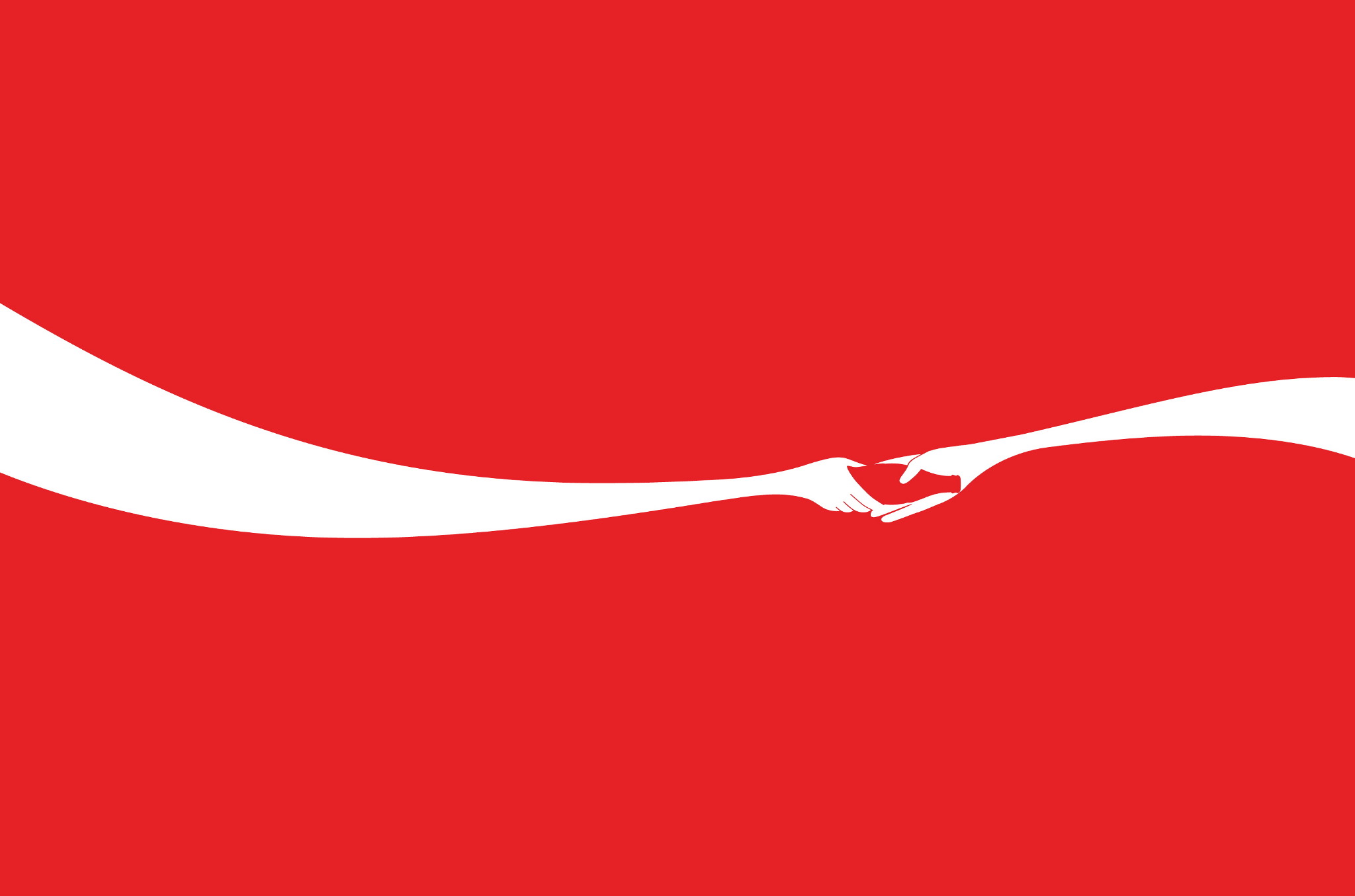
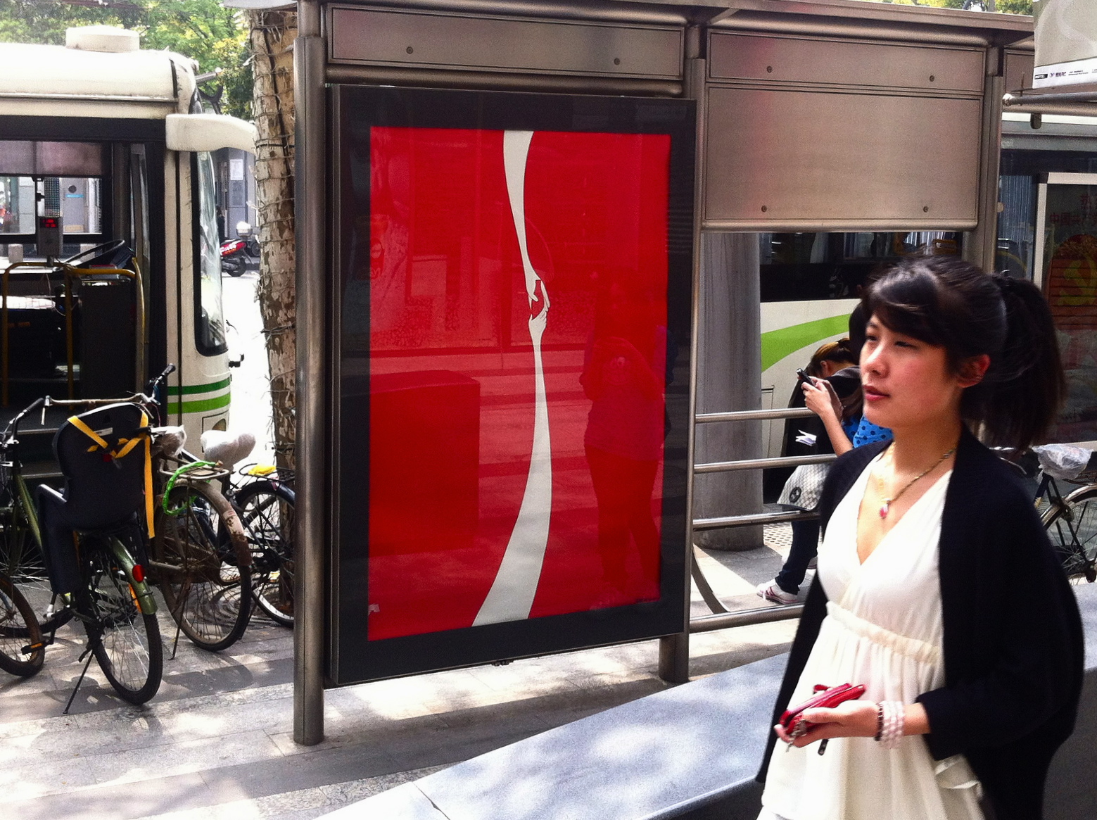
The poster design has been appearing in Shanghai.
Many of you will have already seen Jonathan’s adaption of the Apple logo — his tribute to the late Steve Jobs. It’s what prompted Ogilvy to contact him.
![]()
A little more “Sharing a Coke” info on Co.Create, via @saffronbc.
Jonathan Mak’s Cargo portfolio, and Tumblr blog.
You might like the story of the Coca-Cola logo.

Comments
Really Lovely.
Clever.
Excellent!
That’s brilliant. He’s absolutely right, there is an ‘aha’ moment, which makes his work all the more memorable.
I saw the Coke ribbon and the hands but didn’t notice the Coke bottle until I took a closer look. Very clever!
Maybe he is talented, but how come he can be famous by copying someone else’s logo?
Wow, that Steve Jobs tribute is genius. It’s one of those ideas that seems so simple and obvious on the surface. Effortless if you will. Such a great solution.
Stanley, it’s not copying someone else’s logo/brand, it’s exploring the endless possibilities within it and finding a new way to look at it. To pay it tribute, to reinvent it and present it in a light we haven’t seen before. The Apple logo was so smart because it came to light upon Steve Job’s passing, which many had been fearing because Steve was so much a part of Apple’s brand. Jonathan found a way to express that visually in a very clear and clever way. Steve’s passing left a “hole” in apple, and without him the company will never be quite whole again. It may look simple, but it’s steeped deep in meaning and that is where the genius lies.
Wonderful simplicity. This guy has already created a great name for himself through the Steve Jobs tribute and now this… I can imagine agencies knocking on his door already…
That’s one of the best designs I’ve seen for awhile. With many people out there thinking they’re “Photoshop experts”, it just goes to show that it’s the concept and skilled designer that really matters.
I totally agree with you Chris on your response to Stanley. I am not sure how and why Stanley thinks and considers that as copying. We aren’t originators. We are communication designers. Our job is to present things that people already know in ways that may grab their attention or in this case, in a different perspective. Nothing is truly original. If you look hard enough, there may be a second or even third logo/design out there somewhere that looks similar to yours. Just to give an example. Bentley, Mini Cooper and Hyundai Genesis all share a winged logo. Would you call that copying or just doing what may be appropriate for the brand or what the brand wants to be. Anyhow, I think this simple designs is very clever. I personally never thought of the COKE strips as 2 hands passing on a coke. Good job!
I think the Steve Jobs Apple combination (when seen in the light of the multitude of ideas appearing on Dribbble following his death) could have been perceived as lucky but to follow it up with the Coke ribbon and hand combination really shows Jonathan Mak as someone with a great eye for simple and iconic design.
I’m not saying Jonathan copied the Apple logo.
I was saying Jonathan copied from Chris Thornley (aka Raid71) & Julia Hall. They got the logo exactly the same when Steve Jobs was proven to have liver cancer.
You can check out the link below:
http://www.raid71.bigcartel.com/product/make-your-mark
I agree with you guys, the Steve job logo is good. But the credit is not Jmak, is Chris and Julia.
It’s strangely thrilling to stumble across your own designs on a blog you regularly visit.
After experiencing the tide of negativity during the plagiarism controversy, I should know better than to try and fend off every individual accusation (there’s simply no point), but since the heat has largely died down, and the people here seem quite level-headed about it, I’d like to point you to my follow-up post about the incident. You can obviously choose to believe me or not, but at least now you know what I have to say about it.
http://jmak.tumblr.com/post/11218933775/my-response-to-the-disputed-originality-of-the
Thanks for the mention David! Have been enjoying this blog for a while.
Such a smart and yet simple idea! The Coca Cola trademarks are so recognisable that you can simplify the actual design to a few elements.
Nice details.
Simplicity works, in my case, almost every time to catch my attention.
Interesting that he even made the wave vertical and it still sends out a strong Coke message.
I love the Steve Jobs logo adaptation. If I were Apple, I’d be tempted to change the logo to this :)