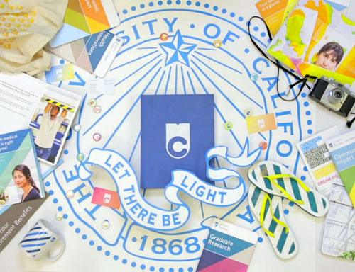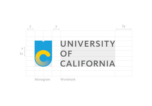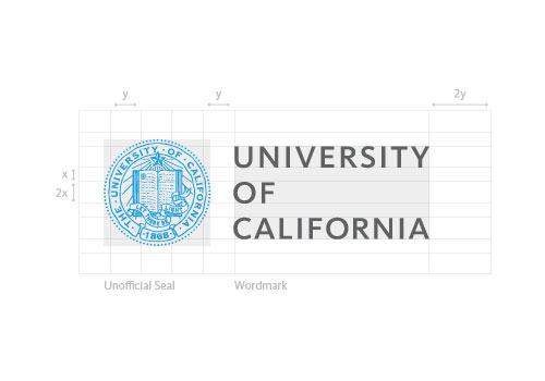
“This video [below] explains the genesis of the University of California systemwide logo. It’s part of a broader initiative — the first in its 143-year history — to articulate a comprehensive visual identity for the UC system. It’s Boldly Californian.”
[Update: sadly now set to private]

“The monogram is but one piece of a visual ecosystem that replaces a hodgepodge of different symbols, typefaces, and colours with a coherent, consistent package.”
— Vanessa Correa, creative direction
More info and contentious comments on Co.Design: University of California rebrands itself with surfer charm.


Credits:
Creative direction: Vanessa Correa
Art direction and lead designer: Kirill Mazin
Photography: Elena Zhukova
Senior designers: Ethan Davis, Kate Brown
Designers: Natasha Foote, Jason Huang, Matt Glass, Jose Pantoja
Developer: Adam Mangum
Multimedia director: Larissa Branin
Multimedia producer: Jessica Wheelock
View the extensive University of California brand guidelines.
—
Update:
The university decided to suspend the use of the new monogram due to the backlash against the design.


Comments
Very cool and creative video, I like the applications, but can’t help feeling the C looks like a loading symbol.
I don’t mind the loading/progress bar look and actually makes sense to me for a university.
Not sure if it was intentional, but there’s constant progression in colleges and universities by educational growth in students and campus expansion. Never still, always growing and progressing.
Honestly, I wasn’t really sold on the look at first.
David, have you read any of the comments about the new logo on the Co. Design website? It’s very interesting to read what many of the alumni think of the new logo. A lot of the comments are quite negative and call for keeping the original seal.
That being said, I like the design of this new logo, but I’m not sure if it accurately represents a scholarly attitude. I think that it would best fit as a logo for a specific department within the university.
“A lot of the comments are quite negative and call for keeping the original seal.”
Pretty cool of Vanessa (the Creative Director) that she also give some feedback.
It’s certainly an interesting approach, looks to me like two ideas going on with logo and the stripes, maybe they could have kept/updated the seal and just introduced the new typographic and colour styles?
I read a few of them, David. I’m unsure if those calling to keep the original seal are aware that it’ll still be used, that it’s included within the new brand guidelines. I’m wondering if the design team first tried simplifying the seal before opting for something completely different. That would’ve been interesting to see.
I think it’s hard for people to understand the idea of having two icons used for their brand. The seal is a strong symbol and what they’ve done with the motion graphics looks great, maybe they could have done something more with this idea rather than creating a new, slightly confusing second symbol.
Why does every designer think by simplifying a logo it makes it more attractive etc… Really this and many other logos are victims of what I call logo rape.
Why were the book and ray of light motifs seemingly arbitrarily selected to be carried over into the new design? I mean, I get the little notch at the top forming the “U”, but that’s kind of a stretch. Also, UC is comprised of 10 campuses. How will this new design incorporate the “sub brands” of the individual campuses. It was possible with the old UC seal by swapping out the “1868” with “Berkeley, Los Angeles,” etc. etc.
If you look at the linkedin profiles of the designers, they’re not brand identity specialists, and it shows.
Designing a brand identity is a very rigorous and complicated process. Obviously, these team did not know what they were doing. It was unfair to ask this team to work on this project. The University should have hired a real brand identity firm.
How can you justify spending money to not only create that logo, which is visually unappealing at best, but to create that video as well? For shame.
I almost never drop remarks, but after looking at through a few of the comments here I have a couple of questions for you. Is it only me or does it seem like a few of these remarks appear like they are left by brain dead folks? And, if you are posting in additional places, I would like to keep up with you. Could you post a list of your social pages like your linkedin profile, Facebook page or twitter feed?
The new logo looks like a toilet bowl flushing. The last time I checked, Harvard-Yale-Stanford were not changing their logos. This logo adds nothing to the prestige and standing of the brand, but dramatically brings it down to the level of the for-profit online colleges like University of Phoenix-ITT Tech-USC.
As a Cal alum and graphic designer (who’s recently moved into specializing in branding), this just makes no sense. Taking the rich tradition and history of a 100+ year old University system and translating it into a “surfer cool” mark that clearly resonants with people as a loading symbol — which they’d know if they’d done ANY focus group testing — not a good way to “replace a hodgepodge.” If anything, by adding all of these extra colors, etc., it added visual confusion and identity crisis that the UC system never had. There’s now a petition being circulated to scrap the entire thing that has over 10k signatures after a day… should be interesting to see how THAT goes.
As a current UC Berkeley student, I do realize that we will still have our original seal for official documents, however my main issue is I do not want to be represented in any way by a logo that I would not take seriously. Honestly, the logo looks like something for an online upstart trying to buy their way into legitimacy or something made for kids.
I do think making an unified UC look, in particular the accessibility of the websites, is much in need, however a logo is used to represent something. Graphic design and art can be used to convey a feeling or perception. It is used to alter a viewer’s perception of that which it represents.
I saw this logo for the first time last night, appearing out of the blue during pre-finals week. It feels to many of us as if the timing was intentionally meant to blindside us, to get this logo passed along before we realize it happened and hopefully we will just get used to it come the next semester. Perhaps there was a focus group that this logo was tested upon, however I have yet to hear of a single UC student or alum anywhere that actually likes this logo and within 14 hours (through night time hours) over 10,000 students, alumni, community members have signed a petition to stop this logo from being accepted.
It is likely true that many of those did not read closely and figure out that this will not go on our diploma, but when it comes down to it, regardless of the venue, so far, I have heard no voices that wish to be represented in any way by this logo. It does not represent us, our values, our identities, our history, our mission, our community.
To be honest, the extreme negativity and jokes that you have been facing in the last 14 hours are likely due to the fact that the initial reaction of many, myself included, was that this logo conveys a message of corporate whimsy which we feel insults the historical contribution and social, innovative legacy that we consider to be part of what binds all the UCs together. 14 hours later, looking at this logo, I still feel like I am being insulted.
I do think that some logos are simplified for no reason, but “logo rape” is way too harsh for what Co.Design have done here. They added a simple, but well designed logo to pair with the historic symbol and made the identity of the system much more cohesive as well. Not A+ work, but a very solid job.
I agree wholeheartedly with Lily. I’m a recent Cal alumni, and I think this logo is insulting to the dignity and prestige of the UC system. I realize that the current UC logo does not render well in small sizes, but I feel like that’s a layout challenge, not one that should require a new logo. If you can’t allocate the space on the page or screen to render the UC logo legibly, then you shouldn’t use it. You could also easily substitute the UC seal with one of the other UC logos that does render well at small sizes, like the golden bear, the script “Cal,” or just the words “University of California at Berkeley.” The other UC campuses have similar branding, and trying to create a new logo that represents all of them is a graphic design cop-out. UC system is not lacking in brand identity or logos, and if you need to create an oversimplified new logo to shorthand all of them, you’re not trying hard enough.
A note on the new logo, as well. First of all, it’s not representative of the UC system. If you see the logo on its own, it doesn’t give any explanation as to what it represents. It lacks the symbolism and the identity of the old logo, and gives only the barest nod to the seal that it is supposed to replace. Secondly, it looks like it’s a loading sign. Enough said. I really don’t know how you missed that one. Thirdly, it’s incredibly dated. The muted primary colors, the simplicity, and the lack of shading all call to mind the new windows and google chrome logos. Within 5 years, this logo will look hopelessly dated, and we’ll need another new one. If you’re going to replace a logo that’s been used for 144 years, at least make an effort to make it timeless. Don’t just borrow the latest fad in graphic design and apply it to a random shape from the old logo.
TL;DR – Changing the logo is a cheap cop-out signifying lazy graphic design, and the new logo was poorly designed and very dated.
I love this design.
I hate college seals. I realize some people like the prestige that comes with a classical authoritative seal for a university, but I hate it. Its for dinosaurs.
A modern design for a modern age. What better way to show that your university is modern and up-to-date then to have a new brand identity that most certainly doesn’t look like some stuffy old Ivy League.
If you are going to college for prestige, I don’t think University of California is going to carry the same weight as say, Stanford or Yale. If you are going for purely prestige, why not go to a college known for it? But if you want to be brave and bold, and claim to the world that you are not like the rest, why not look the part?
I don’t know. I didn’t go to UC so I guess it doesn’t hold the same weight for me. But I despise how boring university branding is. And this new UC branding is most certainly not boring.
Most of the criticisms of this logo are based on bad reporting or on deliberate misunderstanding — misunderstanding only made worse by misleading internet memes. People are asking why the traditional seal has been replaced — it hasn’t. People keep talking about individual campus visual identities (e.g. Berkeley, UCLA) — these are unchanged. This logo is part of a campaign to market and promote the UC system as a whole to the California public; this seems like a good idea in a context where the University has to agitate for continued funding. In this regard, the old seal is plainly problematic, as it is strongly associated with the older campuses, especially Berkeley, but doesn’t incorporate new ones — e.g., Merced. The remarks about ‘toilets’ are juvenile and unwarranted. The ‘content loading’ idea may well be deliberate — online content is probably more central now to educational experience than are books — or else, books are increasingly read electronically. But anyway, the logo graphically captures both. What’s more, it builds on traditional UC iconography, but in a bold departure, and adds a lot of iconography or motifs that signify ‘California’: the U forms both a book, and if you look at it, also a ‘seagull’ (cf. the old B of A logo) against the sky. The ‘C’ is a wave cresting, or perhaps a ‘pipe’ or ‘pipeline’ wave. The gestalt is an ocean scene of the sun setting, waves cresting, and birds flying overhead. It’s in short rather lovely, while also being modern and clearly conveying “UC,” which is how *everyone* refers to the University of California (‘UC Berkeley,’ ‘UCSF,’ ‘UCSLA’). Folks grousing about how this doesn’t signify correctly, I’m afraid, come across as visually illiterate. The logo has to be read together with the whole visual identity, including for example this website (http://onwardcalifornia.com). I see shades of the 80s, Ocean Pacific, and especially the ‘festive federalism’ of the 84 Olympics here. I agree with William Johnson above, in short.
Let me preface my comment in favor of the new logo, by stating that I received my BFA with honors, from UCSC. My parents both graduated from UCLA, also with honors, and were postdocs at Cal. My father was an adjunct professor at UCSC.
The new logo is progressive, beautiful, conceptual, and vibrant. It stands for everything that an institution of higher learning should represent: exploration, innovation, risk taking, discovery, progress. I see a book, a light (energy efficient) a flower, a “UC” (You See?), a shield. I see a loading circle (processing information: not all that is brilliant is immediate, in nature).
The new logo is a simple, flexible, elegant solution – appropriate for not only the digital context mentioned, but also for print.
I love it.
I am disheartened by the strong negative reaction and the desire of the masses to “design by mob”. As a visual designer by profession, I have seen many visually questionable (failed) designs produced, as a result of too many self-proclaimed “experts” on the subject getting involved.
All: let’s not tear down the beautiful design of the dedicated and talented team at UC. I think it would be slightly insane for the University to recall this work.
Let’s move onward!
It’s a lovely logo and appropriate.
Thomas Strong said it perfectly. I am tired of the salivating mob flogging the same misguided points over and over again. This new logo is bold step forward when you take the time to understand the context. I thought being a UC alum was about embracing new thinking. Thank you.
Radically change the brand, then comprehensively devalue it.
Showing such a lack of confidence in their own decisions must surely be the worst possible outcome for the University.
I really liked the layout and useability of the brand guidelines for this – but it seems the University of California took them down when it dropped the new logo. Anyone know if they are live anywhere else on the internet?