

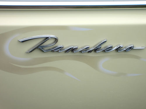
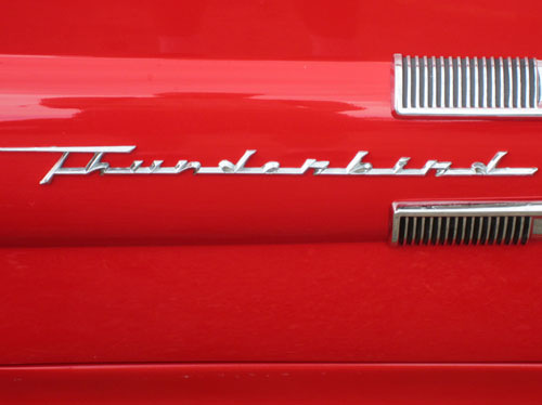
“We believe a logo is at its best with a little dimension. Combine typography and machines and you have yourself a real shindig. The custom lettering adorning the sides vintage vehicles is a design category all to itself. At this weekends “Back to the 50’s” car show at the Minnesota State Fair Grounds, we collected this gallery of logotypes. For those with a serious script fetish, this might not be safe for work.”


More via Beast Pieces.
There’s slo a fantastic collection of old car logos on Chromeography (thanks for the link, Gio).


Comments
Originals here http://chromeography.com/
from russia with love:
http://www.mloh.ru/
Love these old marks, Great finds.
Love love love
My favourite has to be the Skylark logo, it’s so clean and proud, making a bold statement. It also makes me think of milkshake bars and diners.
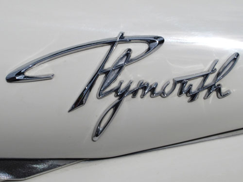
I’ve always loved the old Plymouth logotype. Just look at the wax and shine on these puppies!
The “A” in Skylark is mirrored. In my opinion at least… The form comes from writing with a broad pen. If that’s the inspiration the “A” is flipped.
Sheesh, going through chromeography.com consumed about 20 mins of my life. Gorgeous stuff.