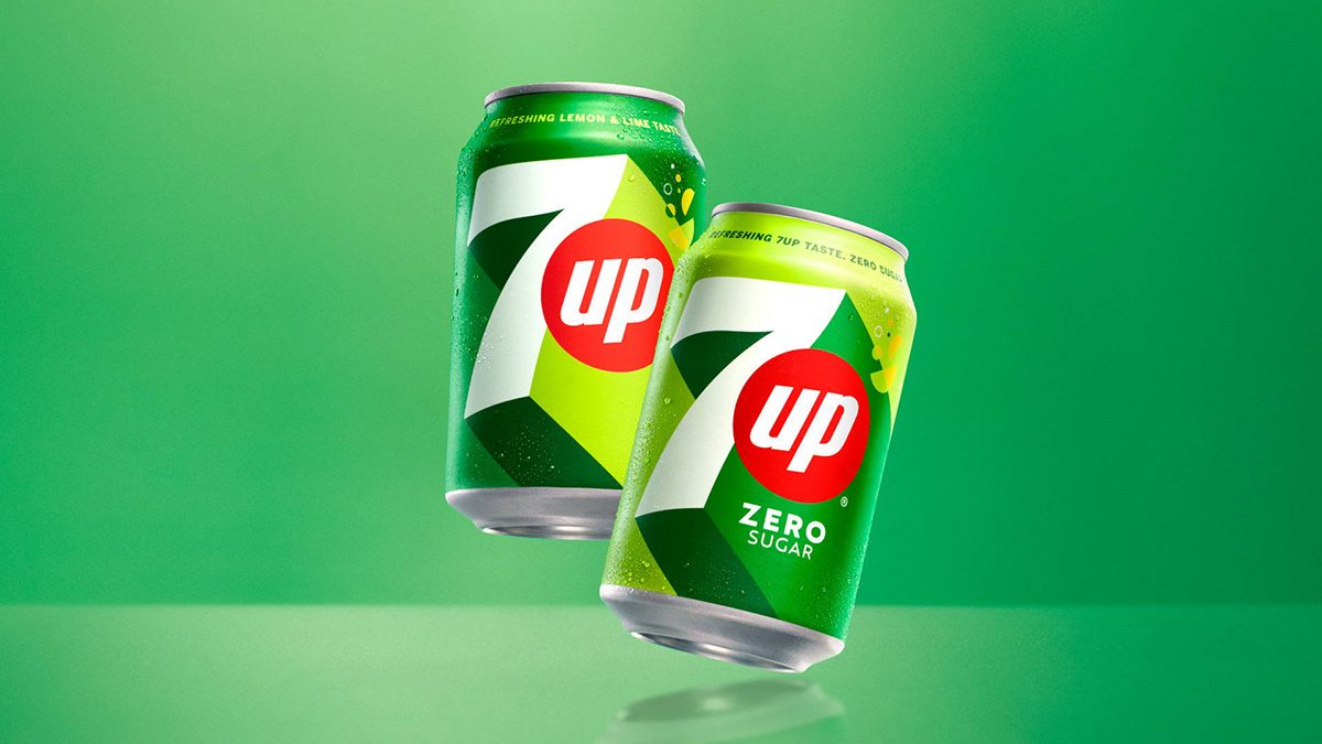
The new 7UP logo and visual identity starts to roll out in March 2023. It was back in 1929 when Charles Leiper Grigg came up with the formula for the lemon and lime soft drink, after launching his St Louis-based company The Howdy Corporation in 1920.
Today, PepsiCo owns the international distribution rights to 7UP, the main rival to Sprite outside the US. While PepsiCo is taking on Coke’s Sprite in America with Starry, 7UP is Pepsi’s lemon and lime drink abroad, and, after seven years, the drink’s getting a significant design refresh.
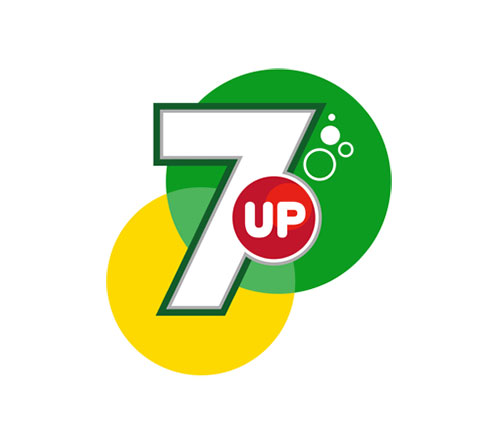
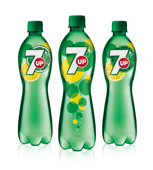
The signature green and red are at the forefront, with bold shadowing added for visual interest.
Here are earlier iterations of the 7UP branding.

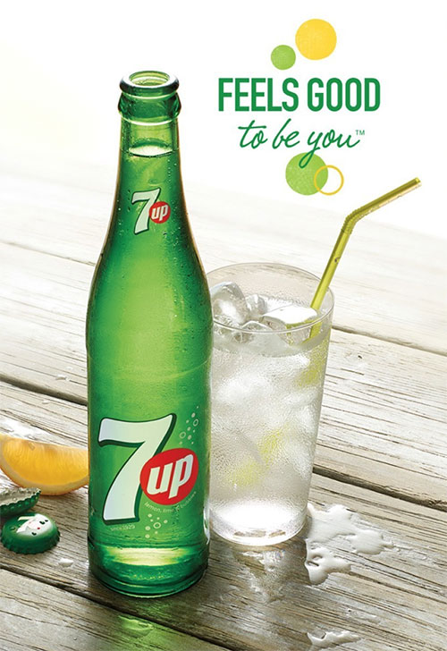
“Feels good to be you.” You could put that tagline after almost any product and it would mean just as little. But it’s the distinctive name and familiar red circle that carries the brand equity.
A couple of the earlier 7UP logos were much more detailed.
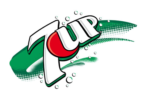
There were others, too (shown on the CR Blog), but it’s the first 7UP logo from 1929 that really stands out. This was in use when the drink contained lithium citrate — a mood stabiliser and supposed hangover cure.
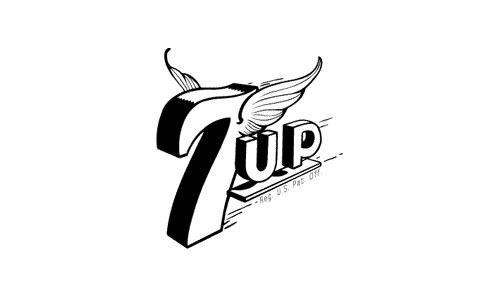
7UP gives you wings!
Press release, via The Branding Source.
Some interesting photos in the 7UP Flickr pool.
Semi-related from the archives, the story of the Coca-Cola logo, and the Red Bull logo origins.




Comments
IMHO, the red disc doesn’t overlap the 7 enough. The 2010 version shows a more successful relationship between the two, although an overlap of that degree wouldn’t be necessary.
“You could put that after any product and it would mean just as little.”
No, I don’t think so. I believe because of the sugar levels making you feel better after drinking this beverage you feel better. And what I assume this tag means is you always felt better and this is you and this drink bring the happy you back from what ever the heck mood you’re in to. I agree this tag would work on any high sugar beverage but not on any product in general.
Nice work with the Langdon WordPress theme, John.
So anything containing sugar, Karan? What about a hot shower or a comfortable bed?
I like the new look. It gives a fresher feel yet have a vintage care free type. Totally adds up to the tagline “Feels good to be you”.
I definitely like the new version better than the last.
I agree, the tagline “feels” generic. See what I did there?!
It still feels like detergent or dish washer branding. The bubbles are so 70’s.
I love this logo redesign. It has a very retro modern vibe.
I like the logo on the bottles.
I agree, David, the tagline is incredibly generic and meaningless.
I think it would help to be able to compare this to other vintage versions of the logo, since that seems to be what they’re reaching back to.
Here’s a quick overview showing where the bubbles probably morphed into the dot, which is now referenced here. http://boldpost.leibold.com/2012/02/history-103-evolution-of-soft-drink-cans/
As far as the slogan goes, it’s exactly what I’d expect. No soda has had a genuine competitive advantage over another since Coke stopped being literally addictive—it’s all marketing.
7Up’s best slogan was in the one-commercial “Make Seven… Up Yours” campaign. http://www.youtube.com/watch?v=QIICQemjmNc
Never saw that one, but its EPIC!
I don’t dislike it, but IMHO, the 7 looks like the 7s you see on the slot machines. I’m expecting to see cherries next.
I’d agree with John, the red circle is too close to where the edge would be that it’s causing visual tension IMO. The word “up” looks force fit too, needs more breathing room.
The whole vibe has subtle retro feel to it as well. Maybe intended?
The previous work was stronger (Although I don’t like the thin grey line) and the new work is just underwhelming.
It’s dead centered on the 7. I guess putting it more to the top would give the “UP” an extra. Perhaps those two circles from the prior version below it as that would give an even stronger suggestion of movement.
Man do we need a better life than talking about the logo. I like the fact you can get it in glass and it’s a green bottle. Excellent for recycling, tastes better. The green glass is excellent because it is not clear. Clear glass can start brush fires. It almost acts like a magnifying glass onto the brush, which starts a fire. Happened in the field of our small farm. I would not be surprised if they link the plastic we eat and drink out of possible one of the factors of illness like cancer and possible other illnesses. I had a research scientist in my cab one day and she told me not to leave the plastic water bottle in the sun as it was very bad for me. Also always check the dates on can soda. I bought one at a gas station and could not understand why it taste so awful. I look at bottom and it was outdated by over a year! I also believe they might link drinking beer out of cans to prostate disease. Soda cans possible to other diseases. They have to do more research on it. My mother home-canned foods in glass, tasted much better than store bought. Just fyi. Now run with the info of my observations. Yeah, I used to watch House on TV too! They would go into the homes and find out what caused people illnesses. Some screen time is good!