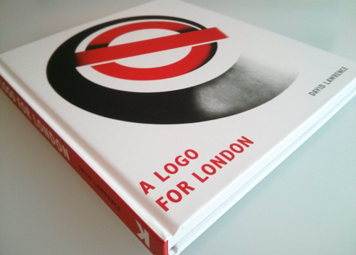
Beautifully illustrated with vintage posters, photographs, and other graphic material from the London Transport Museum archives, the book features previously unpublished inventive uses of the bar and circle.
It takes a special trademark to have its own book, and a lovely book it is. Here’s an excerpt from page 152.

Commerce
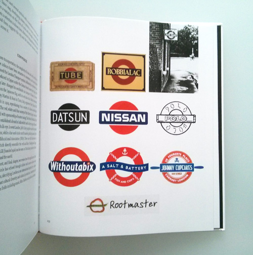
Away from transportation, the simplicity of a bar and circle and the red and blue colours have been attractive to commerce, and many brands have echoed the London Transport symbol, deliberately or otherwise.
Cars were produced in Japan under the Datsun brand name from 1932-3; the company later changed its worldwide car marque to Nissan. Its device is based on the Japanese flag, with its red solar disc.
Martini Vermouth, created by Martini & Rossi in Turin, Italy, registered their bar and ball trademark in 1929, reproducing it in a variety of colours according to product. The red, white and blue variety of the Martini logo is now also associated with sponsorship of motor racing.
The British Robbialac Paint Company established a brand in India which used a direct copy of the red-and-blue bulls-eye.
In west London, Job’s Dairy suppliers used the symbol in the 1930s, while a bar-and-circle motif marked publicity issued by the Workers’ Educational Association (WEA).
There are still trademarks in Greece which directly resemble the red-and-blue Underground logo; one for FAGE (founded 1926) can be seen on Total dairy products in food shops around the world.
—
More info and inside spreads on the Laurence King website.
Related, from the archives: The London Underground roundel.


Comments
This looks really interesting.
London Underground has always employed great design. The recent exhibition of posters at the London Transport museum was fantastic. It may still be on, I’d encourage anyone and everyone involved in design to go and see it if you get a chance.
It’s interesting to see the full history, Lee. A great book, as expected from Laurence King (other favourites include Saul Bass, Bob Gill so far, Symbol…).
I recently completed a project for a parts supplier to the Nissan corporation … each of their auto parts is stamped with a Nissan icon that features no type. (just the ball/bar icon). It was pointed out to me by one of the Japanese translators that the icon is a combination of the Japanese symbol for sun …
“The red circle represents the sun, as in the Japanese flag. The word sun is written with this Chinese character in Japanese “日”. So in the current Nissan logo, the word “Nissan” forms the middle stroke ㈫ in this character, and the red circle is the outer box.”
So both the literal sphere and the bar across it reference the same familiar symbol.
Nice info. I hope the project was a good one.
I have always been amazed by the branding of the london underground.
The Martini Logo was great, and it still works!