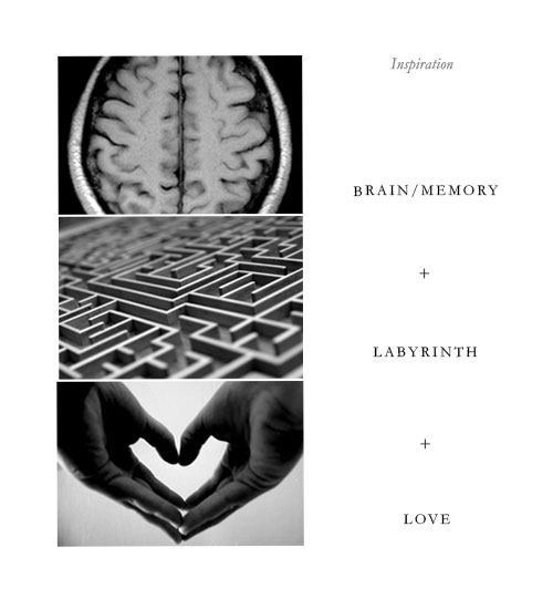
“The logo was inspired by two aspects of this illness: Memory loss, of course, is one. The second, more importantly, is the love and comprehension its patients need to be treated with so the disease can be fought successfully.”

A good idea by designer Mafer Pacheco.


Comments
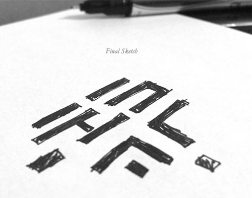
Beautiful symbol! I really do love it, but have one small problem with it. The shapes resemble contemporary versions of asian symbols, and there’s a part of my brain that wants them to mean something linguistically.
John – I like your comment a lot … maybe that linguistic confusion is an amplification of the core concept of the logo (perhaps unintentional) … “My brain wants them to mean something” sounds incredibly close to the confusion the Alzheimer’s patient experiences. Thought provoking. I like that.
Fantastic idea for a great cause. For me personally the only downside is that I don’t necessarily see the heart as being a maze as well, but feel this could easily be fixed by increasing the intricacy of the labyrinth. Increasing the intricacy would also help improve the overall shape.
Sorry for picking minor holes in a great design!
Nice mark but, from what I can see in the pictures, the identity is very logo-centric. There doesn’t appear to be much depth or intelligence beyond the compounding of a maze and a heart.
Studio Dumbar’s work for Alzheimer Nederlands is a good example of an identity project in the same field but which for me is far richer, both aesthetically and communicatively – http://studiodumbar.com/work/alzheimer-nederland
Beautiful mark. I agree with John’s observation that the labyrinth evokes images of Asian characters, but when you factor in the cultural component (with Mexican art, particularly Aztec, being somewhat angular). the mark as a whole starts to make more sense.
And (looking at it through personal experience– my mother passed away earlier this year after suffering with Alzheimer’s for a number of years), I find the maze also conveys the confusion, cognitive “dead ends” and “wrong turns” that are symptomatic of the disease.
I think we’re all responding to the fact that the maze isn’t complex enough to be challenging. It’s too open. (more like asian characters?)
I think it’s a great response to a challenging job.
I think the mark is very clever. I don’t mind the lack of intricacy as others have mentioned, but I do take issue with the unintentional split-up question mark on the right side, which gives a negative connotation to it.
David, you got it. The Human Caring aspect is most important. That’s what we would want if we, or when we, had to face the situation and either receiving care or giving care. Inured by our own pursuits, it is more difficult to see when we are drifting farther and farther away from adequately emphasizing and satisfying human needs.
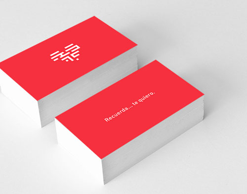
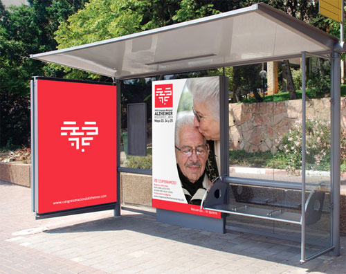
Really like the whole concept behind the logo. I did not see it as a heart until the last picture. I can also see how some would see it to be too open and resemble an asian character.
I think this is a great piece of branding, the combining of those elements to create the mark made a lasting impression, on me at least. Another great post!