

Akademie der Bildenden Künste München
Designed by BÜRO ALBA, Germany, 2008
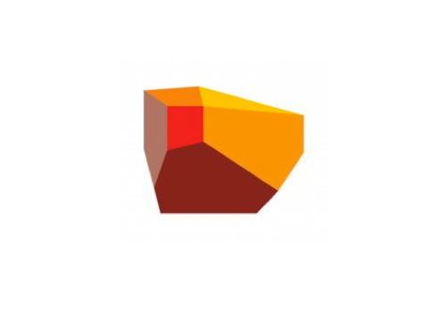
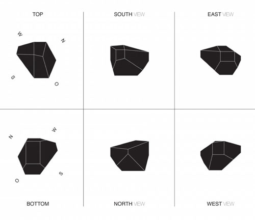
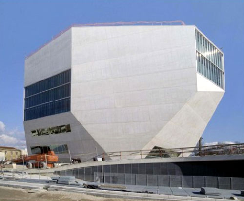
Casa da Música
Designed by Sagmeister Inc, USA, 2007
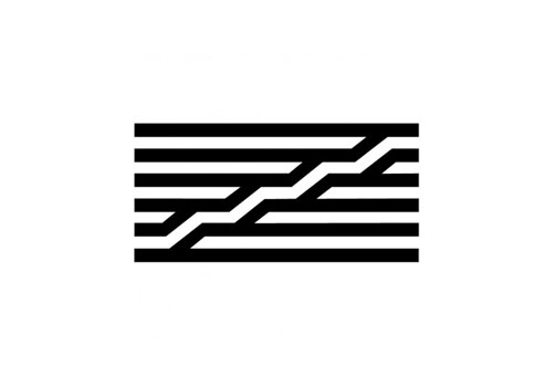
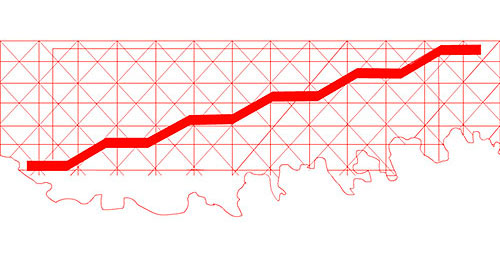
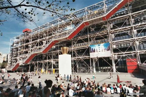
Centre Georges Pompidou
Designed by Jean Widmer, Switzerland, 1974

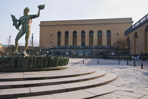
Gothenburg Museum
Designer unknown
Via Gustav Karlsson (in the comments)
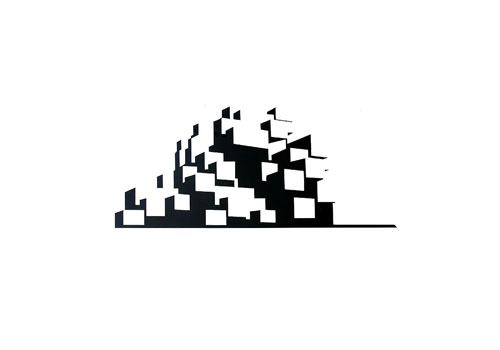

Habitat 67
Designer unknown
Via Jean Chouinard (in the comments)
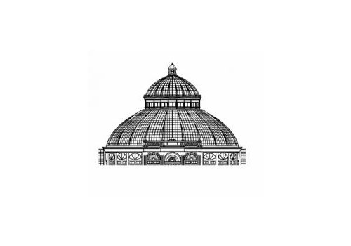
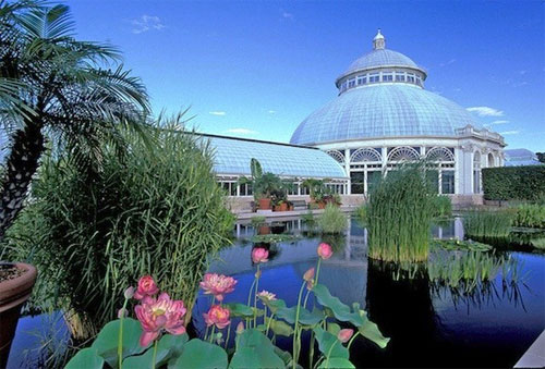
New York Botanical Garden
Designed by Pentagram, USA, 2000
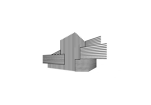

Nouveau Theatre de Montreuil
Designed by Aurelie Gasche and Delphine Cordier, France, 2007

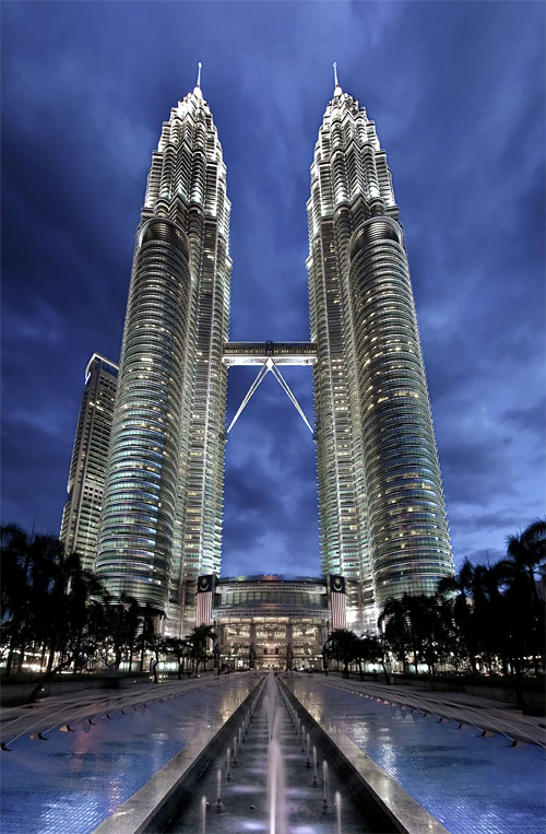
Petronas Towers
Designer unknown

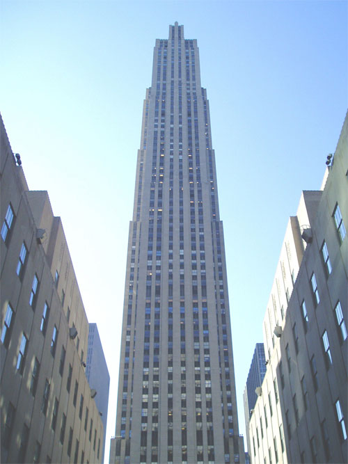
Rockefeller Center
Designed by Chermayeff & Geismar, USA, 1985


Sydney Opera House
Designer unknown
Any others you can think of?




Comments
Gothenburg Art Museum
http://static.flickr.com/3549/3345837419_cd77f3d6b8.jpg
Logo:
http://konstmuseum.goteborg.se/
Habitat 67 in Montreal.
http://www.habitat67.com/
These are very inspiring! I like the idea of creating a mark from the actual physical object/building. Reminds me of the New York Public Library logo design.
Great selection of logos.
the most uninspiring is the New York Botanical Garden – makes an elegant glass house look heavy and boring.
Petronas looks awful. A pair of elegant towers with a logo that looks like a product of the primitive pixel partnership.
Wouldn’t a complete silhouette of the Sydney Opera House have been better?
The Adelaide Festival Centre is an under appreciated gem of early 70s architecture
http://studyadelaide.com/wp-content/uploads/festival_centre.jpg
http://farm4.static.flickr.com/3607/3391714546_b9a50b1f00.jpg
Here’s it’s logo. Not anything amazing, but nicely evokes the ‘face’ of the building.
http://www.advantagesa.com.au/upload/AdelaideFestivalCentre180.jpg
There’s a much better version of the same logo floating around, all in white, with the negative space forming the building shape. Sadly it has never caught on anywhere other than corporate and catering pamphlets!
I know another one. “Concello Santiago de Compostela” I like it. ;)
Tokyo Tower. I’m not sure if it’s official or not:
http://www.flickr.com/photos/christianmlau/2435910957/
Glasgow SECC & the new Hydro Arena in Glasgow too.
http://www.secc.co.uk/
Photo of SECC Armadillo – http://www.pnae-congress.org/content/page/7/conference-venue
http://www.thehydro.com/default.htm
Photo of how it will look when complete – http://www.thehydro.com/the-hydro/about-the-hydro.aspx
I really like the Hydro design – nice use of the shape of the building combined with the sound bars to show it’s a live music venue.
The New Museum in NYC
http://wolffolins.com/work/new-museum
It´s great to see the Portuguese Casa da Música featured here, it’s an amazing work of art, and it was very important that the logo can mimic this important building. As you said the design idea was there all the time but nevertheless the designers involved have to realize that as well. I wish I could always be aware of what is right in front of my nose!
I gots one:
http://jeffhalmos.com/2011/10/24/londonimax/
But they don’t use it anymore since Odeon bought it:
http://cinematreasures.org/theaters/19982
The John Hancock is also an excellent example!
http://agencythreesixty.com/2011/08/05/john-hancock-observatory/
http://logopond.com/gallery/detail/185230
a currently work in progress of ours
http://www.cultura.pr.gov.br/arquivos/Image/logomarcas_institucionais_jpg/logo_mon.jpg
And a great logo using a sketch of architect Oscar Niemeyer of the Niemeyer museum
30 St Mary Axe, London
aka “The Gherkin”
http://www.marketingweek.co.uk/pictures/web/images/MarketingWeek/13169_18_stmary_logo.gif
http://image.guardian.co.uk/sys-images/Society/Pix/pictures/2004/05/14/StMaryAxe.jpg
Hotel Ukraina, Moscow
http://www.ukraina-hotel.ru
Lower Eastside Construction, New York
http://www.lowereastsideconstruction.com
Logos for institutions that simply copy the architectural shape of the building they’re in have always seemed a bit lazy to me. It’s especially problematic when the making a sign for the building, potentially leading to putting a picture of the building on the building itself.
Here’s a project where I worked on signage, but was saddled with a very unimpressive logo, The Connecticut Science Center: http://ctsciencecenter.org. I worked on this with Michael Bierut at Pentagram, and we decided wholeheartedly to do avoid the logo.
Another recent project of his draws inspiration from the building but in a less literal way, The Perot Science Museum. http://www.underconsideration.com/brandnew/archives/perot_museum_hoists_brackets.php. The idea is solid, but the execution is questionable I think.
Finlandia Hall, designed by Alvar Aalto
http://www.finlandiatalo.fi/en/
Canada Place, designed by David Lidiard, Cossette
http://www.canadaplace.ca
One that’s definitely worth mentioning here is the logo for the Milwaukee Museum of Art. Not only has the architecture informed the design of the museum’s identity, but it has become the logo for the entire city.
The MAM Logo: http://yoa.uwm.edu/uwm-day-at-mam
A piece from Underconsideration on the Milwaukee logo: http://www.underconsideration.com/speakup/archives/002193.html
Obviously it was a bad idea for the city of Milwaukee to create a logo so similar the art museum’s!
Aceh Tsunami Museum, designed by Artimasa
http://artimasa.com/portfolio/aceh-tsunami-museum-unofficial/
Zentrum Paul Klee (Bern, Switzerland)
Great building, great logo, great artist : )
http://www.zpk.org/
The ikon tower in Nicosia!
http://www.ikontower.com/
Museum of Contemporary Art Belgrade
http://www.msub.org.rs/
Atomium in Brussels Belgium
http://atomium.be
Museo Nacional de Bogotá