Through his extensive design and educational work, Armin Hofmann (1920–2020) is considered one of the most influential graphic designers in Switzerland. He made a significant contribution to the international reputation of Swiss graphic design and influenced generations of graphic designers and teachers around the world.
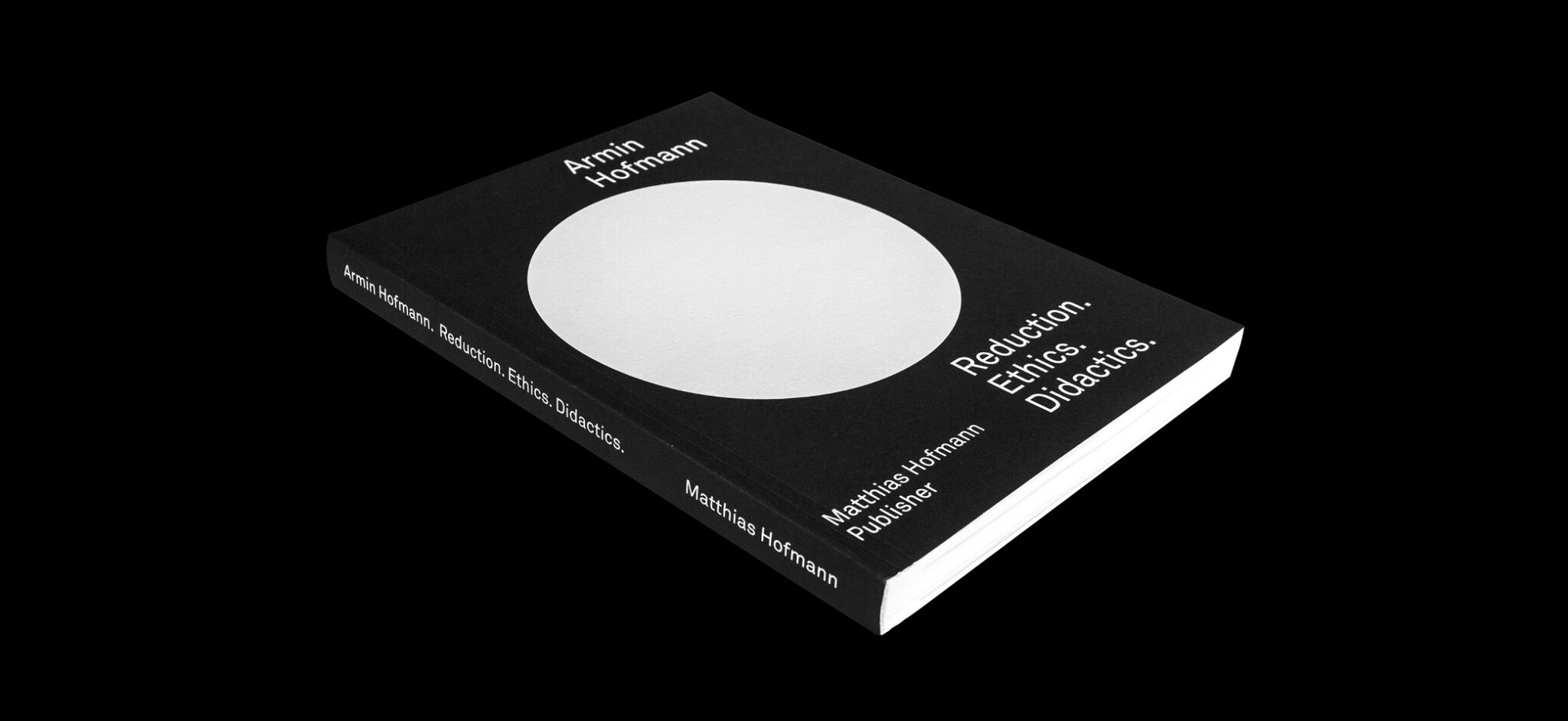
In celebration of Armin’s 100th birthday in June 2020, his son Matthias Hofmann, also a graphic designer, published the book Armin Hofmann. Reduction. Ethics. Didactics.
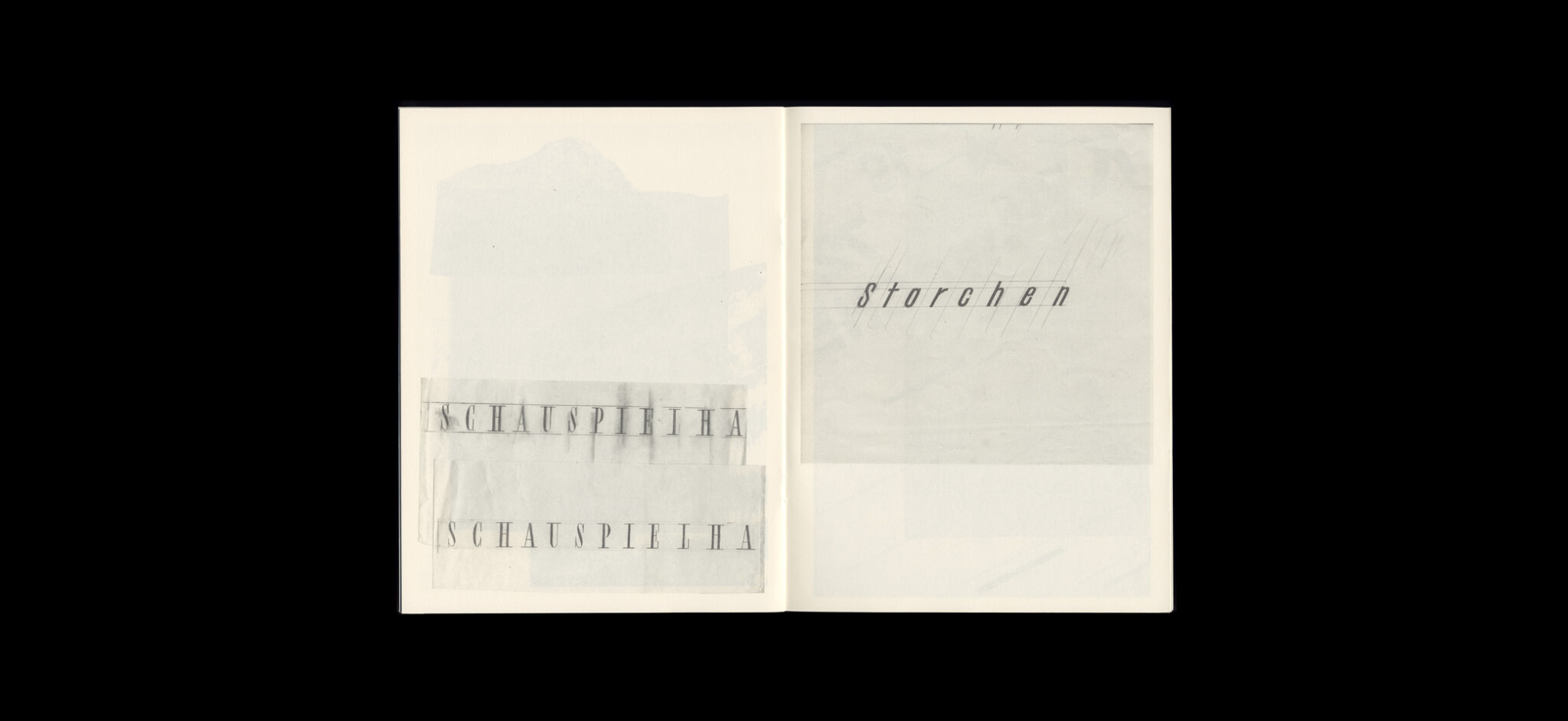
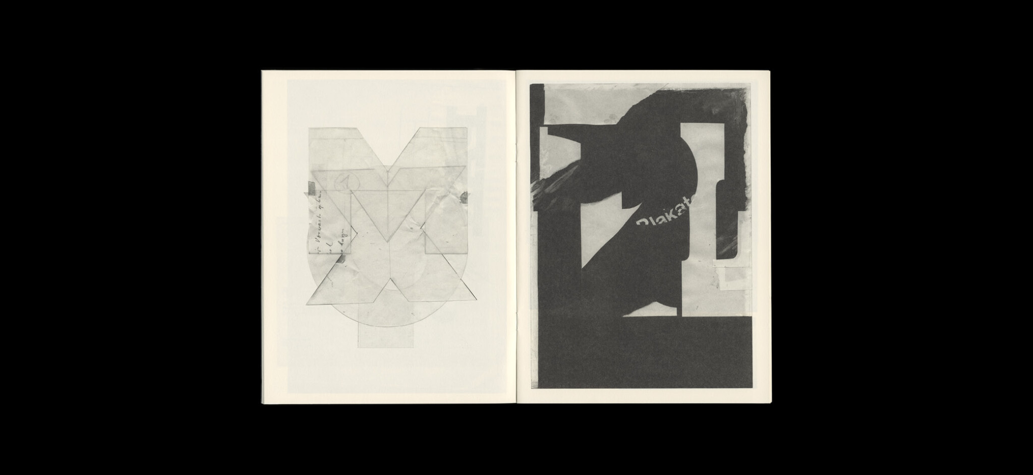
The German / English book showcases a comprehensive overview of Armin Hofmann’s creative work, his professional convictions, and the didactic principles he developed. Thanks to the exclusive access to non-public original sources (his entire creative output, original manuscripts, unpublished texts, sketches, and photographs), the book offers an unparalleled immersion into the work of the celebrated designer.
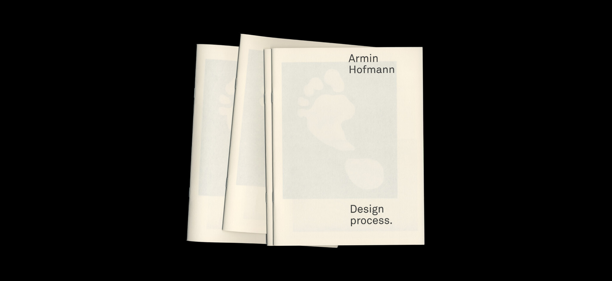
Guest essays give an insight into Hofmann’s teaching and influence, and also included is a limited edition catalogue of sketches and techniques.
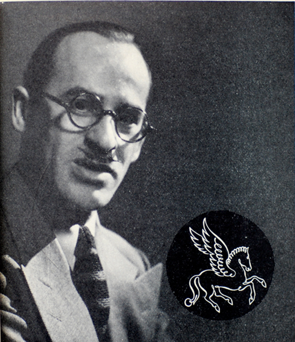
While his logo work isn’t what he was most known for — many of Hofmann’s poster designs have been exhibited at MoMA — the marks he created showed a playful timelessness that undoubtedly influenced the enduring simplicity of more contemporary designs. For example, this, from 1964, for Swiss textiles firm Pfauen Mode.
And this, for Schweizerische Landesausstellung (Expo 64), held in Lausanne.
Often restricting himself to just one colour, one sign, to reduce as far as possible, you can see some other Armin Hofmann logos on Logobook and Thinking Form.
Paul Rand said of his contemporary, “As a human being he is simple and unassuming. As a teacher, he has few equals. As a practitioner, he ranks among the best […] He is a rare bird, a daredevil driver, a mountain climber, a teacher par excellence, and a guru. Yet it is difficult, really, to pin him down.”
Armin Hofmann. Reduction. Ethics. Didactics.
Available to order from arminhofmann.ch.
More spreads on slanted.








Share a thought