Logo origins “go back to deep antiquity,” says Steven Heller. “It was a single image of something that was used as an expression of an individual, representing a thought or an idea or a product. Aristocracy, for example, would have shields, and those are basically complex logos. Not everybody was literate so pictorial means were ways of getting around that illiteracy.”
“In ancient Rome you’ll find mosaics that are pictures of tradesmen, so you’d see an elephant which would mean somebody has been to Africa, or you’d see dolphins which means somebody’s probably dealing in fish. All of these things would indicate who the merchant was, and I think that’s the beginning of the logo.
“Logos increased exponentially as commerce increased, industry increased, as technology increased, and there was more and more competition. They’ve gone from being very pictorial-looking to very modern-looking meaning they’re more economical, so logo designers have to have a sense of what the company wants its personality to be, and then they manufacture this mass, and that’s essentially what the logo is — it’s an identifier, but it’s also something that stands in for who you are.”

And Sagi Haviv continues with thoughts on what makes a good logo:
“The first thing is simplicity, and in today’s media realities it means it could be as tiny as 16 x 16 pixels to work as a favicon, and for signs on the sides of buildings.
“The second thing is that it would be appropriate in character and feeling. If you look at the Smithsonian sun and you say, is that appropriate for an institution that has all these galleries and museums? And then you start thinking, okay, does it look too corporate? No it doesn’t. Does it look to commercial? No it doesn’t.
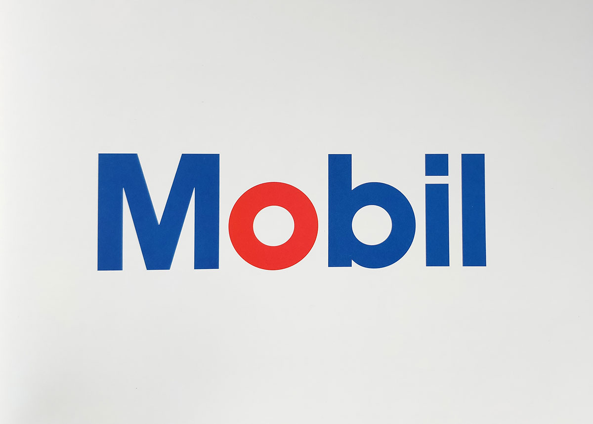
“And the last thing, it should be memorable. And often it’s something awkward, often it’s something that throws off the balance. A good example is Mobil, done by Tom Geismar. He designed these letters that are based on geometry, and the simple change of the ‘o’ to red made it burn into your mind.
“When a design fulfils these parameters, with time it will build equity, it will build recognition.”
Watch on YouTube.
Related, in the archives, is an insightful interview with Sagi Haviv.


Comments
This simple video says it all. Thank you for sharing! It came really handy and on time for our new junior designer here at the company where I work. :)
Thanks for sharing – I really enjoyed watching this brief history.
Superb short video! Somehow the video itself is what a logo does – expressing the brand message in the simplest form possible without loosing the message.
Why does the video do the slow zoom in on EVERY SHOT?
Great little vid but yeah Brad, the constant creeping of the zoom was a bit ott!
Anyone else like some of the concepts for OFF BOOK better than the final logo?
Yes! I believe the black on white where the letters connected during the interruption was the best.
Me! I specially liked more the round one.
re: chris–yes, thank you. was thinking the same thing. they went with something too safe. loved some of the ones that had the bend in the “B.”
Still relevant today, even though most companies forgot about the personality of the brand.