
The Aston Martin brand name came into existence in 1914 following one of Lionel Martin’s successful runs at the Aston Hill Climb in Buckinghamshire, England.
The first Aston Martin logo on record(?) was an AM monogram, pictured below.
![]() 1921-1926
1921-1926
Financial problems plagued the company over the next decade with the business forced to close in 1925 only to be rescued by a group of investors in 1926, forming Aston Martin Motors Ltd, and one year later the AM monogram was replaced with the now iconic Aston Martin logo wings.
![]() 1927
1927
![]() 1930
1930
![]() 1932
1932
![]() 1939
1939
1947 saw the dawn of the ‘David Brown era’ as the business was acquired by the English industrialist.
![]() 1950
1950
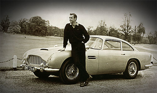
Frequently acclaimed as the most beautiful car in the world, the Aston Martin DB5 entered production in 1963.
The following year saw the birth of a relationship that has left an indelible mark on popular culture, as the DB5 was chosen to be James Bond’s car of choice in the classic film ‘Goldfinger.’
![]() 1971
1971
Despite the development of an iconic product range, the 1970s saw a change in ownership for Aston Martin as ‘Company Developments Ltd’ took over the firm in 1972.
![]() 1972
1972
![]() 1984
1984
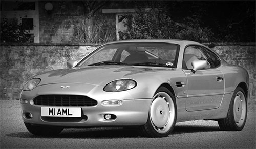
After two more ownership changes, the iconic ‘DB’ moniker was resurrected in 1993 with the introduction of the DB7 at a new production facility at Wykham Mill, Bloxham. The same year saw Ford Motor Company increase their holding to take full control of the business.
The company was presented with the Queen’s Award for Export in 1998, recognising the contribution of the firm to the UK economy.
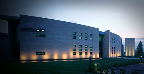
Aston Martin’s new global headquarters in Gaydon, Warwickshire opened in 2003 — the first purpose-built facility in the company’s history.
![]() 2003-current
2003-current
![]() Aston Martin logo photo via Car and Driver
Aston Martin logo photo via Car and Driver
Source: Aston Martin.
See more James Bond appearances.
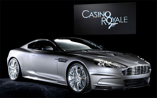 Photo via Lovely Rides
Read about the work that London-based Identity Limited have done for the firm.
You might like the origins of the Mitsubishi emblem, or the history of the Ferrari logo.
Comments
As iconic as those wings are, I think I like the monogram best of all. The A and M weave together excellently and symmetrically; to top it off, they look very rich and elegant encircled in black and bronze. There’s just something about a circular badge on the hood of car…
There’s my two cents…
I really like the evolution of the logo. To me it was as if it got better over time like a logo is supposed to. Glad they straightened the wings out on the logo as well.
I love the monogram logo! I know the current version is iconic, but reverting to something like that would be acceptable as well, in my opinion.
Great to see how this logo has progressed over the decades.
Can’t help thinking that the current version could be improved, it seems abit like they’ve placed it in a black box because nothing else works on the crisscross background.
Where as the monogram could be returned to tweaked and updated to be something really special.
I see the point about the name in a black box, it does seem a little default. But I also wonder at some of the updates. The feathers in the wings seem to have been changed in ways that were pretty unnecessary over the years until this last one, which makes the shapes at least noticeably different, and to my eye, more pleasing.
Somehow integrating the name more into the design would definitely be a step forward, but going back to the monogram I think wouldn’t be. I don’t find that to be as exciting as others. However, if the monogram was combined with the wings and somehow integrated into the feathers without being lost in the design, that could be worth exploring.
I would LOVE to see an new Aston Martin with the old school 1927 logo. How sick would that be!
I would like to see the comparison of the old school 1927 logo vs the logo of today.
See design here: http://martinbrowndesign.com/journal/aston-martin/ and http://martinbrowndesign.com/work/aston-martin-2/ and http://martinbrowndesign.com/work/aston-martin-21/