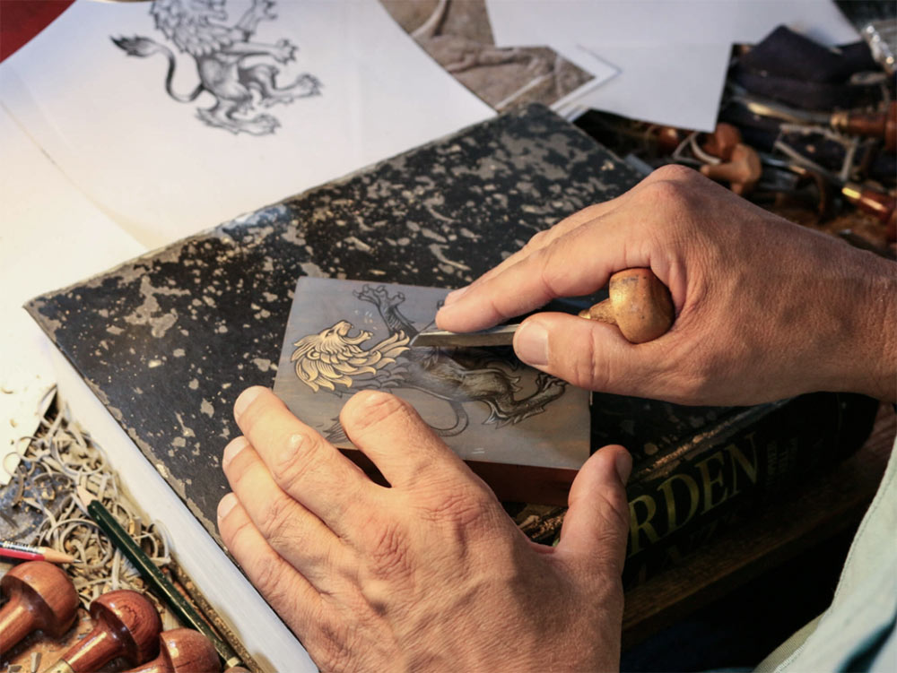
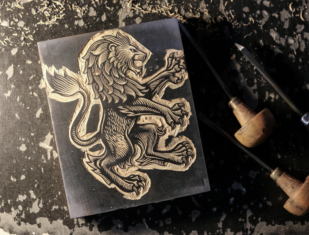
Before the 2015/16 football season began, SomeOne was approached about updating the club’s visual identity. The studio then commissioned artist and engraver Christopher Wormell to redesign the heraldic lion from the badge, aiming to better reflect Villa’s heritage, history, and attitude.

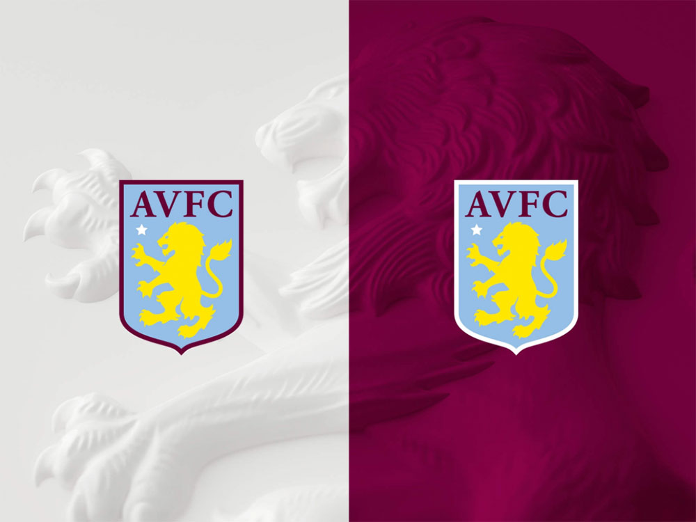
“The updated badge focuses on an enlarged and dynamic lion — its ferocity depicted in detail, which on the badge will be shown through the stitching — whilst also retaining the star honouring the club’s European Cup win in 1982.”


 Before (left) and after (right).
The lack of claws on the previous lion was something the club supporters mentioned in focus groups, and I’m sure most will approve of “PREPARED” being ditched from underneath. The word has history with the club, but it doesn’t represent a lion and isn’t particularly inspiring.


A definite improvement, with some expert craftsmanship for the engraving.
See other identity elements on the SomeOne website, and read a commentary from SomeOne’s Gary Holt on Creative Review: no, it didn’t cost £2million.


Comments
They spent all that time on the lion and didn’t take 30 seconds to fix the kerning on the AVFC. That channel between the “A” and “V” is making me cry.
Impressive work. I love a bit of heraldry in branding.