View on YouTube.
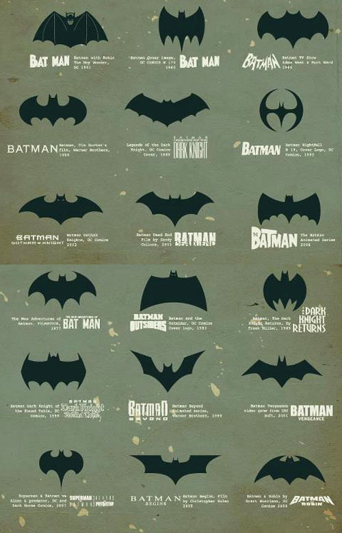
The symbol used in Tim Burton’s Batman (shown around the 57 seconds mark) is the one I’m most familiar with.

Here’s a five-part series showing the history of the Batman logo: part one, part two, part three, part four, and part five.

Video via VIBE. History via Kottke.
In related news, Batman brings in suspect to Bradford police, and Holy Trademark, Batman creators DC take on Valencia over logo.


Comments
That’s quite a coincidence, as I thought just yesterday, how interesting an article about super hero-logos and especially the batman symbol, would be :-)
Hey David, this is awesome. Thanks for sharing. I would definitely say that the either Batman Beyond or Batman Begins are my favorites
David,
Thanks for sharing. Thats a really well done video that morphs from logo to logo. Pretty awesome.
Thank you so much for this video. It was very interesting to see the different logo designs of a timeless hero. I also would have to say that Batman Beyond & Batman Begins were my favorite designs.
Love this video. We’d love to share this video with our website visitors.
Thanks for the entertaining post David! …and wouldn’t you know: that’s one of the few songs by U2 I can tolerate ;)
Like you, the ’89 Batman logo from Mr. Burton will always hold a special place in my heart, but I was pretty impressed with the Nightfall logo from ’93, and I really like the Nolan logo from ’05.
I wonder is there another Superhero logo that has undergone this many transformations?
Great little video, 68 years of designers ‘ tweaking ‘ interesting to see the different versions, I think most of them kinda suit the era they were released.
Next week Spidey?
wonderful video..thanks for sharing..
Wow, not a single iteration I could complain about. What famous logo could change so much and receive no complaints? Maybe logo revisions every few years isn’t such a bad thing! If your basic logo shape is so memorable.
Not even Superman’s changes were this good. Although the best S is better than any bat. Maybe because it’s much more of a cherished symbol.
I had no idea there were so many… I only knew of some the earliest ones starting with the one from Tim Burton’s Batman.
David, that’s a great little video you found. I really enjoyed seeing the symbol morph through the various versions over the years, it gave a real sense of the changes made, some of which were quite a departure from what came before.
Wow! the designer sure knows his bats… amazing extension without losing the personality and attitude of the original logo… can’t get batter. ;)
I was wondering if anyone knows the reason for the differences in Keaton’s bat suit chest symbol and the bat logo used in the poster and marketing in the original ’89 Tim Burton Batman? The chest symbol had thinner wing underlines and a kind of square look around the lower central spire, and the poster/marketing logo had a more symmetrical look horizontally of the outer wings and no center lower squaring around the bottom spire.
The chest symbol was then changed to match the marketing logo in the follow-up Batman Returns. I never really liked the suit chest symbol in the original ’89 Batman and always preferred the look of the marketing logo. But my favorites are the Batman Dead End and the BvS logos.
The most recent logo is missing.
Yep, like most of my posts, this one could use an update.