Sagi Haviv of Chermayeff & Geismar & Haviv redesigned the Beko logo, and kindly answered a few questions about the four-month project.
What did you feel was lacking with the old Beko design?
We were unhappy with the typography and the lack of balance in the existing wordmark. When you set the word in caps, you inevitably get an unbalanced composition with the very closed B and E on the left and the widely open O on the right.
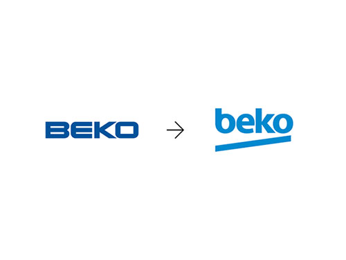
From a personality standpoint, it seemed to us that the existing design projected the wrong image. The brief we received from the client talked about the primary target audience being between 18 and 35 years of age and described the desired identity characteristics as youthful, dynamic, full of energy and approachable. The design they had with its elongated rigid all-caps lettering was the opposite of that.
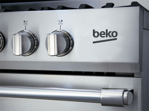
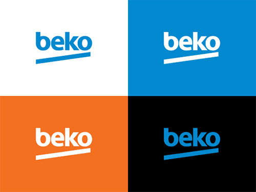
The challenge was to do something very simple that didn’t rely on color so it could translate well to the all-important applications on the appliances. Going with all-lower case was a way to bring in a youthful look and approachable attitude and also to balance the word visually. The tilted underline was a simple, almost rudimentary way of injecting energy and dynamism. We also suggested a brighter blue for a more optimistic overall image.
Did you design fully custom letterforms or did you customise an existing typeface?
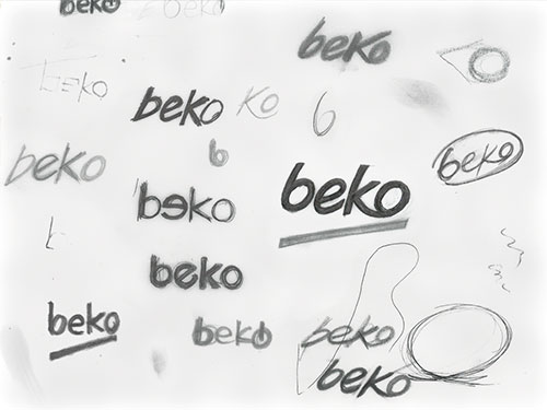
The letterforms were customized. Some of them grew out of a version of Myriad, but all were redrawn. Especially the ‘b’, as it was important to echo the ‘o’ and also to eliminate the stem, which was interfering with the thrust of the diagonal underline.
Did you create anything else for the client, or was your sole focus the Beko logo?
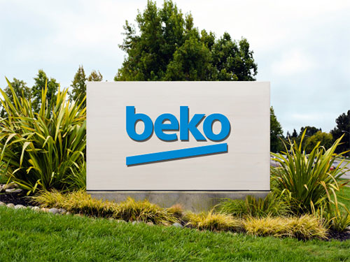
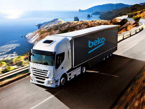
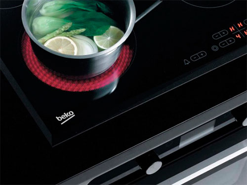
The wordmark was our main focus. It’s going to live in people’s houses on their washing machines, stoves, and TVs, so it is a significant thing for the Beko leadership, who think very strategically. Once the identity was approved, we developed an approach for store signage and designed basic guidelines for the logo’s use, including specifications for a distinctive corporate typeface.
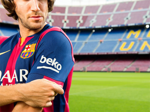
In 2014, Beko sponsored FC Barcelona, and the new design will now appear on team jerseys and stadium signage through to 2018.
More from Chermayeff & Geismar & Haviv.
Related, from the archives, is this interview with Sagi Haviv.



Comments
So basicaly they draw a disapointing face, with b and o being the eyes and the diagonal mouth going down. I wonder if it was intentional or nobody saw it so far…
A cute coincidence – here’s the logo of one of the major textile industries in the former Yugoslavia. Its name was also Beko – derived from ‘BEogradska KOnfekcija’ – literally Belgrade Confection, not pertaining to sweets whatsoever.
http://static.mondo.rs/Picture/165136/jpeg/
Original simplistic logos are hard to design and in my opinion, this is a poor example!
I actually prefer the linked logofont in the sketches, at least it has a personality. The final design just looks like a standard font and no unique features.
I’m not sure how the designers missed it but it looks like a disappointed emoticon. I’m not sure if this was a good move. How has no one at the company not seen it yet? :/
I couldn’t see the disappointed figure – until now, but now I can’t ignore it anymore. Maybe I’m too old (34), haha. But younger people in the target audience probably realise it instantly.
When I first saw the logo, I said, well, not that bad, but the diagonal line felt a bit off. In the sketches, where k & o are linked, the underline feels more natural, and it’s more unique and balanced than the end result, in my opinion. I didn’t know “beko” before, but the previous logo does look like one of my grandfather’s electronic magazines from the ’80’s. The new one became the total opposite, and for me is too playful for such a company. I find symmetry a sign of stability and reliability, which is important when I buy electronic devices, but the diagonal line here represents some kind of uncertainty for me.
I rather have a problem with the explanation than with the design.
He’s saying there was disbalance on the old wordmark (between B and E on one side and the K and O on the other), but it seems he’s ok with huge disbalance on left and right hand side on the new wordmark? I’m talking about the gap between the letterforms and the line below.
I don’t get it.
Personally, I like this new version. For me the older logo was a bit too rigid and lacked personality. The new lowercase font helps bring some playfulness into the design, although Im undecided on the slant underneath and whether that is neccessary at all?
I wish they would have worked some more with the spacing, it might grow together when used in a smaller version… And also the shape of the k, so it “belongs” with the more rounded b, e, and o.
@Ivan Apostolski
I like the Yugoslavian “beko” even better IMO.
And it totally looks like a slanty face, and once you see it…it can’t be unseen. Hopefully their products bring more happy emotions than dissatisfied.
I agree that the slant doesn’t do anything for it. I think it’s taken it from a professional to an amateur look.
Cover up the slant and everything looks professional, put it in and it falls apart.
I would say they’ve redesigned the former Yugoslavia’s Beko logo. Could this be a coincinence? Please have a look: https://lh5.ggpht.com/efS8b53KS4bA6IrqMQtQsbVilH3NeEHZV71NKFQsOZVOx9zyEupIGprDHqLNCld7a_2ZKw=s170
Goodness the slant though… pointless addition.
All that work on the typeface was not enough that they had to add the line to complete it or compliment it?
I agree with Zita on this one. In my country (Poland) BEKO products are very popular and I know this logo very well. This new logo is too playful, too childish, for a company that makes dishwashers, ovens and such. In that kind of sector, the logo should be incorporated with reliance, innovation, trustworthiness. Now, it looks like a kids toys manufacturer :/ And a dash? Well, for me it’s something like an opened door of a fridge (top view) or an oven (side view) – but all it’s bringing to the table is not “energy” and “dynamic” but lack of balance…
In my opinion some of their earlier sketches showed more promise. I thought the slightly more scripted free flowing typeface was better, it had a more youthful edge to it and worked better with the slant. You never know that may have been the designers choice but the client went with the final design.
I agree with Paweł that the new logo looks too childish for a company that specializes in electrical consumer goods. Instead of invoking a feeling of trustworthiness, reliability and support, the logo creates a feeling of playfulness and fun. Though this is my personal opinion but I think a little bit of tweak in the design is necessary to create that perfect impact.
I think the logo is good as long as it solves the problem. Haviv was right about the imbalance between the old logo’s ‘BE’ and ‘O’.
He also says that they wanted youthful, dynamic brand characteristics, which the new logo shows.
BEKO founded in Turkey 1967.
In 47 years, makes people believe, trust and use it.
They say for old logo “an unbalanced composition with the very closed B and E on the left and the widely open O on the right.”
On the new logo every letter is finished with round and straight lines except “K”!
Is it not going to bother anyone?
I agree with Ali that they could have something with the letter ‘k’. Instead of keeping it like that way. They could have used the ‘k’ and ‘o’ in conjunction to maintain the consistency as visible with the other letters.
As a design student, I think that the old one was better. This was a stupid, unnecessary move. For someone that doesn’t know the brand, the new one makes the products look cheaper and shittier, instead of something modern and reliable. Kids do not buy washing machines, why does it have to be playful? When young people buy appliances they want them to be good and reliable too! They want them to last 30 years!
I’ve never heard of this corporation before, but I agree with the redesign. The original logo just “screams” IKEA to me. Going with the lowercase letters really helps them stand out a bit, especially with the diagonal underline. That’s a nice touch and gives the design a better sense of unity that complements the custom typeface they created.
I received my new BEKO appliance yesterday and was unaware of the logo change! I do have another appliance with the old logo, and I must admit I feel the old logo looks classy, iconic and impressive. The new logo makes the appliance look cheap and like a child has been allowed to use a crayon to draw the logo on. Not very impressed with the company’s brave new move to become trendy!
I live in the US and just went shopping at PC Richards for a new range. LOVED everything about the Beko (which I never heard of before), however I cannot get past how unappealing and cheap the logo looks. It actually really bothers me, and my husband was wondering if we would be able to take it off because he thinks it looks silly too! Did they even test out the new logo on consumers before implementing it? I can’t imagine there are many people who like it!