
![]() Old Bing logo.
Old Bing logo.
The redesign (mentioned by Bing a couple of days ago) is definitely an upgrade, and more in tune with logos for Microsoft’s other services.
![]()

“From the color of our logo to the angle of the cut on the top of the b, the Bing identity has been designed to fit seamlessly into the Microsoft family of products.”
![]()
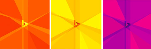
“We’ve taken inspiration from the new Bing symbol by taking all angles to infinity and adding in levels of color and transparency to add depth and energy. We call this the Searchlight graphic as it uses the Bing symbol as a prism of light and inspiration.”
— Scott Erickson, brand and creative
It’d be good to see more context when new designs are shared, such as where those “Searchlights” will appear. A small number of visuals never does the designers any favours when it comes to general consensus among the people using the service.
More details on the Bing blog.
Comments
Nice redesign! It definitely fits in better with the Microsoft family of products.
I’m liking this and the theory behind it.
Is it just me, or does it still look awkwardly spaced? I keep reading “Bin g”.
I liked the old one, even though it’s stretched. Even Dreamworks Animation logotype is stretched, but that’s unique.
Bing is my all time fav design. I don’t like the new one. It looks like the “Google DRIVE” logo broken.
I prefer and love unique “old bing” a lot more better than this new one.
Also, I don’t know why “b” is in lower case, as other MS products start with Uppercase like “Office” “Windows”.
Looks suspiciously like a monochrome version of one of Google’s logos (Google Drive) rotated slightly… I’d wager that’s no coincidence.
I also like that the name of their search engine still means “waste tip” in my part of the world.
Bird in the negative?
Yeah … I see a bird … for sure. And would like to see it animated to highlight that negative element (intentional or not). I don’t see a “stylized b” so much at all.
Much better!
Nicely done!
Look’s a bit like a bird or (homing pigeon) in center!
Botta-Bing!!
A much improved look!
Sorry I disagree. Two words: Lost opportunity.
Struggling, reads more like an uppercase “G” especially at an angle. The relation between symbol and type is slightly off… modification unresolved in my book.
I don’t think this logo fits next to the ‘bing’ type. It’s too thick, sharp and clunky. The small bird is a nice touch (if intended) but I feel like that animal’s already taken by twitter. Better to go for a more independent identity. I certainly don’t see a prism.
To me a search engine brings up a lot more emotive imagery without being as cliche as a magnifying glass.
I think it’s a massive improvement on the original wordmark. The new logo is edgy & fresh in my opinion. Also, I absolutely love the conceptual idea of the Searchlight graphic. I don’t believe I’ve seen that done before. Lovely work.
Much better then the old one. It got an edge to it :)
Infinity? The Infinity symbol has changed dramatically since I saw it yesterday!
As someone else commented: A missed opportunity!
Why are the search engines all jumping on the bandwagon and changing their logos? What’s about to be launched??
Their priority was making a logo fit in with other logos, and it shows.
“We’ve taken inspiration from the new Bing symbol by taking all angles to infinity and adding in levels of color and transparency”.
Some people don’t half talk bollox! ;)
There seems to be a trend in flat design and primary/secondary colors. Not sure how long I can handle that.
Looks too much like the outlook logo in my opinion, although I love Microsoft’s quad square.
Definitely much better then before.
I feel that it’s certainly a better move, putting the logo in the same family. My only complaint is that with some of the Bing homepage backgrounds, the B looks very out of place. It has more modern lines than you’d expect to see next to a pair of ducks for example.
So….now we have all strong, and sharp lines, except the Xbox one… doesn’t match…
I think it’s a huge improvement on the first word mark. The new brand is nervy & recent in my opinion. Also, I completely love the abstract plan of the Searchlight graphic. I don’t believe I’ve seen that done before.
Looks an awful lot like the Dedicated Nutrition “D”. http://www.dedicatednutrition.com/
The new mark is very brandable but I’m not sure it matches up well with the type. I do see what looks like a dove in the negative space but what’s the significance with that, if it is?
The new Bing logo fits in so much better with the other Microsoft products. Now if they can only get more people to use Bing instead of Google then the redesign will be worth it.
I feel like I’m taking crazy pills! It’s just the Autodesk logo rotated!!
http://cdn2.digitalartsonline.co.uk/cmsdata/features/3437213/autodesk-logo-pantone-uncoated-color-logo-black-text-large-512.jpg
http://www.behance.net/gallery/bing-ambigram/5170085
Great bing logo concept.
TOTAL ripoff of a wellknown danish brand
http://www.bikubenfonden.dk
Amazing…why is Bikubenfonden not doing anything about it? Clearly infringement….not only did they swipe the logo but they even adapted the diagonal lines. I don’t get it, why would Bing take such a foolish risk? Unless they were unaware, and the designer did a colossal No No… hard to believe, a search engine not searching.