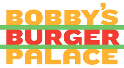
“Conveniently, each word in the name has six letters: sandwich them together and, rather nicely, you get two buns, a burger (and some lettuce).
“Designed by the studio’s Michael Bierut and Joe Marianek, the identity further informs the design of the restaurant itself, which was created by the Rockwell Group, and also the look of the menus, uniforms and signage. And the chunky type is set in a customised version of Hoefler & Frere-Jones‘ Knockout font.”
Quoted from Creative Review.

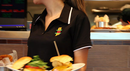
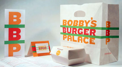
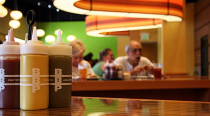
A good example of how logos seen in context can appear much more effective than when in isolation. The packaging, menus, signage, and interior all work well together, even though initial impressions on the logo alone may not be too high.
I’m curious why the Rockwell Group worked on some elements, while Pentagram were brought in for the identity.
What do you think? Are you in favour? Against?



Comments
= “Just like any other fast food chain”
I agree with what you said—at first I was like “wait? what? this from pentagram? it sucks!” but in context it works quite well.
Seen alone, it will be very hard to figure out that the logo refers to a burger with a green letuce :/
The idea is good, but still I don’t really like it :)
Yeah, on its own it looks a bit naff, but when it is viewed in its intended environment, it works really well.
I especial like the abbreviated version ‘BBP’ more that the original/full lettered logo. I noticed by looking at the sauce pots that ti looks good in white, too.
I really like this logo. It is subtle, almost subconscious. I immediately ‘feel’ it’s burger related. Leaving me intrigued and I look further and then I’m validated. This thought process is what makes logo recognition stick. It is the logos that slap you in the face with the obvious (a burger icon) that are forgettable.
the BBP logo is ok, but the full word logo I really don’t like
This feels like an “homage” to some of burger kings earlier identity? pre freaky king and blue in their logo. Or is it just me?
<< What do you reckon to this logo? Are you in favour? Against?
David, great choice for a post!
I really love this logo, but I’m wondering what the general public think about it.
It drags you in for a double look, and that’s always a plus.
And like Peter said, it avoids the obvious clichés of burger logos. And that, I like.
maybe if the edges were rounded off a little bit. it might look better
I love the BBP, it works well on the uniforms and packaging. The single color version is very catchy.
But the full word version is a mess. They could have kept the BBP part as the logo and have had the text as a separate extension (say in white and not bold). Just a suggestion
It’s just ok to me. as previously stated, it is very “fast food” formulaic with the colors, san serif font and blocky layout. I would have made the green lettuce lines a little thinner; probably the same height as the horizontal line of the A or bottom connector of the P, then made the height of center horizontal line of the E to match.
I know it’s Bobby Flay and all, but it is just a burger joint. Do you think a ketchup and mustard colored script font would have worked better instead? Although…
Trish
I like the idea of making a burger out of words/letters and using it on all their packaging, but I’m kind of disappointed with the colours. They had to use red and yellow, like every other burger joint out there (BK, McD, Carl’s Jr)?
I like it. It works well in the category of food without feeling like the same from “the big guys” in fast food. It is unique enough to leave a lasting, unique impression.
The colors are so-so, but again, I DO like that the scheme matches identity without trying to break out and be something it’s not. I can look at it and know that it probably has great burger food not greasy spoon meals OR Fru-Fru “exotic” burgers.
When I looked at it before reading the post, I thought “why is there a post about the logo of some hole in the wall burger shack?” It looks cheap, like the owner didn’t want to pay for a design firm and decided to just make his own logo.
I think they should have formed the top and bottom words into the shape of a bun to really pull together the concept.
I like the concept. It immediately brings to mind a burger. As regards the colors I think they’re there as well – the bun, the burger, the ketchup and the lettuce. The only thing that I am a bit not convinced upon is that it is somewhat similar to other burger logos such as Burger King, but then again, the association may have been created on purpose to “ride on the wave” of larger burger chains.
In my opinion, this case is a paradox. If I would see the logo in a gallery, I would say that it’s not the best possible… BUT seeing all the visual identity components I have to say that IT WORKS GREAT!
This logo has the potential to lead to controversial discussions but… from every debate Bobby’s Burger Palace & Pentagram will come out as winners… :)
Ahmed,
The fact that it’s not instantly recognisable as a burger is what makes it more appealing than a big burger image / icon.
Andrew,
I also like how the BBP logo works on those sauce bottles.
Peter,
Similar to my own sentiments. The logo doesn’t try to be something it’s not, and fits well in the industry.
Kevin,
Definitely more similarities with the older Burger King logo, particularly with the colours used.
Cat,
Likewise, I’m not sure how the public would take to this, but for me, it’s a winner. The whole package ties in very well, even if my initial impression wasn’t so hot.
Trish,
To be honest, I’d never heard of Bobby Flay. The fact he can hire Pentagram tells its own story about his popularity though.
Kris,
Your point about the colours is valid, especially given the BK logo I link to above.
Chris,
The expression, “Does exactly what it says on the tin” comes to mind, and as I type, my stomach just rumbled! Time for lunch.
Thanks a lot for everyone else’s comments. I must rush to the kitchen now.
who is Bobby Flay… he is a decent looking ginger guy who has become the poster boy of American food (think nearing middle age Howdy Doody). He appeared on two episodes of the original Japanese Iron Chef, losing one (he was not happy because most of his appliances didn’t work, he got electrocuted and other stuff; it was pretty funny really) and winning the rematch (pissed off Masaharu Morimoto because he stood on his cutting board as time ran out). Now he is a fixture on the American version of the same show as well as starring in another three shows on the Food Network. He is most famous for BBQ and Southwestern style American food with several successful restaurants in New York, Las Vegas and elsewhere. Oh, and he played himself on one episode of Law & Order. Seriously, I am not a fan of the guy, I just watch a lot of weird TV. Bobby gets around.
I think they did not round the corners of the text so they would not resemble too much other burger joints and the text is too nice, in my opinion, to distort in such a way.
Trish
I’m not a fan of Bobby Flay either. Now if Alton Brown opened a restaurant, I’d be excited!
Alton Brown is on my list! Along with Bill Nye. What can I say, I love geeks!
Yeah, an Alton Brown restaurant would be the bomb!
Trish
I agree that at first I was like come on really, but it does work well with everything.
i too felt that the logo looks very “cheap” but when used in context looked quite well. I would have chosen a different font but I think Pentagram knew what they were doing.
smart.
NO imagination, very blah, run of the mill, Logo works anyone?
That is probably an unfair statement, the logo does not suck, I am a fan of Bobby’s but I would not wear this on a tee shirt. So in my opinion the logo it is far from good.
With that said I would like to see the sketches of the process of how they arrived at this solution. See if the client drove this boat.
The “palace” in the name is lame.
not a winner with my first impression…. but in the grand scheme it works ok.
I like the abbrev. best
B
B
P
Not sure if the sandwich Idea really STANDS OUT, the colors may lead you to the thought of a sandwich but then again… who cares when your hungry… lol
Kristine
I think there is a very deliberate harkening back to the glory days of burgers here. Palace as in White Castle? The logo so similar to the old Burger King logo? The old “orange and red colors make people hungry” color palette?
What do you think?
Trish
creative? I think many of the readers will put all the words in a hamburger sooner or later but choose not to because it’s kinda cheesy.
I simply don’t like the name to begin with. overall, i’d give it a 6.5/10
I really liked the logo for Bobbys Burger but it really proves that the fast food logos have something to do with the contrast of red and yellow, color scheme and this point is proved by a very nice post at http://www.graphicdesignblog.org. Do chk it :)
This logo is so very very average! A burger joint with a burger style logo… there’s nothing clever or unique about the idea or the typography. It’s a flat and boring identity that doesn’t work alone or in the environment it’s used. Sorry, I don’t like this logo at all.
I too see a resemblance to the early Burger King logo. But what it really reminds me of is the stock signage you might see assembled for the storefront of a discount Chinese restaurant.
There’s not a lot of substance. Looks like it was killed in committee. As in, “ok, can we AT LEAST agree to have the words stacked onto one another so it looks like a burger?”
Perhaps the venture capitalist had too much of a say in this one.
I am not overly impressed by this logo. I think the concept is there, but it is not well executed. I agree with those that stated it would be better if the bun was curved at the top and bottom. Right now I just think it looks unfinished. I do however like the abbreviated version. It seems to work much better than the whole name.
You can analyse a logo forever, but it usually comes down to a matter of personal taste in the end. And personally, I like this one, it’s a little bit different, it’s fun and it looks like it works really well in the restaurant. I love a bit of bravery in design!
ICanHasCheezburger is better: http://icanhascheezburger.com/
I agree with those who say it looks like crap alone, but not so bad in situ. Still, if I had been the designer, I don’t think I would have had the balls to present it.
I am really confused. Logo alone looks cheap and not very well executed, but has nice concept. At the other hand bbp looks very nice in monochromatic, especially on sauce bottles. Overall I’m not charmed, but at least whole thing looks compact and not repelling.
Excellent point – How a logo will be used in is an important bit of information that new designers are prone to forget. Designing in-context can help a logo live longer and make more impact while in-use.
Excellent reminder!
I think it’s mediocre. I can’t imagine the number of personnel hours put into this design and this is the end result. I agree that the acronym works better from a design standpoint. But all in all.. I give it two thumbs down.
I wonder what the burgers are like? I bet it’s at least $10-$15 for a cheeseburger.
Hmmm….I’m not ‘loving’ it, excuse the pun ;)
I agree it definitely looks much better in use, but even then I don’t find it that great and feel that something much better than this could have been created.
I do like it on the sauce bottles however and at the end of the day ti does it’s intended job pretty well.
Trish,
Thanks a lot for the insight into Bobby Flay. It’s funny, since publishing this post I’ve heard his name mentioned a few times on UK television.
To all you other kind commenters, thanks so much for your time, and apologies for my recent lack of it. I never like such short and general responses to your comments. I hope you’re all enjoying your Mondays.