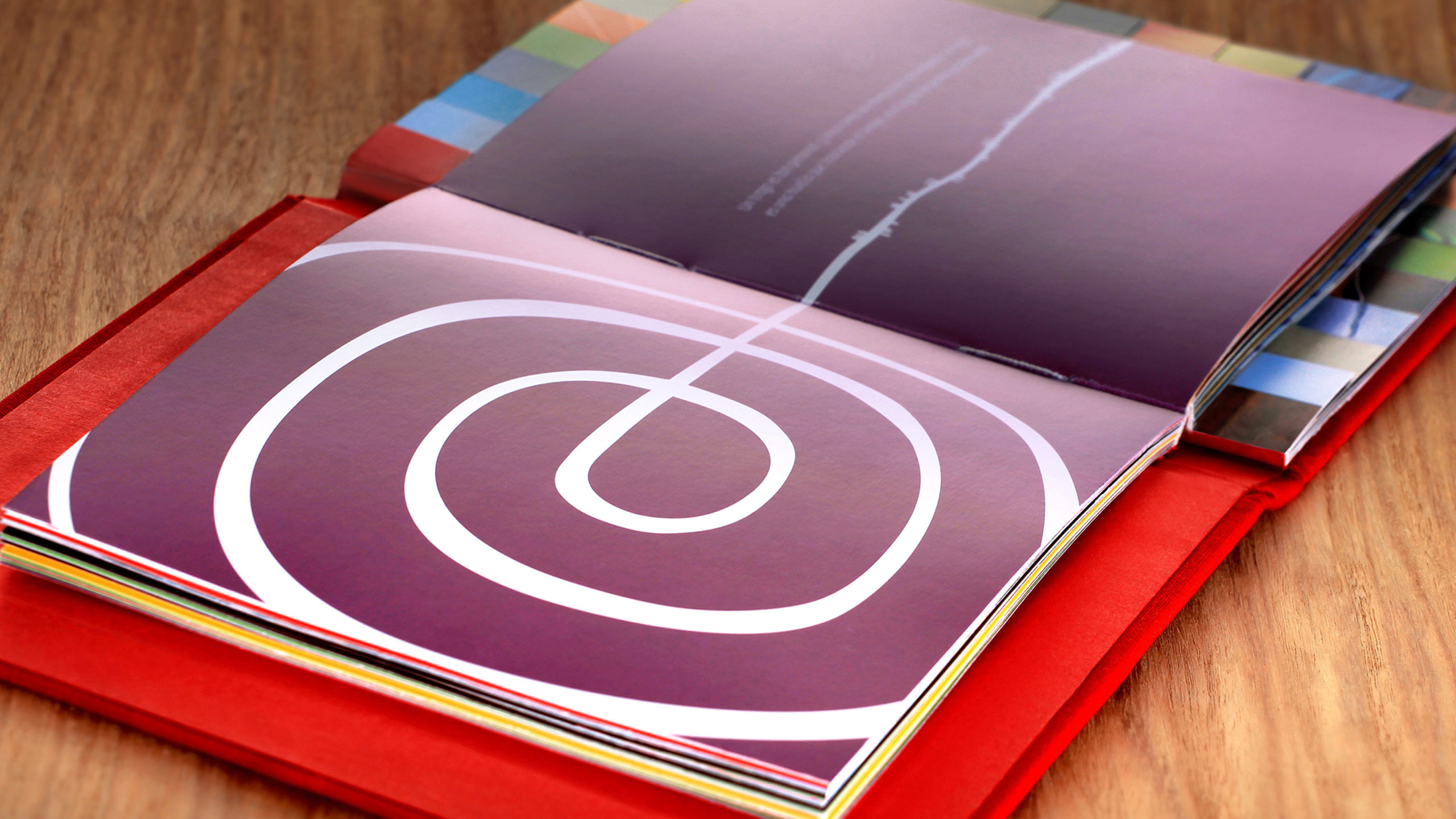
For the new Peru logo, “no images were used. The word Peru is enough, according to the campaign. It is uniquely short for a country name, it has a universal pronunciation, and the accent mark over the letter u stands out.”
“Starting April 26, the brand will be promoted in a campaign within Peru. Then the hope is that shortly after consumers around the world will begin seeing the Peru brand on an array of Peruvian-grown foods and manufactured goods.”
Elsewhere:
Country Brand Peru, on FutureBrand — who created the design
Press release, from FutureBrand
Peru Brands Itself, on @Issue Journal of Business & Design
Peru’s New Brand, on Brand New
Type Together, the foundry commissioned by FutureBrand


Comments
I like it, very simple, clean although is there any reason for the amount of swirls that make up the p?
I really like it too for its simplicity… long promotional video though, could’ve said the same in half the time
Lovely identity. Captures the spirit and landscape of Peru nicely. I Didn’t understand the video as I’m English so they could have been talking about.. ‘carpets’ for all I know! And if so, the identity would work equally well ;-)
Perhaps the P’s “swirls” are reminiscent of those ruins that they showed in the video. The Inca’s and other ancient people did a lot of tiered farming. There are also many mounds and forms of land art that share that motif.
The imagery really sells this by the way.
This is really refreshing, although maybe a little hard to read initially, the letter forms have a lot of character and movement as do the little line details that accompany it.
Very interesting and well done, too. Not to start trouble, :) but when is the US going to improve its brand?
? What IS the US brand?
The American flag with wording “Made in the U.S.A.” underneath.
I’d love to now how the US would go about trying to define or narrow down its brand values. It’s too big to have a unique and single proposition…
I think the new branding is charming, fresh and engaging. According to the press release…
The spiral form that the “P” has is referred to one of the graphic motives present in all the cultures born in Peru’s land. It represents evolution, change, transformation. It also refers to a finger print, in line with the concept that “there is a Peru for each one”. Also, the use of a handwritten typography, creating a logotype from a single line: because in Peru people trace their own path based on their particular interests.
I like the new Peru branding look, but ultimately their ability to transfer an “experience” to potential visitors will be the determining factor as to whether or not it works. That’s the only worthwhile measure of success in any campaign.
@Craig @Paul – I don’t think the US does a very good job of branding as a nation, but certain cities have branded themselves well. Las Vegas, Nashville, Austin, New Orleans, Key West, and others have done good work. The recent California branding was interesting as well.
The obvious reference is to the Nazca Lines … I agree, it’s very nicely done.
Ah, you did post it David. This is great. Love it. It has life beyond just the logo, a complete identity. It FEELS right, it’s emotive, it’s distinctive and it’s entirely appropriate and relevant. Compare this to the 2012 identity and you can see instantly just how badly London 2012 fails.
There is some great work coming out of Latin America (this was designed in Argentina). I went to an Icograda design conference in Cuba many years ago and was really knocked out by what I saw. Cuban design students are also very skilled.
As for the USA. I take it that the Peru identity is for tourism. I agree with Craig that the USA would struggle to define it’s brand in a logo as the US is too big and encompassing. Arguably, you could say that they don’t actually need one. They just need a frame.
I’ve never been to Peru and no nothing about the culture, but as a ‘Westerner’ this just feels so right. A kind of ‘Machu Picchu’ thing going on. It’s fresh. Distinctive and simple. Reminds me of the Mind logo.
I really like this. It’s simple, distinctive and I think I get the influence of Peruvian art and culture. I love to see logos in white too…so clean.
I quite like the video too, even if I don’t understand a word of it.
Gorgeous, David. A breath of fresh air. Thanks for posting it!
Regards,
Kelly
The P looks like the Nazca field drawings that you can see from the air. Also a nice spiral.
I like the logo a lot actually. As for the video, it does not have to be one of those way too fast Attention Deficit Disorder videos you see on TV nowadays, but this video can still be edited to be a little tighter. At 2.12 minutes, the logo should have made an appearance a lot sooner
Hi i’m peruvian, the P looks like the “Lineas de Nazca” (Nazca’s lines) that you can see the monkey’s tail from the air, is one of the most representative images of Peru.
link: http://en.wikipedia.org/wiki/Nazca_Lines
@Alonso Li Shall you tell us what does the peruvian people say about this? Because there’s a little of buzz around this project done by an argentine team.
Nice logo though I think a few other countries would contend the claim that it is uniquely shot for a country name: Cuba, Iran, Iraq, Chad, Fiji, Oman, Laos, Togo, Mali . . .
Hi @Demian Perez, Peruvians had taken so well the logo. As usual we feel proud of our country.
Great logo. I think all the swirls are meant to represent Peru’s famous Nazca lines.
I agree that the new Peru logo is very nicely done. It does look like the Nazca line drawings but also is reminiscent of patterns in textiles and pottery from other Peruvian cultures.
Hi everyone. I’m from Peru. It is a very particular country with a coastline, mountains, and jungle, plus it has one of the best cuisines in the world, people are very warm and friendly, is now one of the most economically stable countries in Latin America, the country’s P logo is the result of an iconographic figure of cultured Mono Nazca, but also could be taken as a spiral which would represent the appointment process had by evolutionary Inca, Nazca, Mochica cultures. I invite you to come to Peru and I assure you that you will have very pleasant memories of this country so mystical. Greetings to all.
Interesting! I always think it’s cool when a country or city tries to rebrand itself — it’s so interesting how the way they go about choosing a logo reflects what they think of themselves, how they want to be perceived, etc.
The swirls are because of LINEAS DE NASCA
The reason for the branding is because Peru wants to be be at the vanguard of all the emerging countries of south America, and the swirling logo mimics one of the many wonders Peru has, In this case the iconic “Nazca Lines”.
I think the US does have a single propsition brand wise. It’s the spirit of the world’s people that came to an undeveloped continent and conquered it for their survival. As is usual with regards our species, terrible things were done to indigenous peoples, and eco systems. Greed and power were the motivating forces that shaped it. It will always be thus. The history of the US is really the battle for ownership of the country’s debt generation, or central banking system and control of the profits, the interest, from the debt that built the nation. That era of expansionism now over, the banking system has moved elsewhere for profits, finally able to bankrupt forever the nation that made it. I think ‘pioneer’ spirit is the identity of the brand. Synonymous with that, however, is not courage or victory, but exploitation whch is the price of naivity; both characteristics that the American people are now realising is their inheritance. The food of the pioneer is hope and, to paraphrase that great pioneer, Carol Quigley, we can but continue under the premis that there is hope in their tragedy.
Started seeing the Peru tourism campaign on TV. Couldn’t take my eyes off the logo. I’ve never visited the country, but knew instantly that the swirl symbolized the crop circles I’ve seen now and again in photos of Peru. Even if I didn’t make that connection, I would have loved the logo regardless. The swirlly P is pleasantly hypnotic. Thanks for creating it!