JLW: How did the British Steel commission come about?
DG: Through a neighbour, Will Camp [British Steel’s director of information services]. They had commissioned ideas already but they didn’t like them, so he came in one day and said will you give it a go.
JLW: Was that done quickly?
DG: Very quickly, yes.
JLW: I’ve read that it stemmed from a visualisation of the steel process — is that true?
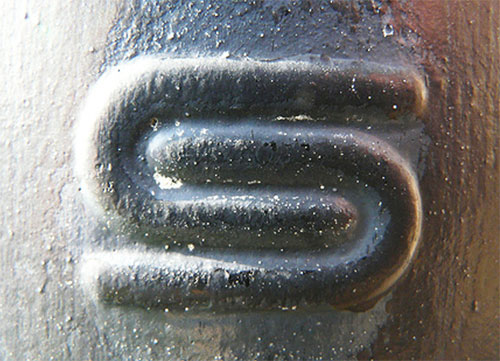
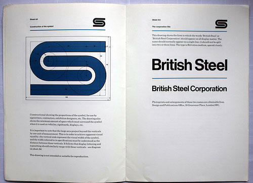
DG: It came first from my own wish to suggest that steel was strong and flexible. Only later did I discover that steel was bent in order to test its strength — so I used this as a rationale, but I didn’t know that at the time!


—
Read the full interview on eye magazine.
Images courtesy of eye blog.


Comments
Very strong logo…
Works very well, nice application!
Such a strong logo.
Love the back story.
Reminds me of the Sims Metal Management logo. . . similar theme. Both pretty strong I think (http://www.simsmm.com/)
David Gentleman came to my University in the early 90’s to lecture about his designs, specifically the British Steel logo and its background. The explanation he gave about his thought process when creating a logo helps me even today whenever I am asked to design logos. Thanks for some valuable tips David.
One of my all-time faves. Simple and well-executed. Nearly perfect.
As a designer, when you see a logo and say to yourself, “Damn, I wish I designed that!”, that’s about as high a compliment as there is.