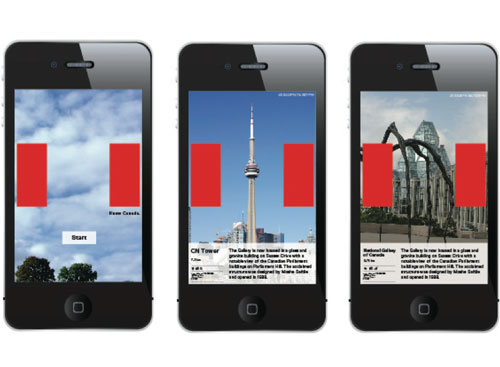
Bruce Mau Design (BMD) was approached by radio program Studio 360 with Kurt Andersen in the US to take part in its series called Redesigns.
“At the suggestion of a listener in Saskatoon, Saskatchewan, Studio 360 put the focus on redesigning Canada. But the ‘design exercise’ is not really about changing Canada, said Alexis Green, marketing and PR manager at BMD, as much as it’s about changing America’s view of Canada.”
Quoted from Design Edge Canada.


“Canada has an image problem in the US. When Americans think of Canada, stale and often cliché ideas come to mind; such as maple syrup, hockey, snow and lots of it. These images don’t pay homage to the intellectual, creative and social contributions that Canada makes as a country on a global scale. These clichés do not accurately depict the 21st Century Canada.
“In our redesign, we began with an assertion that Americans simply don’t understand Canada. Our view is that Canada doesn’t need a redesign; rather, Americans need to be educated.”
Quoted from the BMD website.
Watch the video on YouTube.
Visit the associated website: Know Canada.
View the full design presentation (PDF).


Comments
A great idea.
Thanks!
Reading through the comments on the Studio 360 site I can see the challenges of pulling together a rebrand that represents an entire country – it’s highly emotive, and there really isn’t a way to please everyone. It would be interesting to see how it pans out if Canada did take it on.
I like it. I’m British, not American, but there’s plenty I’ve seen in this that I just assumed was from the States. I get the impression that some* Americans have an inherited negative attitude towards Canada that exists because it is accepted and never really challenged. This campaign seems to be a lighthearted way of challenging assumptions about things people assume are American, and maybe it would make people think twice about their other more deeply held beliefs about Canada. It’s got to be worth a try…
I always assumed that Peanut Butter came from the States – I stand corrected. They say you learn something new every day!
*before anyone moans I said SOME – I am sure there are lots of American’s have a great attitude towards Canada without any encouragement!
I’m American, and I’ve discussed this exercise with some Canadians.
While the concept is clever for the enlightened, I think it misses the mark for the intended audience: ignorant Americans.
To ignorant Americans, would they even realize that there’s a Canadian flag there, without the maple leaf? To them, those red rectangles would look like giant earmuffs on the headshot photos.
The point is to replace the clichéd maple leaf with something more authentic. But if the average person doesn’t see the representation, does the concept still work?
I agree with both of the above comments. I do think the campaign has great bones that could be successfully used to market us Canadians.
Definitely a great thing to do. Because I feel Americans do need to be educated more about Canada. When I think of Canada I just think of cold weather, moose and not really much else.
Agree with Patrick. Will the American public identify “Canade” without the maple leaf? I think not.
The problem should have been solved using the basic identity elements of the foundation and building upon it.
Can we see a identify of Kellog’s Frosties without the image of sugar-y corn flakes?
As a Canadian, I thought it was clever and humorous. BUT because I knew that was our flag, I agree with Patrick’s comment above, I don’t think all Americans would see the flag.
In my opinion, this was a very clever concept by simplifying the Canadian flag visual association with just the two red rectangles. Now everyone will associate them with “oh! that’s the canadian flag!” without needing to see the maple leaf.
I really like seeing the quote in between the red blocks (like the “peanut butter was invented in Canada”) instead of just a picture of a place/person without saying nothing associated to it. If they wanted people to ‘know Canada’ then they should give the fact about that image. I see that it works for the peanut butter billboard, then why not everywhere else? If the peanut butter ad didn’t have that quote, I wouldn’t have ever known that it was invented in Canada. Just saying.
I bet 90% of people will never see the flag of Canada in these posters. This should be used as a example of design that’s “too minimalistic”.
That’s what the tagline – Know Canada – is there for.
I’m Dominican, from the Caribbean that is, and right away I got that it was the Canadian flag.
I can only speak for myself, but over here many people see Canada as an eminent nation with oh-so-many-things to be proud of, the tolerance and respect for other ethnics is overwhelming; and generally, they’ve come so far. I don’t really understand why some americans can’t acknowledge how cool (not just cold) this country could be.
Is this not a quintessentially Canadian thing to do? It reminds me of a This American Life: http://www.thisamericanlife.org/radio-archives/episode/65/transcript
Ira Glass: And so, when a Canadian finds out that some figure is Canadian, what happens in their heart?
David Rakoff: Oh, well, your heart does a little bit of a– a certain special Canadian’s chamber opens up and enfolds that name and you keep it. Or if you mention a famous Canadian in conversation to a Canadian without acknowledging it, there’s a vague flicker over their eyes like the shadow of an angel’s wing passing, and then the conversation will go on and on. And then, just as an afterthought, they’ll say, well, you know, he’s Canadian, by the way. Of course, it’s all you’ve been waiting to say the entire conversation.
I’m Canadian, but wouldn’t have realised this was our flag without the “Know Canada”. It just looks silly on many of the pictures and doesn’t even tell what it is, except for the peanut butter one. It doesn’t look good and doesn’t do what it is supposed to well enough.
Great campaign, great effort. But the ignorant will remain ignorant.
Arcade Fire are from Texas.