
![]()
Translated name marks (above). From top to bottom: Danish, Hebrew, Arabic, Chinese, Korean, Thai, and Russian (thanks Jami, T).
Company: Carlsberg, Denmark.
Design: Thorvald Bindesbøll, 1904 and 1987.
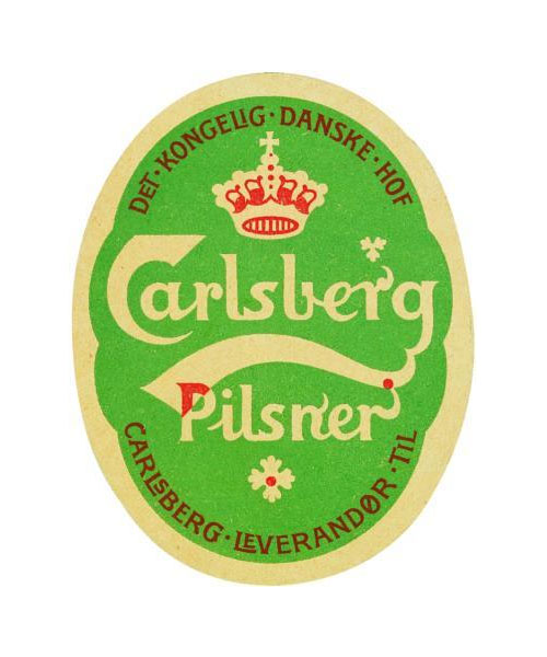 Thorvald Bindesbøll’s original Carlsberg label (above), designed 1904.
Translated logos from Marks of Excellence.
—
Update:
@issue published an addition with these Coca-Cola logo translations.
Comments
Nice!
FYI: It’s actually Hebrew and then Arabic for the name marks at the top.
Yeah, it’s actually (from top to bottom):
Danish/English – Hebrew – Arabic – Chinese – Korean – Thai – Russian
Thanks for the correction. Language isn’t my strong point (or, seemingly, the caption typesetter’s).
Love how the swish is consistant in each one!
These are great logo examples of how far a brand can stretch itself on the world wide stage.
Thanks, nice to see all these translated logos together.
Visually, just the Hebrew and Arabic translated logo interpretations looks good. The other ones can be improved upon.
Yes, I love how you can see the consistency through the marks.
It’s interesting how some are backwards, do people from these countries read backwards too? I know some read top to bottom. I really like the Korean one because it’s so different, but the thing I love most about all of them is the style of the C, they mostly try to keep the shape of this along with the swish and little emblem above the R.
@Kelly,
Yes. These languages do read right to left. Arabic books look weird to someone used to reading left-right: it’s like the spine has been flipped. Semetic languages, like Hebrew and Arabic also don’t write their vowels the same way. In Arabic, only the long (stressed) vowels are written; the short vowels are understood through grammatical context. So the Arabic version above consists only of the letters: KARLSBRJ
These are the letters/sounds that best match between Arabic & English, though the Egyptians pronounce the “J” character as “G” as in “goat”, whereas most other Arabic dialects pronounce it “J” as in “juice”. There is no “C” in Arabic, but since we use our “C” as both a “K” and an “S”, I don’t really see why we have a “C”, anyway.
The Korean Carlsberg one is sooo different, incredible how far removed logos can be due to language disparities… great post.
@Rod
I second that thought. This is definitely something for companies to keep in mind as the world gets smaller. The way that branding elements may have to be translated in the countries that they do business in needs to be a consideration when designing or re-designing their logos.
I don’t understand why the Hebrew and Russian versions have negative intersectons between some letters. It’s not consistent with the original logo!
The Arabic logo could have a better C (or K)… and I don’t mind if the swish in both Arabic and Hebrew was in the same original directon as in English (this has nothing to do with the right-to-left reading direction).
And why is Korean missing the swish?