UK broadcaster Channel 4 unveiled a new identity yesterday, designed through a collaboration between DBLG, Steven Qua, Brody Associates, and the in-house 4creative.
There’s scope to for the identity to grow and stay fresh, and despite not actually being shown in the idents, the design idea from Lambie-Nairn’s classic Channel 4 logo is an integral part, so there’s a familiar sense of continuation that makes sense given the success of the original.

Lambie-Nairn’s 1982 design

And updated for the rebrand
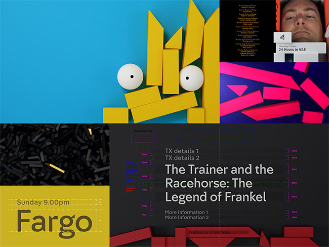

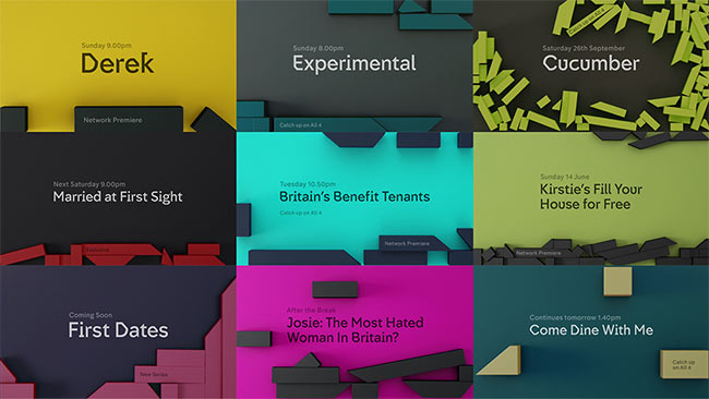
Neville Brody and his team were commissioned to design two new typefaces — Horseferry (for display) and Chadwick (for information).
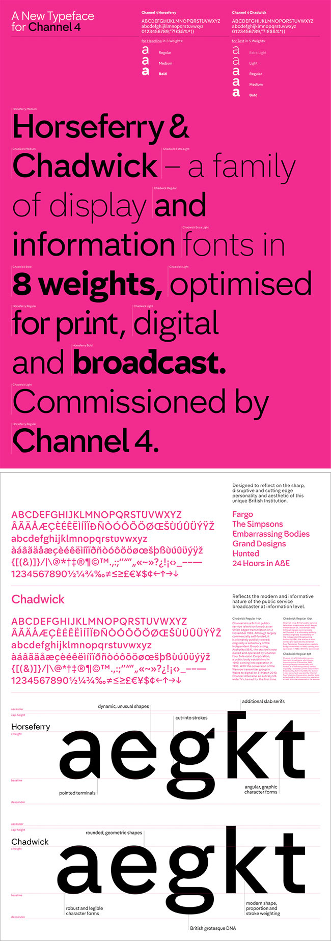
Channel 4 type design
“Horseferry is designed to reflect on Channel 4’s sharp, disruptive, cutting edge personality and aesthetic as a unique British Institution. Chadwick reflects the modern and informative nature of the public service broadcaster at information level.”

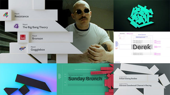
A “four-part narrative” was produced by Academy Films, shown in the compilation below. They’re the biggest risk, because other than the abstract relationship between the Kryptonite blocks and the deconstructed logo (around the 1 minute 10 seconds mark) it’s unclear how they tie in.
They’re to be continued.
Read more about the project on:
Channel 4 (includes credits for everyone involved)
Creative Review
The Branding Source
According to Creative Review, the project lasted three years.



Comments
At first glance, I will miss the old Channel4 typeface, but this new system seems extremely logical and versatile. I look forward to seeing this in action!
I’m confused.
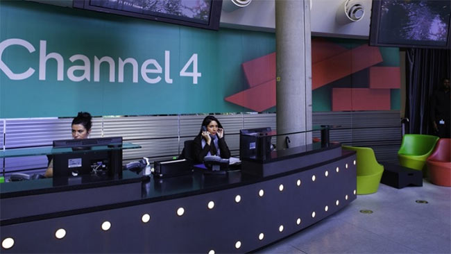
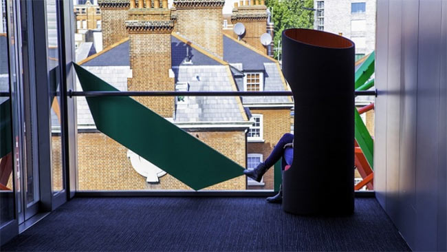
The deconstructed ‘4’ seems to work for me, I see the blocks and they work well when applied to the wallcoverings/windows of 4 HQ as well as the static idents/break bumpers etc.
But I can’t see how the organic nature of the main idents tie in with the clean crisp nature of the blocks on everything else. When I first saw the blocks in an article and then I clicked on the ident, I actually thought I’d clicked on an advert! That’s how disjointed this is for me!
I can see the ‘hidden’ blocks in the films, and the fact that they are so discrete doesn’t bother me too much (although I would say it is an extremely brave!) but I’m sure it will cause much controversy.
I’m liking ‘Horseferry’ the unexpected quirks throughout doesn’t particularly jar me, and I think this fits well with the overall Channel 4 brand and is still very readable.
Apologies If I’ve missed something with this but thought I’d throw in my t’penneth worth…
Loving the custom typeface!
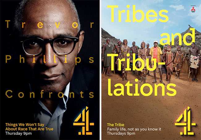
Is that a shadow on the logo on that Tribes execution?
Superb ! I once collaborated with folks who worked on channel 4 identity some years ago. That one was good. This one also kicks *ss. I heard channel 4 is a dream client in terms of artistic approach, at least was :). Again – great !