In 1957, Robert Brownjohn, Ivan Chermayeff, and Tom Geismar formed Brownjohn Chermayeff & Geismar, with an office in one room on West 56th Street, NYC. During their first year they designed record album covers by the dozen for Columbia Records, numerous book jackets, and hired their first employee, Stanley Eisenman.
While the firm — now Chermayeff & Geismar & Haviv — has evolved in the years since, the work has remained consistent — not in style, but in its modernist approach to design.
In the words of Sagi Haviv, “If you accept the premise that good design starts with an idea, then the best way — we find — to channel this idea into a visual is usually through a hand-held pencil or pen.” So as a nod to the achievement of a hugely successful 60 years in business, here’s a brief look at the sketches behind some of the firm’s logos.
Chase Bank, 1960
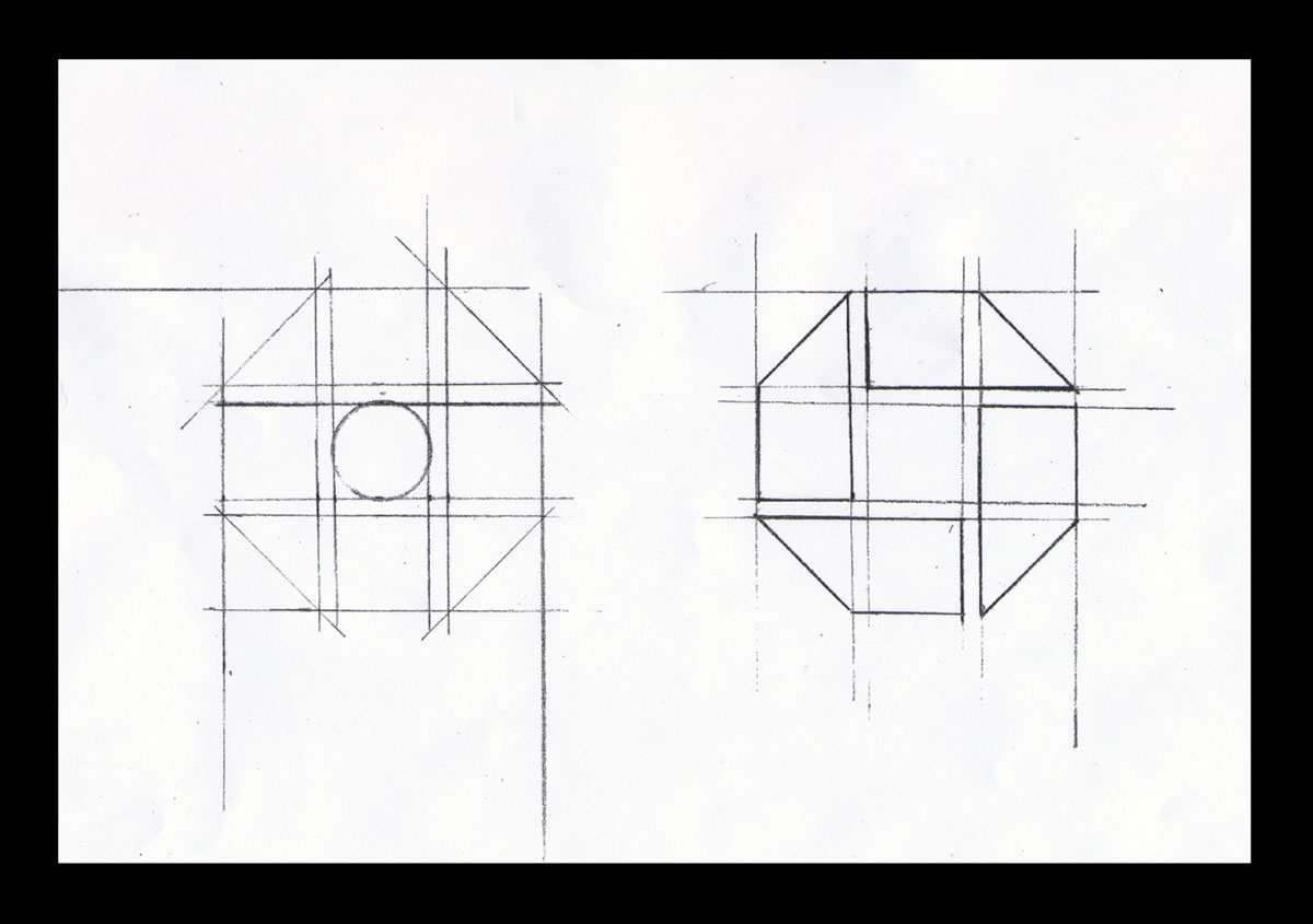
“The blue octagonal mark is abstract but not without meaning. It suggests a Chinese coin or, with the square enclosed in an octagon, a bank vault and by extension the notion of security and trust. […] The presentation to the Chase Manhattan top executive board that would decide on the new symbol was quite dramatic. Two of the three top executives resisted the very idea of an abstract symbol, which wasn’t surprising — at the time, no major American company used an abstract symbol to identify itself.”
Mobil Oil Corporation, 1964
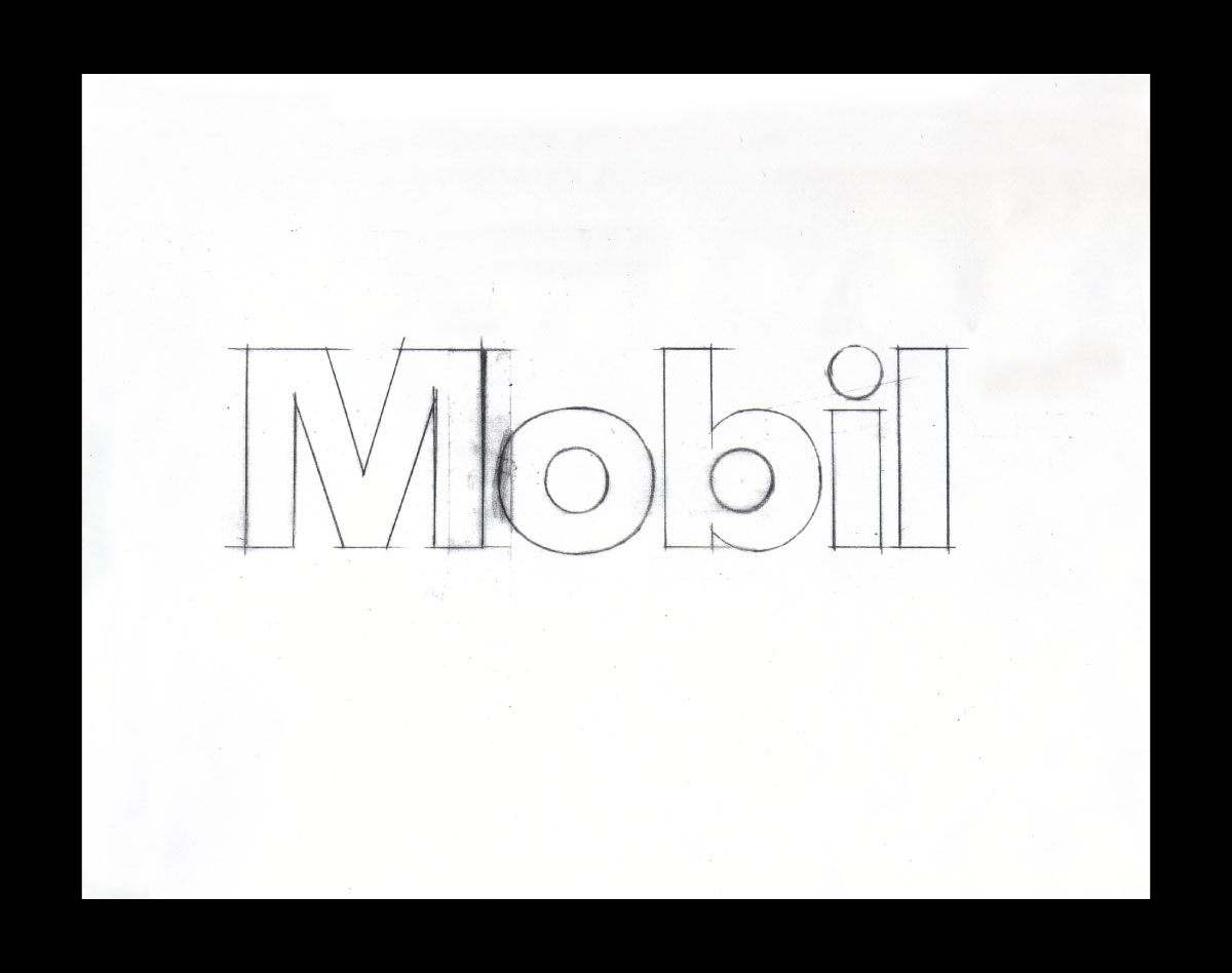
“The idea of the red O came about partly to reinforce a design concept to use circular canopies, pumps, and display elements for a distinctive and attractive look. It also served to help people pronounce the name correctly (Mo-bil, not Mo-bile), and of course to add a single memorable and distinctive element to an otherwise very simple lettering style.”
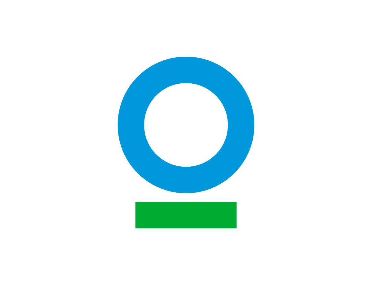
Conservation International, 2009
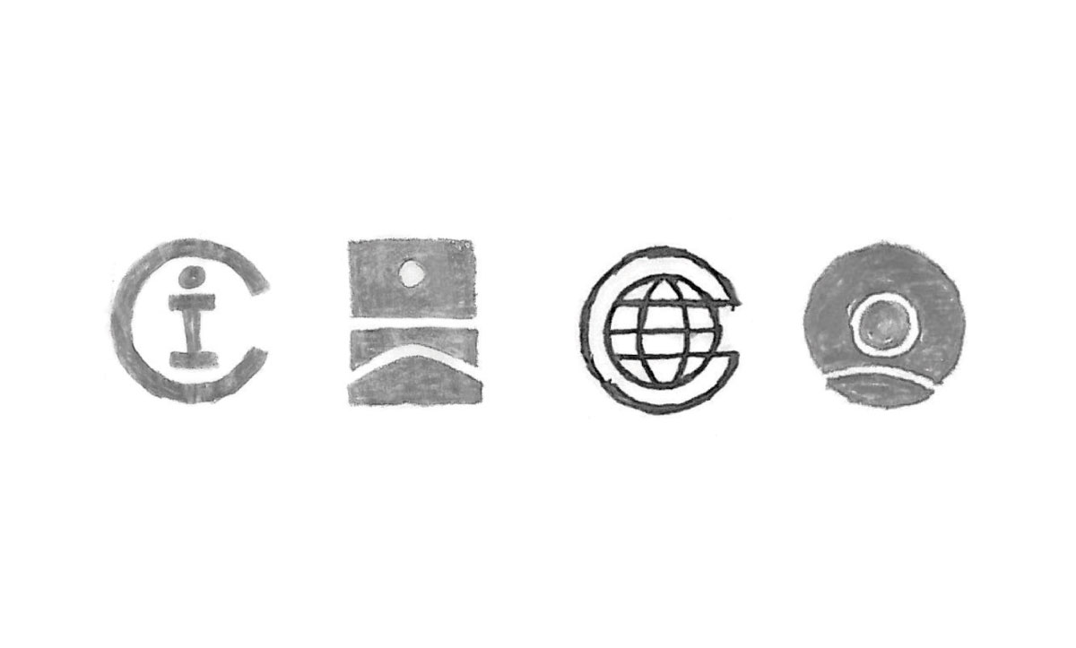
“We explored dozens of design concepts, including many that featured or were representations of a human figure. However, in the nonprofit arena the human figure has become clichéd. Throughout the sketching and exploration process, one simple concept rose to become our favourite: a blue circle underlined in green. Although the design was made of two simple, basic shapes, their combination and proportions did not look familiar. And it was appropriate: the group’s director of branding, Laura Bowling, titled the form “our blue planet on a green path to sustainability.”
Factset Research Systems, 1996
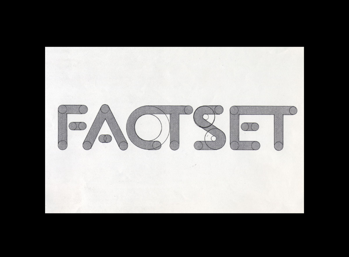
“Factset Research Systems supplies highly sophisticated global economic and financial data to investment professionals. Since the Factset name is short and memorable and since the potential audience is limited, using a distinctive lettering style for the name seemed a logical approach for the company’s identity.”
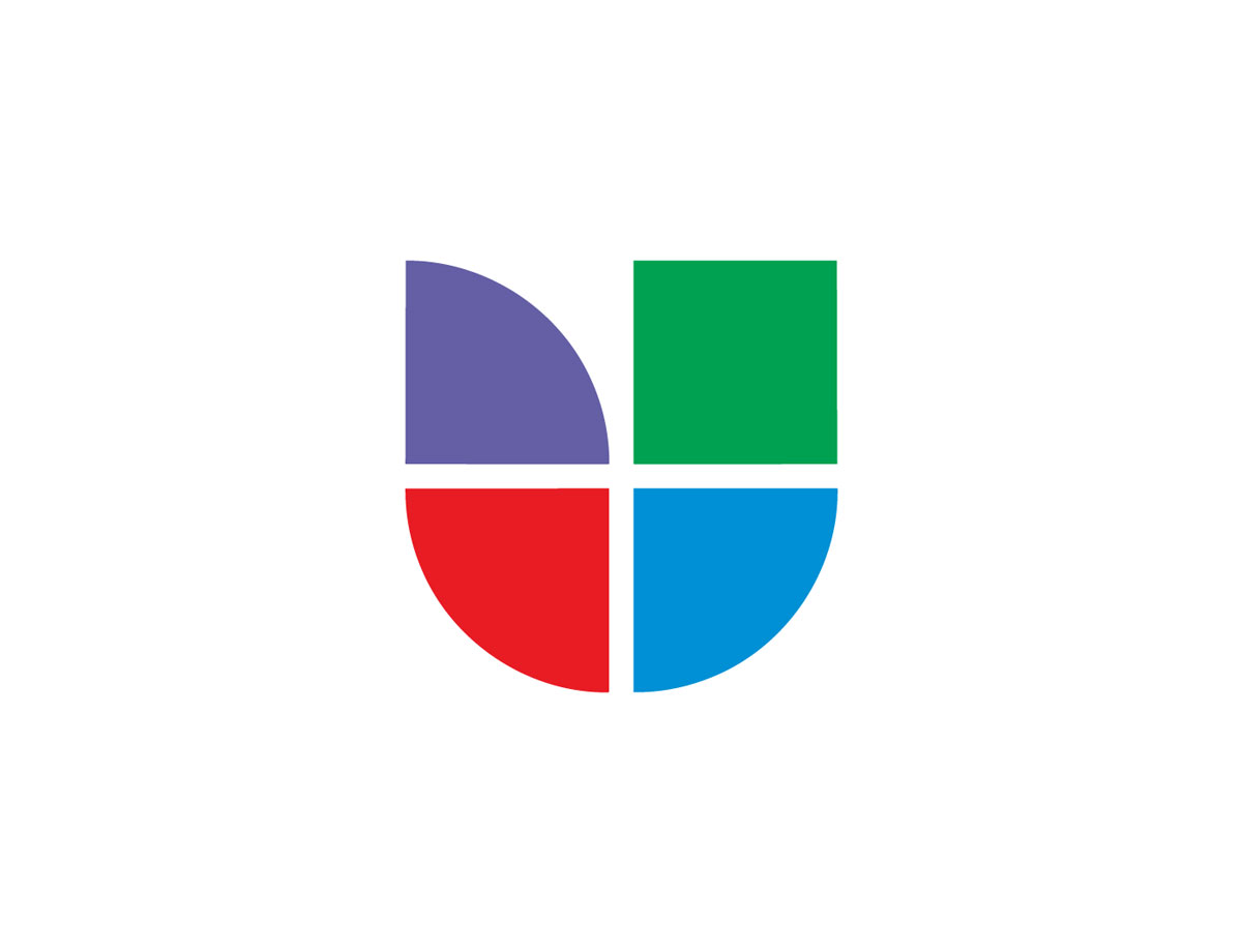
Univision, 1989
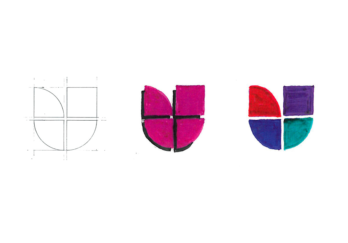
“The mark is derived from the initial letter U in the company name and is broken up into four colorful panes. The top left pane, which is identical to the lower forms but flipped on its side, gives the mark its unique character. While overall the form is clearly a U, the flipped pane also makes it into a colorful abstract bird or flower.”
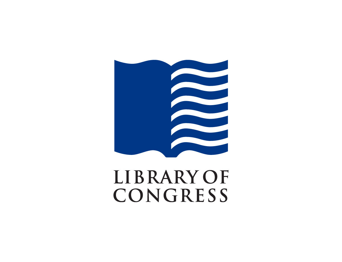
Library of Congress, 2009
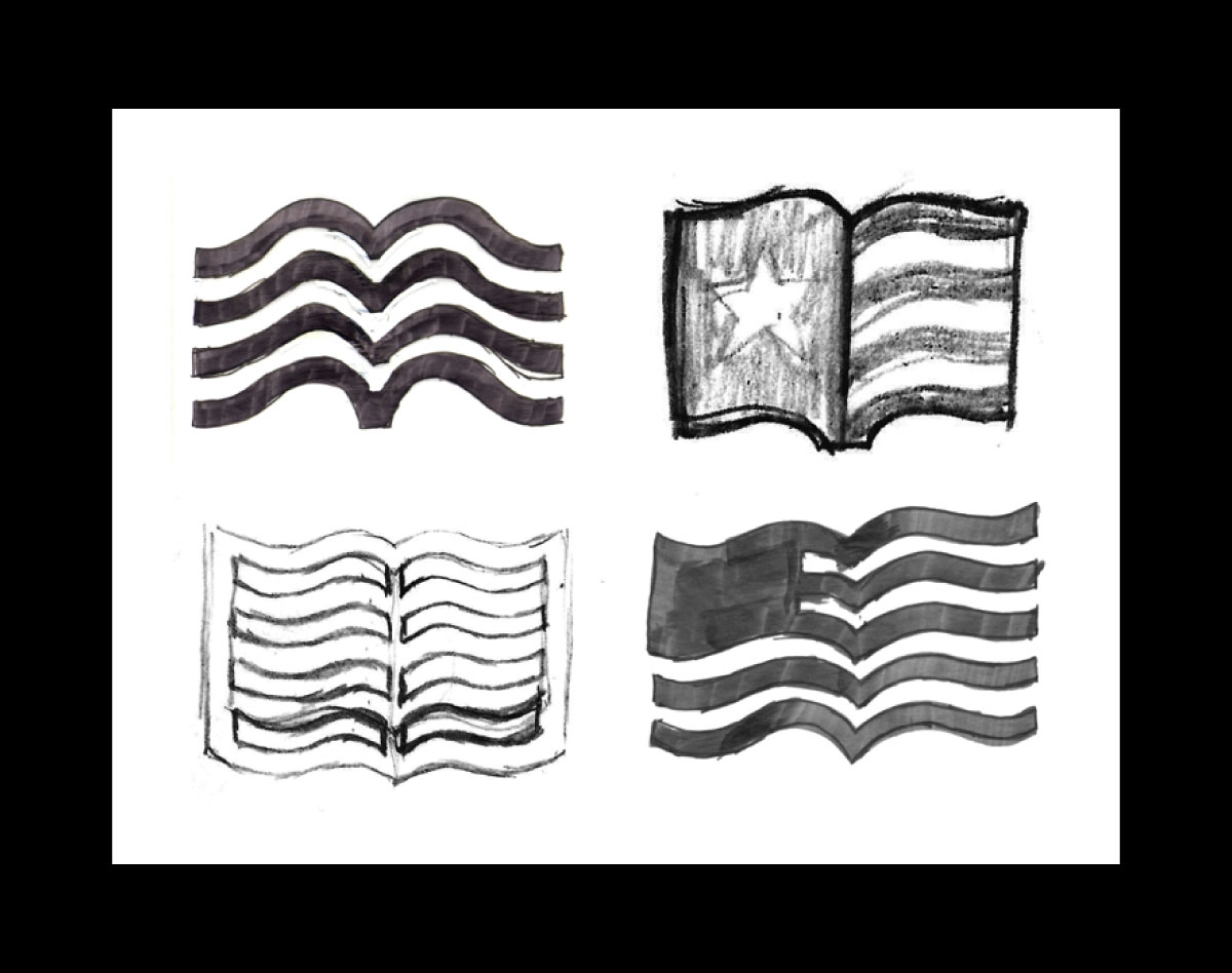
“Our solution was a combination of an allusion to a library and a representation of the American nation: an open book and the American flag. This is a clear distillation of the core identity of the Library of Congress as the national library of the United States, and it’s hard to think of any other organization for which this symbol would be appropriate.”
National Broadcasting Company, 1986
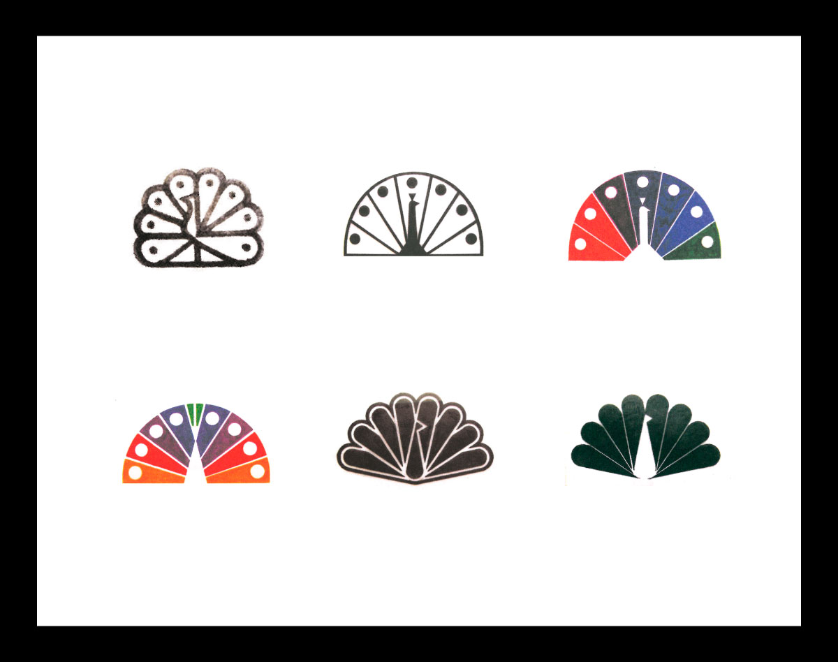
“At the end of this process, which was one of the most involved redesign efforts we’ve ever taken on, we were astonished to learn that NBC was not actually ready to adopt the new identity — not just yet. At the time, NBC was third in the rankings, behind ABC and CBS. The company was reluctant to undertake the expense of changing its signs, trucks, promotions, and so on until it was officially number one. It wasn’t until 1986, six long years after NBC first hired us, that the network took the number-one slot and the new peacock was released into the world.”

Armani Exchange, 2009
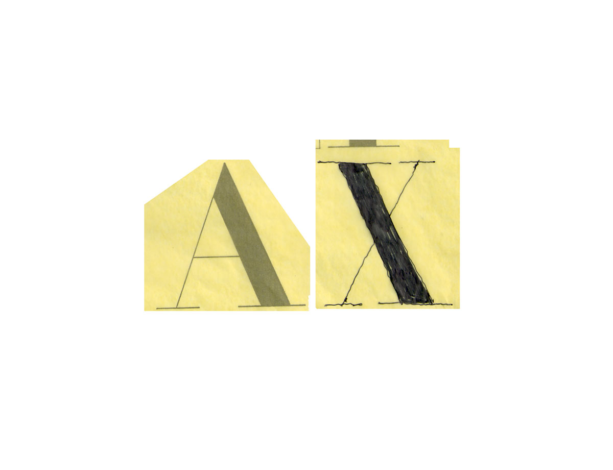
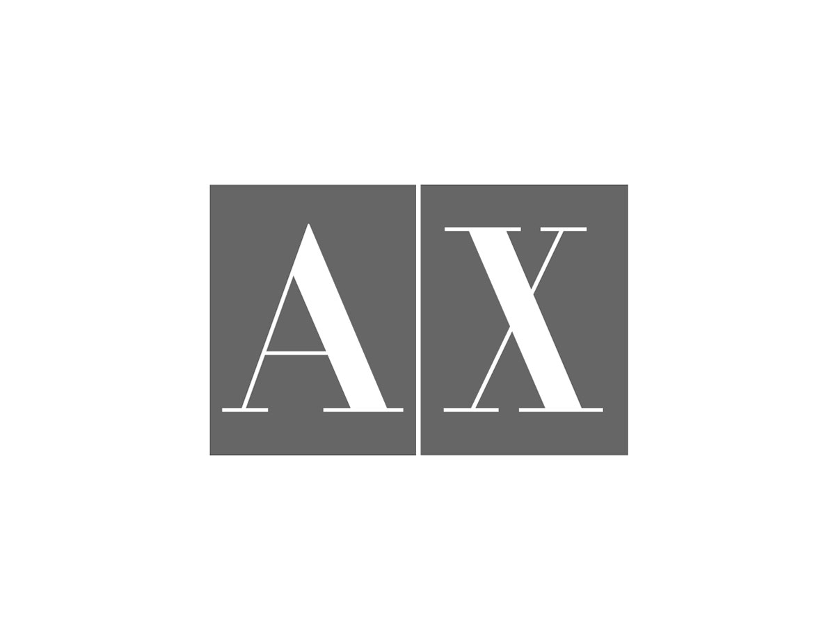
“We resisted the temptation to create something completely new, even though that meant our design work in this case might go unnoticed. We realized that the brand equity was too valuable to jettison on a whim. Instead, we made a series of precision tweaks that solved every aspect of the problem.”
Giorgio Armani first rejected it outright.
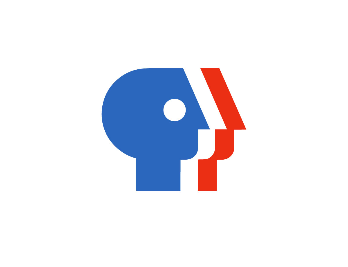
Public Broadcasting Service, 1984

“The P from the existing three-letter PBS logo, designed by Herb Lubalin, was turned to left to right, given a facelift, and expanded to ‘Everyone,’ representing the idea of public television.”
Raising a glass to the next 60 years of Chermayeff & Geismar & Haviv.
Related:
An interview with Tom Geismar.
An interview with Sagi Haviv.
Ivan Chermayeff interview (on designboom).
Identify: Basic principles of identity design in the iconic trademarks of Chermayeff & Geismar.


Comments
Fabulous! I grew up with these logos. They are like “old friends.”
Amazing article!
I always love to read about logos in a bit more depth, to get to know -why- they’ve been built that way. By this I train myself to understand better and better about the meaning behind logos. Thanks for sharing, David, it was a great read!
Leyendas de la síntesis de la imagen, maestros del modernismo.