Standards Manual is an independent publishing imprint founded in 2014 by designers Jesse Reed and Hamish Smyth. The talented duo are also partners at design consultancy Order, and Jesse kindly took time to answer a few questions about their latest book release.
Why did you decide to produce the Chermayeff & Geismar & Haviv (CGH) monograph?
CGH floated the idea when we were working on the EPA Manual reissue last year. We were a little in shock when they mentioned it, but of course we were immediately interested in publishing the title. We’ve been following their work since we were both in university.
How involved were CGH in the production?
The team over at CGH were very involved, including weekly calls with Tom and Sagi up until the day it went to print. Their staff were instrumental in gathering the content and making sure we had everything we needed to get the story straight. They’ve produced an incredible amount of work over the past 60 years and we didn’t wan’t to misrepresent or exclude anything critical to the monograph.
Our design office, Order, handled the design of the book. Hamish and I led the design direction, and everyone in our office helped with the final production.
How did you decide what print spec to go for?
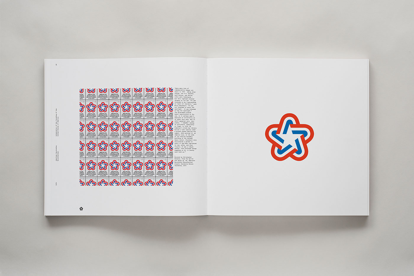
We always like to include special printing or production techniques with our titles. For NASA it was the silver bag, on this one it was a combination of things like the end papers, but also the cover treatment and the physical size of the book. The cover is particularly nice because it follows Tom and Ivan’s philosophy of “identity as art” — as in, a logo should be just as beautiful by itself regardless of context. To emphasise this aspect, we silkscreened the logo collage on a canvas-like material. Ivan, Tom, and Sagi personally designed the final logo crops that you see on the front and back covers.
Who printed the book? Were there any production challenges? How many copies did you have printed?
We used Die Keure in Bruges, Belgium. Normally, we print at Graphicom in Verona, Italy, and this was the first time that we’ve worked with Die Keure, but they came highly recommended by other publishers and designers. In terms of production, we flew to Bruges to be on press and to make sure all the colour reproductions came out perfectly. There are a lot of brand spot colours that needed to be printed with process inks, so we made sure to closely monitor that aspect.
The print run was for 4,000 copies. That number’s based on a combination of pre-order sales and what’s most economical to print at scale. Now that we have distribution we’re able to calculate projected direct and retail sales through the year. But at the end of the day, you never really know.
Die Keure did a terrific job.
Are there any special finishes you’ll add to the packaging?
This book will simply be shrink-wrapped and shipped in a normal padded box. The cover itself has the impact that we want to display, unlike NASA where some people don’t even take it out of the bag!
The monograph includes written contributions from other designers and writers. Can you share an excerpt?
Sure. Here are the first few paragraphs of the introduction by Alexandra Lange:
When the partners at Chermayeff & Geismar & Haviv present a new identity to a client, they like to prepare her first. “We give a lot of warnings,” says Sagi Haviv. By this point, the partners have interviewed employees, collected the marks of competitors, dug into company history, sat, sketched, debated amongst themselves, and checked their picks in the trademark database. They have prepared a presentation that takes the client on a visual journey, from old mark, to half measures, to the shiny new thing. They show her this warning.
They know the client wants to love it.
But that doesn’t always happen right away.
Sometimes she says, “I’m going to need a minute.”
Sometimes he says, “Go ahead, but I don’t want to see it on my letterhead.”
Sometimes he says, “That’s the one.”
What’s next for Standards Manual?
We have a new book that will be crowdfunded through Kickstarter. We can’t release the details just yet, but stay tuned to our social media or sign up for the mailing list to hear when it drops. We’re not sure if we’ll release a third title this year, but we definitely have more ideas on the burner. We’re also hard at work building up Order, so we may spend the remainder of 2018 doing just that.
Book specifications
308 pages
11.875 × 11.5″ / 302 × 292 mm
Triple, self-coloured endpapers
Three paper stocks
Floating board covers with silkscreen on textured canvas
Black cloth spine with white foil
Printed in Belgium by Die Keure
Cover design by Chermayeff & Geismar & Haviv
Photos by Brian Kelley
Published by Standards Manual
Designed by Order















Comments
I respect the company, but I wish they would show more of the logos in context rather than in isolation on a white page. That’s not how logos are seen in reality.
I suspect they only wanted to display the logos within their own strength for the purposes of the book. By adding context to the logos, the creators risk dating them.
A few years late, but I’ve finally picked up a copy of this and I’m blown away by the quality. Such a beautiful book… probably one of my favourite in my collection. I love the interviews at the beginning, and seeing the sketches overlaid the final version of the logo. A real ‘must have’ for anyone working in logo design. I aspire to create work this good!
Hi Ian, a definite step up in quality from the 2011 CGH book Identify.
That’s nice.