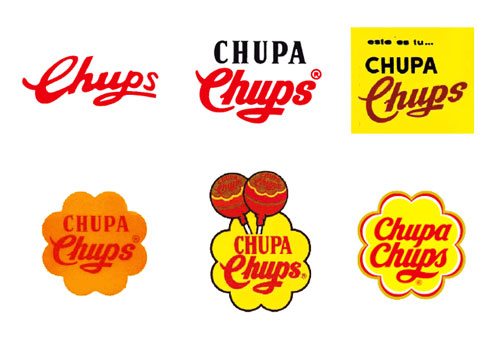
Founded by Spaniard Enric Bernat in 1958, Chupa Chups is now owned by the Italian-Dutch multinational Perfetti Van Melle (the corporation also owns brands such as Mentos, Smint, and Fruitella). The Chupa Chups brand name comes from the Spanish verb chupar, meaning “to suck.”
In the obituary of Enric Bernat he was quoted as saying, “I saw sweets didn’t suit their main consumers, children. They got their hands sticky and ran into trouble with their parents. So I stuck a sweet on a stick.”

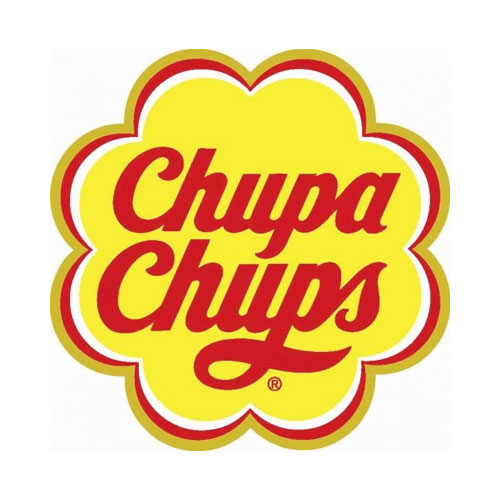
“In 1969, Dali was approached to design a new Chupa Chups logo, and the result became as instantly recognisable as his melting clocks. Dali incorporated the Chupa Chups name into a brightly coloured daisy shape. Always keenly aware of branding, Dali suggested that the logo be placed on top of the lolly instead of the side so that it could always be seen intact.”
Quoted from BBC’s Modern Masters: Dali, Chupa Chups logo (link removed, no longer live, unfortunately).


Its first marketing campaign was the logo with the slogan “És rodó i dura molt, Chupa Chups,” which translates from Catalan as the rather uninspiring, “It’s round and long-lasting.”
In the 1980s, an anti-smoking slogan “Smoke Chupa Chups” was tried to attract further adult consumers. The company’s current anti-smoking slogan is “Stop smoking, start sucking,” with certain packaging designed as a parody to cigarette packs. Some packages parody the mandatory black and white warning labels of the European Union with the notice “Sucking does not kill.”
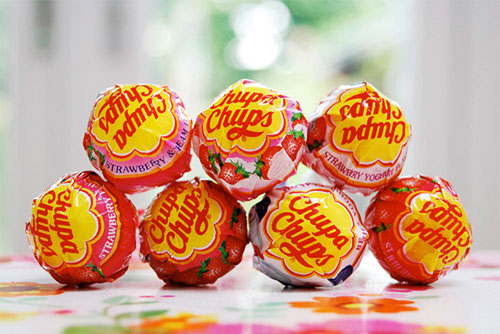
Today Chupa Chups sells lollipops in more than 150 countries, in more than 100 flavours. Founder Enric Bernat is survived by his wife and five children, including Xavier, the president of Chupa Chups.
More in the Chupa Chups history.
And if you liked this, you might also like the evolution of the LEGO logo.


Comments
Brings back memories.
Even the newest logo has a nice retro feel.
A logo evolution without any bad designs… as yummy as Chupa Chups!
I didn’t know Salvador Dali designed logos… awesome.
Chupa Chups is Chupa Chups, all over the world. I’ve never thought about the logo itself, those bright colours always bring back old, good times, naturally.
I am glad they kept the same style typography for their logo / wordmark. It still has that old school / nostalgic feel… which is great for the candy market. I don’t eat a lot of candy now that I am 34, but occasionally having a Jolly Rancher or Now and Later always brings me back to my youth.
When I realize I’ve bought and thrown out thousands of Dalis over the years… *sobs*
Salvador Dali was genius. The Chupa Chups logo design is so simple and enduring, and Dali knew about this a long time back.
I am also a logo designer at animationvisarts studio mostly focused on logo design projects but now I am interested to know more about Dali’s work to know how he was thiking. Thank you!
CHUPA CHUPS always elicit laughs in the Philippines since “chupa” is a dirty word there.
And? They aren’t speaking your language so it doesn’t have that meaning.
Los hijos del Catalán (el articulo dice “español”) Enric Bernat se han vendido el negocio que fundo su padre en 1958. A cobrar y a vivir de rentas.
I don’t have any teeth left but I can still Chupa Chups 🍭 😋