

Heraldic achievements — often mistakenly called crests or a coat of arms — are probably one of the oldest forms of logo.
Steeped in meaning, these designs continue to endure over centuries. At SomeOne we take pride in being a progressive design practice, but sometimes a project calls for timeless levels of craft, rather than adaptive data fuelled responsive system. That’s what happened here.
Most accounting qualifications train people for private practice, working on external audit and tax issues. The Chartered Institute of Management Accountants (CIMA) prepares people for a career in business. It teaches skills for strategic advice, managing risk and making key decisions.

Inked woodcut, prior to painting


With more than 227,000 members and students in 179 countries, CIMA is the world’s largest professional body of management accountants. They work at the heart of business in industry, commerce and not for profit organisations, and uphold the highest ethical and professional standards, helping to maintain public confidence in management accounting.
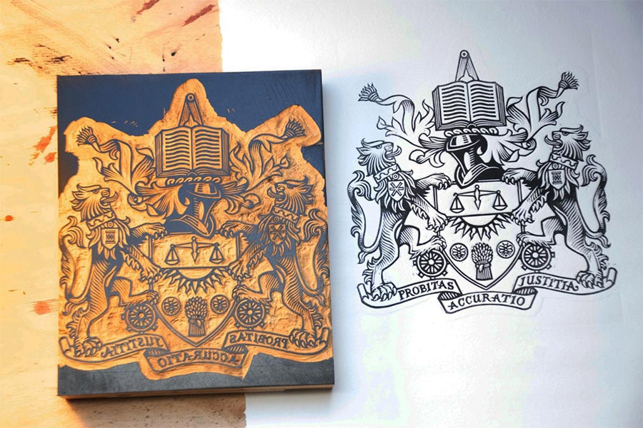

Final print of the CIMA achievement
These high standards carry a seal of approval in the form of a heraldic ‘achievement’ that has been held by the organisation for decades.
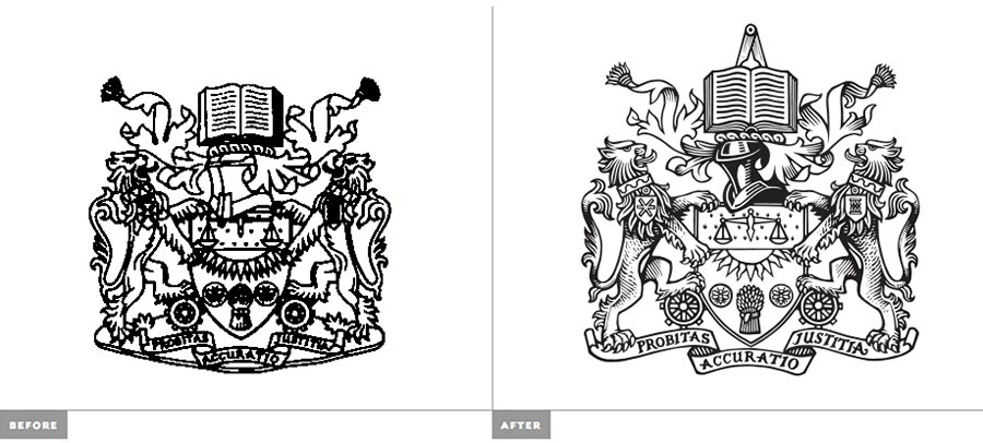
The previous version wasn’t fit for digital use, whereas the new design is created with screen-based applications in mind, and works alongside the existing CIMA wordmark.

Embossed covers of notebooks

Flag application of the crest at the London headquarters
The work will be used in parts of the CIMA organisation where the added authority of the achievement is required.

Specialist materials for CIMA
At SomeOne, we’ve always rather loved heraldry, an entire world of meanings, systems and ideas that come together in a beautiful coded way to form unique ways for organisations to represent the many aspects of business.
—
View more design case studies from SomeOne over on Identity Designed.

Comments
Lovely illustration, my only worry is how it looks small. The branding mock up doesn’t seem to show how the logo works on a small object other than just shrinking the size of the logo. Still nice work!
Beautifully executed and finished work, but I can’t help think this could have all been done in a quarter of the time (and probably budget) in illustrator, providing much the same end result through die-cut/laser work.
If the client wanted authenticity and had the wallet to do it — all the better to indulge in a bit of old school craftwork otherwise it’s a bit self indulgent and over the top.
The craft doesn’t have to change, the tools and the way we work to provide value for money should.
Hello,
How can I get the CIMA logo in HD? I am making a ring for myself as a graduation ring. :)
Hi Anas, CIMA’s press team’s probably your best bet.
http://www.cimaglobal.com/Press/