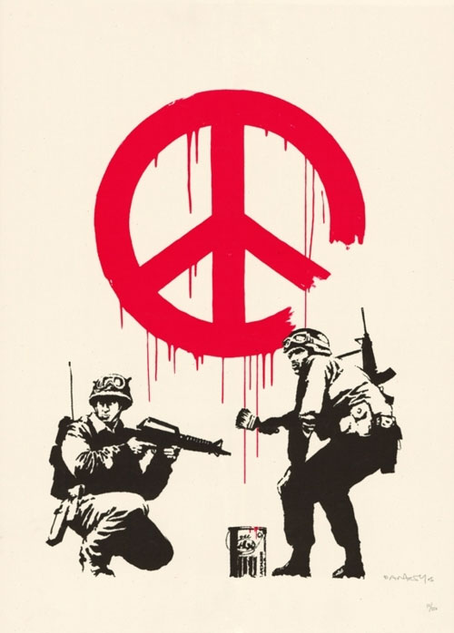
Logos making use of circles in one form or another do seem to be among the most eye-catching and memorable; and most date from a period stretching from shortly before the first world war to the end of the second world war. Three, at least, just happen to come from Germany.

These are the VW logo, designed by Franz Reimspiess, a VW engineer;
The Mercedes-Benz logo, first seen on a German Daimler in 1909, but refined into the purist shape we know so well in 1937;
And the Audi logo, dating from 1932, its four overlapping circles representing that year’s merger of Audi, DKW, Horch and Wanderer.
The famous Olympic Games logo was designed in much the same vein; this was the work of a Frenchman, Pierre de Coubertin, and first appeared in 1913.
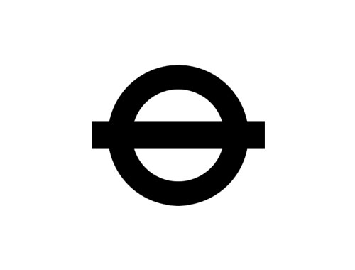
And no Metro company has yet to come up with a better, and longer lasting, logo than London Underground did more than 80 years ago. The Bullseye, slightly modified since to become the Roundel, consists of a horizontal bar set through a circle. It still looks good, and is instantly recognisable.
The circle is clearly a form humans find easy to remember and recognise.
—
Read the full article, In praise of the CND logo, on The Guardian.
Related: BMW logo evolution.



Comments
A great post and something I was very concious of when designing my own logo for the business. Not only are they more memorable but seem to be more portable to all forms of visual communication. I think this is due to the symmetry in the form and like all good logos, the more simple the better.
BMW, TEXACO, and STARBUCKS are other good famous examples.
Be careful there David, LOCOG will be onto you showing that Olympics logo.
Isn’t the Target logo the most recognised in the world (or at least the US)?
I’m partial to circular logos (I use one myself), but I wonder why it is that circles are so strong. They’re complete, whole, and have a soft, strong clarity about them that draws people, but I wonder what that sub-logical connection is between the human psyche and the shape itself…
Any thoughts, anyone?
A question I’ve been considering myself Shawn. What is our connection to the basic shapes (square, circle, triangle, etc…)
If I had to give my two cents, I’d point people to objects that best resemble them. How do we know something is most likely (9 out of 10 times) manmade? If it has a square, or rectangular shape. It’s not an organic shape. To a much lesser extent, we can say the same for triangles.
A triangle is more in the grey area. Pieces from rocks can be triangular, as well as some parts of animals if you simplify them. Fish fins for example.
Circles are different. They are organic, on a cosmic scale even. I point you to the full moon and (indirectly of course) to the sun. Heavenly bodies are circular and have been the subject of many religions over the ages. Circles (as perfect as our eye can perceive them) are dominantly found in the heavens for all to see. We admire the heavens for their beauty. I don’t know the psychological mumbo-jumbo, but I think there lies our answer.
Great post. I’d never really given deep thought to why people connect with certain shapes. However, the comments really made me pause to think. Maybe shapes are a bit like color theory. You learn colors and basic shapes as a child and typically they’re tied to stories, symbols, etc to make them easier to recognize and remember. As people get older the connections are so ingrained that while they remain present they become subconscious. It becomes more difficult for people to forge strong mental connections with irregular shapes because they don’t have the same history with them as squares, circles, and triangles.
Or at least that’s my wild idea. Really interesting topic!
For some reason I can’t stop staring at the VW logo, it’s just so simple and clever.
Who knows, it might even have influenced me when I decided to buy a Volkswagen recently.
Perhaps it’s a Zen thing. In Zen teaching, all things in this universe are represented by the circle, triangle and square.
Or it could be because they’re easier to draw than a dodecahedron.
It’s funny, coming from an architecture background, we always joked in school how much the circle sucks in the built environment. Although, there are some good examples. However, after my foray into the GD world, it does seem that the circle carries a pretty hefty load as far as aesthetics, impact, and functionality.
Is it possible that the circle is such a good shape for a logo because of its resemblance to a stamp? Especially the idea of a signet ring or something which marks authority and trustworthiness. The Starbucks and Costa (UK) logos are circular with text in the middle- I wonder if it has any links to a kind of seal which we link to being trusted.