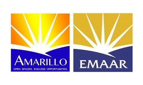
The Texan City of Amarillo unveiled a new logo on November 9th, but it didn’t take long before someone in the city’s IT department flagged up something similar.
![]()
![]()
Dubai real estate company Emaar Properties filed for a U.S. trademark registration on its logo in 2006.
![]()
Photo via Wikimedia Commons
About $30,000 was budgeted for the rebrand, and although not all the money was spent, I wonder who got paid.
City spokesperson Sonja Gross said, “It’s just kinda amazing. It’s just one of those fluke accidents.”
Mayor Paul Harpole said the city is looking into whether it might be possible to tweak the design. “It’s a choice if we want to use something that’s that similar, and then can you tweak it enough and will they care?”
Nice.
More here:
City eyeing ‘legalities’ over logo
New City of Amarillo logo causes stir
Thanks for the tip, Edwin.


Comments
No way is that a “fluke accident.” They match exactly when overlaid on each other. It’s a rip off.
I overlaid them and they are pretty exact.
I expect the 30K for the rebrand included printing and production of various brand collateral, guidelines etc, 30k for just the logo is extremely steep, even for a large branding agency.
It would be good to get the full picture rather than just the edited highlight. Apparently a professional marketing company was given the job, but they chose a logo created by City Staff instead.
They should admit defeat and start again, create a proper strategy identify how and why the identity will be used. Sunrises are generic and not very own able.
I’m not sure this identity would help many find their way to Amarillo.
It’s too similar to be a fluke, I can understand if they came up with the same concept but the execution is practically identical down the number and angles of the sun rays. They’ve been caught out and are trying to cover their arses!
City spokesperson Sonja Gross said, “It’s just kinda amazing. It’s just one of those fluke accidents.”
…Did they actually say this with a straight face? The shape is exactly the same!
Perhaps both companies bought the same stock art and just put their name over the top.
The smile I got after reading this is beyond imagination. :)
This is the iceberg ladies and gentleman, it shows that anybody really can’t be a logo designer or designer at all, it shows that businesses still believe they can swim in these waters without help and overuse mal practices (in house work) without consequences.
The bells of free/cheap work are so irresistible. Until that glorious day come when the public realise you cheated/stole/did a bad job. And you might regret these dollars hidden in your mattress.
Thanks David to have posted this, I will share it with my prospective clients and I’ll pray they will finally understand the real value of a designer under the sun!
Ps: David could you please include a “disqus” comment feature on your blog? It’s very easy to interact with the comments this way.
Please, fluke accident. So called designers nowadays feel that it is ok to “revise” a logo and call it their own. Clients are also at fault for asking fly by night artists to throw something together “similar” to a design they saw somewhere else – perhaps at the airport, a billboard or on the internet. City of Amarillo, ante up, hire a professional and get a professional design, not “something similar.”
Never in a million years is that a fluke. An exact carbon copy and no doubt an expensive lawsuit on ‘the horizon’ if it doesnt get removed ;)
As a resident of Amarillo and a identity designer this was hilarious to me. I helped break the story to shine some light on the misguided and corrupted leadership in our city.
It was “designed” by a college student at West Texas A&M University as she was also an intern for the City of Amarillo in the Communications Department. After the initial reaction on facebook of how this did not represent Amarillo, several people took to her facebook page to stand behind her, commenting that the logo was well done and she should be proud, that she should ignore the comments of narrow-minded individuals in Amarillo. However since the story broke that she committed plagiarism, her facebook has been silent, those that stood up for her have mysteriously disappeared.
As of last night the designer removed her facebook page and all other forms of social media.
I don’t think $30k is overly expensive for a city wide branding that might include several dozen applications and brand guideline documentation. Of course, for $30k you’d expect an original execution.
I’ve seen several blunders of this nature when marketing firms (servicing communities exactly like this) take on branding. They often outsource it. Client ends up with a strange (or in this case, much worse) logo that is piggybacked with volumes of explanation as to why it’s the perfect thing for the client. Since both client and marketing firm are not experienced with branding, this sorta stuff makes it to the public.
If you’re gonna rip something off at least rip off something good. This reminds me of an arse farting into the air.
Hahaha. Best comment!
I absolutely agree with Niall’s statement! That’s brilliant… An arse farting in the air. Couldn’t be more spot on. But in all honesty someone almost got away with murder and the mayors reaction is even better, “will they even care” WOW… unreal.
Ultimate fail on the cities part and shame on the designer who proposed and sold this to them.
Cheers
Jon
This is about as obvious a rip as it can get. There is no way that you could randomly duplicate the proportions and color scheme – even the number of rays in the sun and possibly call it anything other than plagiarized work.
How many times have these so called ‘opportunities’ for the untrained, just-looking-for-their-first-break situations blown up in the face of an organization before people learn?
The intern is an intern for a reason. They don’t know what they don’t know. Not only does this not save the city money, it makes this effort into a PR nightmare, costing twice as much with all of the wasted print materials and man-hours to correct it.
And what did the intern think would happen, that no one would ever find out?
Empty accolades. Empty satisfaction for a job that you didn’t do in the first place. Lesson learned on the client’s already strained budget. What a disaster.
Love the spokeperson’s comment: “It’s just kinda amazing. It’s just one of those fluke accidents.”
Having found over 250 rip-offs of my own logo design work, in just the past two years, nothing surprises me any longer and the excuses, justifications and explanations are always priceless. I especially appreciate those that try to turn it around and accuse me of plagiarism – until I make it known to them that the design appeared in a book as my original work five, 10 or 20 years earlier.
ok !
Behold now ! :)
Who designer can come with a brand new design out of this and post it somewhere (yes with huge watermark on it of course) ? I think it’s worthless pointing issues without giving solutions. your thoughts?
Lionel, It’s up to the city of Amarillo to hire a designer to make a new logo and they should start from scratch not with a ripped off logo as a starting point.
I strongly recommend using my friends copyrighting site to register your logo designs. I have used it for all my work, regardless of the client doing it or not. I also include this link in my agreement to the client so the responsibility falls on their shoulder to protect themselves. The site is myows
Niall
You are absolutely right on this.
It’s just so frustrating!
Sean
Is there a copyrighting site that could cover Africa area
as well? I’m wondering.
“I’m not sure this identity would help many find their way to Amarillo.”
Via Dubai, perhaps.
Lionel, I’ve thought about Disqus, but haven’t for a couple of reasons: It’d mean doing away with the comments already posted, and I’d be relying on the Disqus platform rather than the in-built threads. I remember wanting to leave comments elsewhere through Disqus but there was a problem with their servers, so couldn’t. Maybe an isolated thing, but it stuck. I’ve thought about an overhaul of the whole site (it’s barely changed since launch), but it works, so it’s not a priority. Thanks for the suggestion.
Maybe Yahoo turned it into a thing, Bart (having interns do the work). How’s business over there? Going well I hope.
Stephen, I agree on the pricing. There’d be a lot involved in a city project, but I can only guess at the deliverables. A website could easily eat the whole thing.
Let’s hope the unveiling was pre-rollout, Leighton.
Wow $30,000 for the exact same thing. Guess this shows that even if you want to find a company in the middle east and copy their logo people will still find out.
I am sure there are more people, not just the Sheiks in the Middle East, who think the sun is shining out of their asses (blue hills = butt cheeks).
You figure after this many years of failed attempts to plagiarize work without getting caught would deter this kind of situation from happening. When will people learn?
Bart, thanks for the insight to what’s been happening on FB. She’s probably hiding out in a cave somewhere.
Wow, this ‘designer’ took a bad logo and made it worse.
The colors are ‘web safe’ hideous and the “AMARILLO” kerning is non existent. It’s hard for me to look at.
After this scandal, the city held a logo design contest and the winner got about $1500 for their work. The new logo looks much better than the one they stole originally.
http://amarillo.com/news/local-news/2014-01-21/agn-media-city-logo-contest-winner-be-announced-today
Hi, that’s not the only one who is copying EMAAR. Another is joining the board.
http://eastcoastmobility.co.uk/
I know this is an old post, but wow, I’m amazed that the logo made it into the public eye before being picked up on! There is no doubt it’s a duplicate rip-off, it shouldn’t have gotten as far as this.
“It’s just kinda amazing. It’s just one of those fluke accidents.” What a gross statement!
Mayor Paul Harpole should give her a pole.