The Co-operative Group is one of the world’s largest consumer co-operatives, owned by more than eight million members. It is the UK’s fifth biggest food retailer operating across the country with almost 2,800 local, convenience and medium-sized stores.
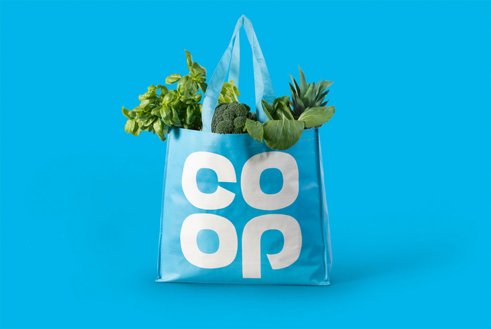
Founded in England in 1844, and now commonly known as the Co-op, the group has brought back its “clover leaf” logo, originally designed in 1968.

The change can be seen in a number of Co-op’s food stores from today, but the company rightly chose to make many of the updates through their usual business refits and maintenance programme, so it’ll be a few years before all of the 3,500 outlets show the updated identity.
London-based North initially investigated creating a completely new identity, but following extensive research into the Co-op’s history they decided to propose a move back to the past.

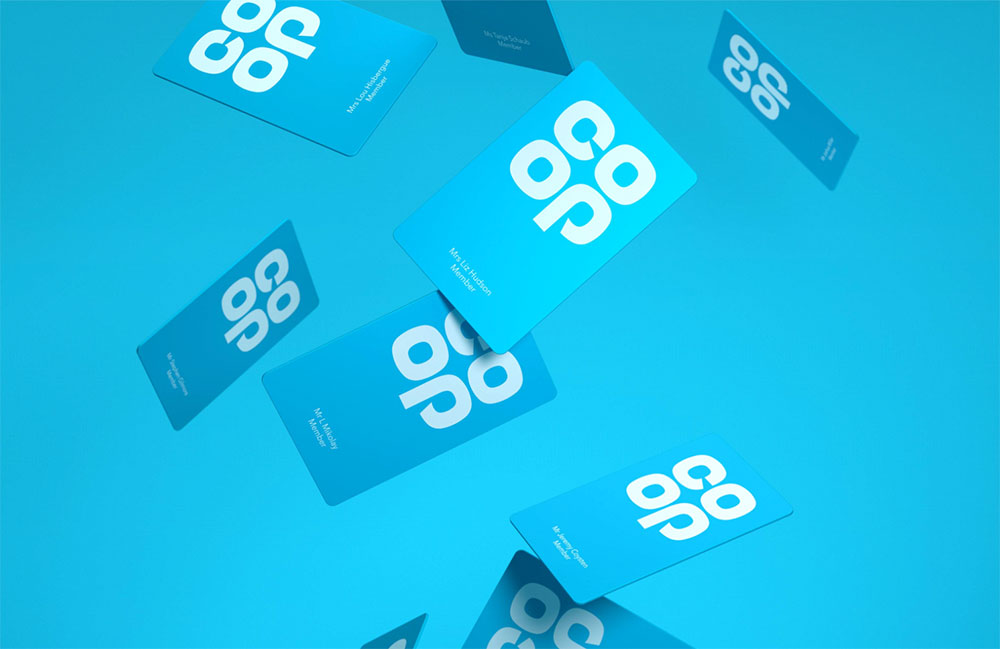
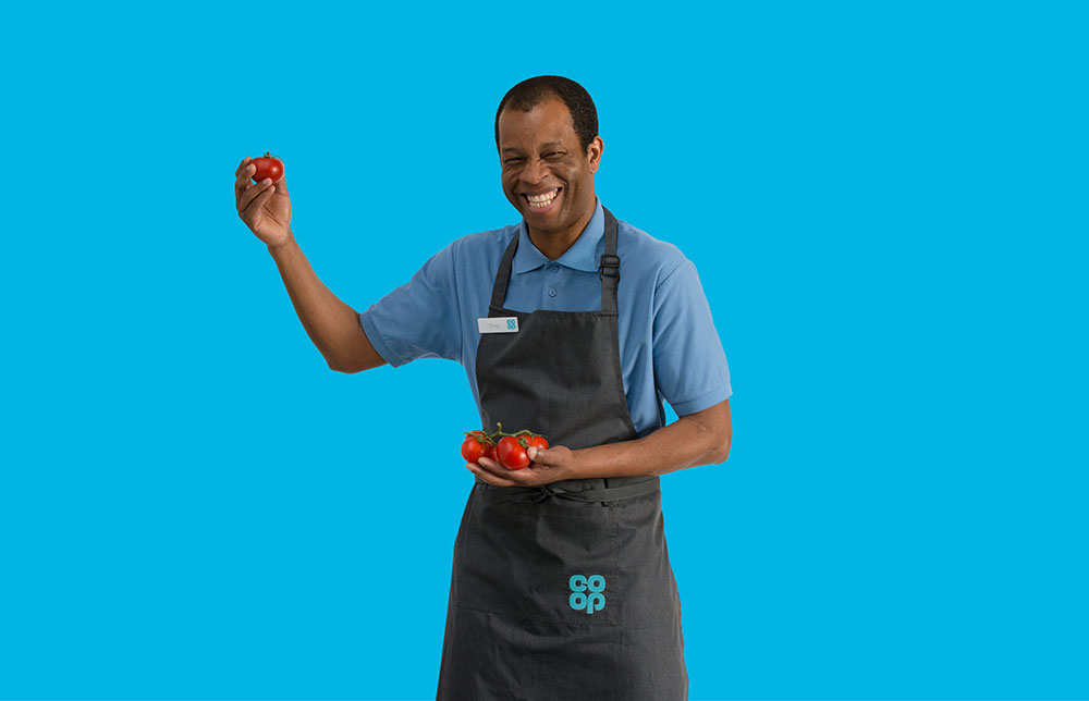
The logo was redrawn from archive material and given an updated colour scheme to modernise the 1968 palette. It’ll be seen on signage, packaging, uniforms, vehicles, literature, and digital content.
“Returning to the familiar can be a radical act, but it is the timeless quality of this iconic logo that makes such a move possible — it is distinct, recognisable, approachable, and dynamic, giving us the opportunity to signal a shift back to the ideas that made the Co-op special for its customers.”
— Sean Perkins, North


More info on Creative Review and the Co-op website.


Comments
The Co-operative had lost it’s way. It had been hit by management problems in it’s banking division and various problems in it’s structure and supply chains. New management has come in and changes have been made to it’s structure. It was time the branding reflected this change and also shift it’s image from ‘just a company’ to one with high ethics and morals.
The previous branding was extremely corporate, their funeral parlours looked the same as their grocery stores (in a different colour) and all the heritage had gone. Plus everyone calls them ‘The Co-op’, not ‘The Co-operative’.
Back in the 60’s the Co-op was the biggest supermarket in the UK. This is a return to that confidence, to make their own way and do things in a c0-operative way.
The new signage especially is much better, less brash, generic, corporate cookie cutter, cheap looking signage. This reflects the fact that the Co-op generally has pretty good products and lots of ethical lines (they were a pioneer of Fairtrade products).
This brand show that they have gone back to their roots. It’s a fantastic job, nostalgic, yet modern. I hope they don’t treat the brand too corporately going forward and communicate their values as well in their marketing as they have shown their newfound confidence in their branding.
This shows what good brand management can do.
That’s one of the best reasons for the switch, Lee — “Just heading down to the Co-operative” said no one.
Testament to the strength of the original 1968 design, too. I wonder who designed it.
Do they have something to do with the German firm Coop?
They use the exactly same logo?!
https://de.wikipedia.org/wiki/Kurt_Weidemann#/media/File:Co_op_AG_Logo.svg
I think a lot of credit has to go to North for realising that the Co-op were already sitting on a trusted and recognised brand, when the natural approach would have been to go back to the drawing board and create something new.
I remember this logo fondly from my childhood and it really hasn’t dated at all – strong, clean and approachable, It’s really nice to see it again.
As a logo it’s far more compact than using the word “Cooperative” and I imagine that was a factor as it will work really nicely across apps, responsive websites and in social media profiles.
Totally agree John. North have done a fantastic job.
Yes, agree with all the previous comments, works really well. Clean, friendly and has personality. Interesting to see how it works as a banking brand??