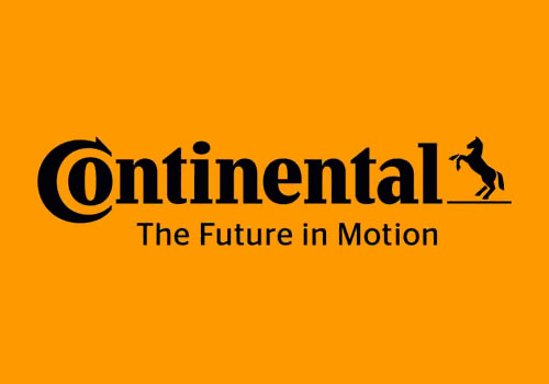
The typography has been given an update, too.
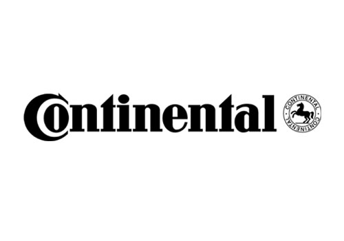
The old design (below) showed the brand name three times, which wasn’t exactly a good use of space, and the smaller versions within the circle weren’t easy to read at small sizes.

Continental’s Dr Elmar Degenhart had this to say at the annual shareholders’ meeting in Hanover on May 15th (quoted in this PDF).
“You have, no doubt, likewise already noticed our redesigned logo. The revamped, more contemporary, fresh design represents the positioning of the corporation. The message it projects is this: Our technological solutions are helping people enrich the quality of their lives through mobility, and structure their living space in a sustainable way.”
It’s not quite giving me that message.
Redesign by Peter Schmidt Group. Via The Branding Source.
On a side-note, it was interesting to see/hear the “sound logo” section on the Peter Schmidt Group website. I was listening to the Linde Ambient Sound while putting this post together.


Comments
Excellent update of the logo, but the horse’s tail lost a bit of its flair/dynamic.
“The message it projects is this: Our technological solutions are helping people enrich the quality of their lives through mobility, and structure their living space in a sustainable way.”
Uhhh.
The focal point of the identity is the CO. It’s always hard to manage two visual focal points. I’m NOT saying the old version was better, but there was a good contrast between name and horse seal, keeping the visual at the end from stealing attention from the front. It’s generally a good idea to let logos evolve, but in this case, keeping the horse may have been a mistake. How many of you remembered that there was a horse? I think the underscore is the biggest mistake. That’s where the contrast is now, and it pulls your eye away from the CO. If the horse has to stay, I’d get rid of the underscore and make the horse that much bigger. I’m glad they kept the typographic look, but the changes weaken it. The T, E, and A have become more conventional — the only real change is that they have lost a little distinctiveness. The real weakening of the type is the more open spacing.
I’ve put my suggestions into visual form. You can see the way I think it shoulda been done at:
https://www.facebook.com/pages/The-John-Langdon-Fan-Page/168916813130435?fref=ts
I was just thinking that the underscore was completely unnecessary and then I saw John’s version and presto, coupled with the even more legible typeface to boot. Orange and black to me doesn’t say technological solutions though, it says brewery.
I do agree with everything that’s been said but as designers we also need to remember that the client is in control.
If Continental knew they needed an update but was the least bit hesitant, then the designer is going to be constrained in that regard.
With that being said, I question a few things.
I don’t agree with the underscore below the horse. To me, it doesn’t make sense and it’s not necessary at all. If it had to be there, why didn’t they line it up with the tail coming off of the “l” instead of it being a completely different height?
The color scheme throws me off too for a company that’s trying to “…structure their living space in a sustainable way.” Orange? I’d like to hear the reasoning behind that decision.
I do like John Langdon’s version that he posted above.
Overall, it’s an improvement from the original logo with the confined horse that repeated their name three times.
When I wrote that the type had been spaced more open in the new version, I hadn’t looked closely enough to see that the type has been redrawn, and the weight is actually lighter. I made a couple of kerning changes and altered the lower serifs of the Ls.
Colt redid their logo?
The horse shouldn’t have the platform… definitely
The type update is a little less geometric now (notice, they got rid of the perfect hot-dog shapes in the negative space of the O, E, N and A) giving it a slightly softer feel and allowing the logo to feel a little more approachable. Those subtle updates also make it feel a little more current and not quite as dated. Personally, I would have considered removing the horse too, but if it has to be there, I’m okay with the underscore. Otherwise, the horse appears to be just floating. The underscore helps lock all the elements together. The color, as everyone has mentioned, is completely off. It doesn’t say “future”, “motion” or technology to me and is a bit off-putting, in my opinion. All in all, though, I think they did a nice job updating their look without getting too far away from the original logo. This can be very challenging. Instagram and their updated logotype is another prime example.
If the underscore really has to be there why not at least make it the same thickness as the serifs, or even make it an extension of the L. They’ve already edited the original logo by separating the horse from the base.
“Our technological solutions are helping people enrich the quality of their lives through mobility, and structure their living space in a sustainable way.”
That’s quite a confusing message. To be honest it smacks of corporate drivel and is exactly the thing that I try to steer my clients away from as it just doesn’t really say anything worthwhile to the end-user. And I certainly don’t get that message when I look at the logo :)
I also totally agree with Rich’s point about the underscore / serif thickness – an oversight?
Steve
Yeah, I agree too, Rich. Great point.
The horse does not project the message “Our technological solutions are helping people enrich the quality of their lives through mobility, and structure their living space in a sustainable way.” And it looks like a clipart pony. The CO would be enough.