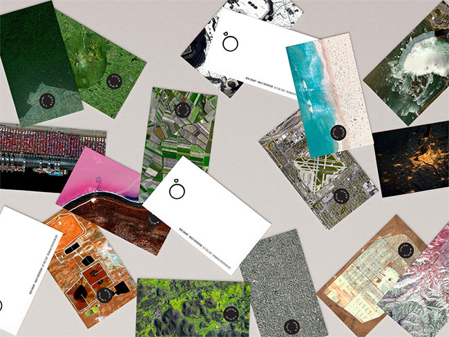
Daily Overview shares compelling images of the earth from above. Brooklyn-based Fleet created this fresh monogram for the project.

“By taking the D and the O from their name, we crafted a mark that depicts their method of curation — a satellite, pointing earthward.”
Appropriate, memorable, clever.




More from Fleet. See Daily Overview’s top ten.
Via Brand New.



Comments
I particularly like the new logo’s animated version, where the “D” orbits the “O”. Nicely done.
Before reading the post I thought it was a ring. After reading I realize the genuine creativity invested into the mark.
Great work!
I’m impressed. The design is simple but still has a lot of meaning behind it. As a result it is very memorable.
Simple but very effective!
This is the kind of Logo that lives for decades.
Iconic. Straight. Simple. And lovely.
Logo design in its simplest form. An iconic logo that will stand the test of time.