
At the start of 2015, there were a record 5.4 million private sector businesses in the UK alone — an increase of 146,000 from the year before.
With thousands of designers continually working on hundreds of thousands of logos, is it realistic to trawl every design in search of originality?
“A better question to ask is, ‘Have you ever done this before?’ Or perhaps, ‘Are the people you are seeking to serve going to be bored by this?’”
— Seth Godin
Don’t try to be original. Just try to be good.
Comments
Thanks for sharing this insight, David.
I think of it this way: When designers have mutually converted the idea of doing something similar to Paul Rand, or when they “must follow the 2015/2016 great trends of logo design”, it’s quite obvious that most — especially the young designers — will struggle to be original rather than being good and, needless to say, “people are going to be bored by this.”
I think the way forward is to create more language of communicating our ideas, in other words, not really restricting ourselves in defying the odds or the status quo.
New trends must be born, embraced and appreciated. We should allow young designers to rethink the old trends and discover novel ways of identifying brands.
Let’s always remember, “The principal role of a logo is to identify.” — Paul Rand
The principle role of a logo is not only to identify but also to differentiate.
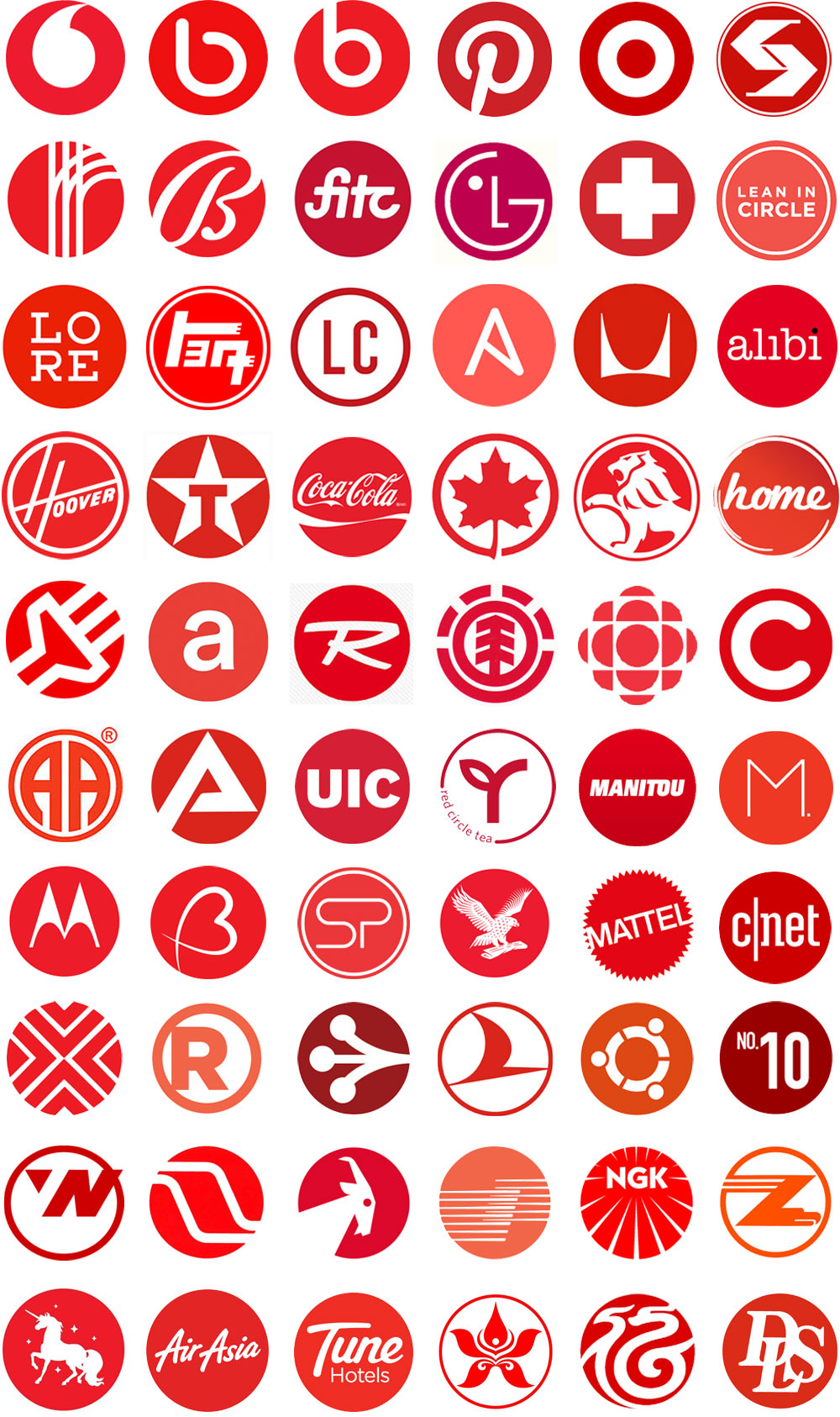
The image here is actually quite fascinating.
Even though together they collectively look similar, as they are all used differently, and in different industries, I perceive them very differently. I guess what I’m getting at is that how and where the logo is used matters more than the logo design itself to differentiate…
I think providing the logo doesn’t look like the direct competition it’s ok. In that case there’s so much less to compare it against.
Sorry but this is a cop out. The reason why we get most duplicates now has nothing to do with volume.
It does however have everything to do with a sloppy creative process that goes looking for ideas rather than generating new ones through a proficient creative methodology.
Add to this an overall depreciation in the skill of drawing in this industry for ideation and ease of digital through lazy pull-down menu thinking mentality and it only compounds the problem.
There are all kinds of fresh approaches being done, but we also have a legion of hacks who know digital tools but lack true skill and craftsmanship that far out number the rest.
Seth’s quip is just too convienent and not very true in practicality.
You reminded me of something good I read recently, Simon, about designing for all senses instead of just the visual. Must look for it.
Exactly, Ian. Competitor differentiation should always be a part of the process.
There are a lot of cheap copies, Von, but when an enduring mark needs to be fairly simple in appearance, it’s inevitable we’ll see something similar if we spend long enough looking.
Great! Your response have piqued my curiosity, David. Please kindly share that resource — “Designing for all senses instead of just the visual” — with us when you find it.
And about Ian’s submission — on “competitor differentiation” — I couldn’t agree more. That’s why my major research interest is consistently on “Rethinking Logo Design and Branding™”; gleaning insights into West African (or Ghanaian) Adinkra symbols as a unique language for designing logos that evoke meanings relatable to people (especially natives), and eventually identify the thing they are made to represent (through their typical aphorisms or proverbial meanings). I’m presently conducting interviews and actively researching into, what I coined as, ” Adinkra Logo Systems™”. I will keep you updated.
Thanks for your responses.
Something to consider also is that all brands aren’t competing with one another, there are some industries that have zero overlap in their consumer base, and could just as well use the same exact logo and be just fine.
The issue isn’t whether it has been “done before”—if that’s your main concern, then you’re letting your ego drive decisions.
Rather you should be asking—if it did exist in the past— did it succeed? If not, is there a reason why the last company that used it wasn’t able to own it? If so, is there something different about your company that will make that outcome different somehow?
If a brand becomes mega successful using a logo, obviously they then own it and it becomes futile to use the same one—given the confusion it’ll inherently generate (not to mention actual legal stuff).
But if a logo has been used and HASN’T managed to make its way into the circle of super successful ones that stick around, then there’s definitely room to re-use a similar mark/logo etc.
Researching current logos should be a part of the process from the beginning. It’s not fool-proof, but a simple search online helps avoid 80% of these situations. You need to refine your own design process and as Von said, create your own ideas, not look for them. The last thing you want is another Tokyo Olympics logo fiasco.
Totally agree with you on this point. well said. Another bad example other than the Tokyo Olympics is the CTS vs. STC scandal.
Good luck with the research, Simon.
I remember talking to a trademark lawyer for an old post, Haik. He said how the majority of registered trademarks are protected within specific markets, professions, countries, because legal costs spiral when more markets and borders are covered. Like you say, the exact same design can easily be inadvertently used for two non-competing businesses — a restaurant in Singapore, a haulage firm in Canada, something like that.
At the same time, Jacob, there’s only so long can be spent researching other logos when hundreds of thousands of new (and old) businesses are continually being designed for.
I’ll make sure my ideas are different from a client’s current and potential competitors. And I keep track of what our peers in the profession create, but I’m not at all convinced the latter’s a good thing.
The notion that only an agency or a design company with facilities and staff can create original, captivating and one of a kind branding is false. Too much research into what is out there is also blinding and blocks creativity.
The only concern I have about searching for pre-existing designs is that a designer may fall into the trap of subconsciously repeating some ideas.
Other than a round shape, each logo looks different and serves its branding purpose well. I don’t see what the problem is. They are all beautiful in their own right.
We are all inspired by our predecessors and when it comes to such a small piece of design like a logo – it’s almost impossible to design something that doesn’t resemble anything else out there.
Does anyone know what the logo is for lowercase letter a in white with background color red and is round?