
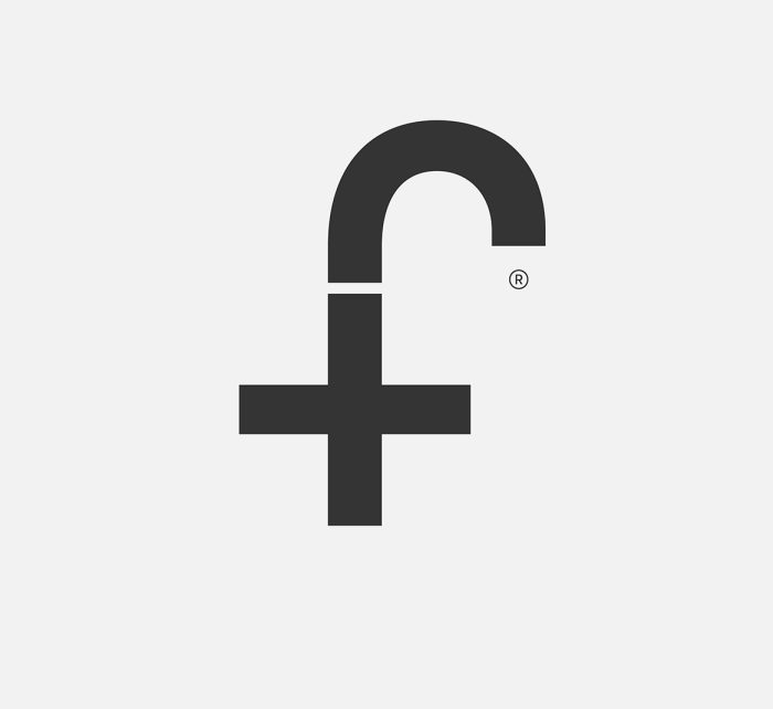
Designed by Paul Palmer-Edwards of London-based Grade, I was told it was one of those eureka moments, done quickly without much else to show (not that anything else is needed).
Posted . Updated .
More on how marks like this are made in Logo Design Love, third edition.




Ivanna,
Love it- simplicity is where it’s at. Love those eureka moments when the right logo just hits you. Amazing how just a few well chosen curves suggests the full head of the elephant. Will scale down beautifully too. Jealous!
Maria,
It’s nice. But also very close to George Bokhua’s elephant logo:
Verena Tam,
It resembles very much the letter פ (P = “pey”) in the Hebrew alphabet. Even the point inside is traditionally used to make clear it is not pronounced as F = “fey”. The only thing that makes it different from this letter is that it is mirrored. Someone acquainted to the language would always first see it as a reference to the letter, and not to an elephant-shaped letter “e”…
Paul,
Indeed simple and perfect to me. Jealous too. A pity that Grade wasn’t asked for designing (or at least templating) the elephantbookcompany.com website (apparently). They should use its force and build some brand identity around it.
Richard,
Lovely, but completely agree with Paul about the website. What a shame.
David Landreth,
We’ve had a similar logo in Edmonton for nearly thirty years. It was just replaced in 2012. I think ours was much nicer – the line work and how the ear completes the letter ‘e’ for Edmonton of course. Designed by Wei Yew. http://listofzoos.com/Valley+Zoo
Susan,
Lovely design… simplicity at its best!
Juan M,
Would’ve been nice if the aperture had started with a slant similar to the final (end of trunk), but aside from that, I like it!
Caleb Colestock,
Accomplishes its purpose with elegance. Would be nice to see it used in printed/digital work (so much potential), but unfortunately, after looking at the website, it stops short. Nonetheless, still great work.
And although the stroke-weight variation really gives it a “tusk” feeling, Wei Yew’s design for Edmonton Zoo does look dated. They already have a new, rather poorly designed logo to prove it!
http://www.edmonton.ca/attractions_events/edmonton-valley-zoo.aspx
Andrew Sabatier,
Inspiration at work.