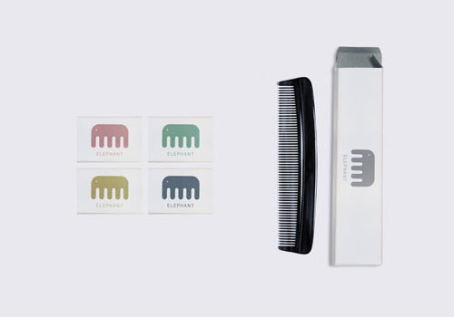

Designed by TBWA/India for MKV Household Products, it also made the graphic design longlist at D&AD.
The typography could use some refinement, but it’s a lovely idea, and so fitting I can’t help thinking it was designed before the product existed. That’s a compliment.


Comments
I love how if you stare at it you get the perception of dimensionality. Nice to see such simple (but well executed) design making it onto a consumer product.
This is one of the times that make you think “why didn’t I come up with something like this?”
Clever. Pachyderms are beautiful, as well as bringing Good Fortune.
How simple. How lovely. I absolutely love this design.
I can’t imagine how long it took the designer to decide upon the size and position of that dot…
This makes me wonder whether they came up with the name just so the logo design can be used.
It’s a lovely idea but I have to wonder if this is even a real job. I can’t find any other reference to it on the net, anywhere other than the fact that it won a gold pencil in the one show and Davids post (which gets copied on various other sites).
The logo and product don’t seem to match. If I opened the box and found that inside I’d be disappointed! If they were baby combs or something more unusual it would make more sense.
A good idea, executed well, but when I look at the actual comb I see a centipede, not an elephant. Centipede Combs might not sell too well though, bit too ‘creepy’!
I kinda agree with Lee…..in this case I think the logo ought to match the product a little better. But the Logo is great!
I love this logo and agree with John about the placement and scale of that dot for the eye.
That’s the keystone brick in the whole design.
Is there a website where there are sold? Or was this just a concept piece?
Overall, a great logo that is just perfect.
BRAVO!
I love it! It is ALWAYS a challenge for logo designers to make a simple, memorial & yet impactful logo – and TBWA smashed it. They did a fantastic job!
A simple, clever logo for a simple, everyday object. I love that its uncluttered with plenty of room to breathe.
A really great logo, but I also doubt it being a real job. I’m always less impressed with logos like this because basically they are just making a random solution to a design problem that never existed. Nevertheless, simple and clever.
I’m a huge fan of simple uncluttered designs that quickly convey the message in a crowded marketplace. I appreciate seeing works being highlighted here. Thank you David.
I’ve just ran into this page:
http://www.rosenfeldmedia.com/
I don’t want to be picky, it is just the illustration of how tricky is to come with something really genuine…
Clever logo, maybe all its products now need to have a straight top to match the design (i.e., not curved).
Brilliantly simple showing exactly what the product does and is. Its hard to think how this company’s logo could have been designed differently.
Can someone please direct me to the MKV Household Products website?
What font is used?