Emblemetric is a website by James I Bowie.
Working with its database of more than 1.2 million logos dating back to 1884, Emblemetric examines patterns in design over time and across industries, including those related to the births of new styles, deaths of old trends, colour use, and geography.
Here are just a few articles of note, where James has been meticulously writing about logos and their usually untold stories.
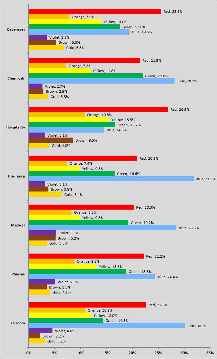
The Color of Logos (2012)
“Colour use in logos can be addressed in terms of particular industries. The graph above shows the relative use across time of eight colours in the logos of seven selected industries.”

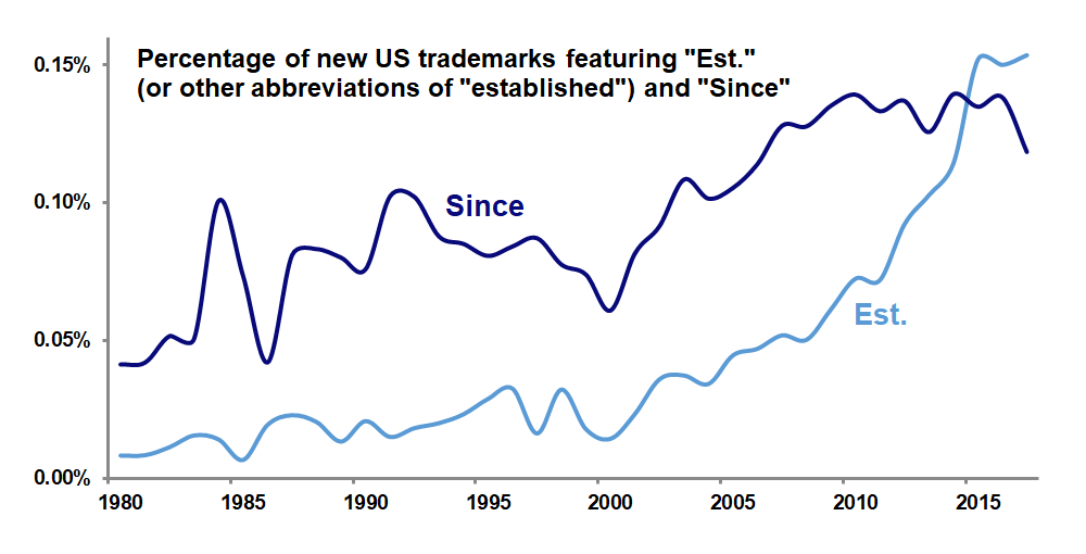
Well Established (2017)
“Does your local craft brewery’s logo helpfully inform you that the business was “Est. 2016”? Logos declaring the year that a company was established seem to be everywhere recently.”

How Custom Fonts Became the Ultimate Corporate Flex (2020)
“Why everyone from Goldman Sachs to Netflix is investing in their very own typeface.”
More charts and stats on Emblemetric.
Via @ucllc.



Comments
I find it interesting that Hospitality is primarily red but medical is primarily blue. Not too surprised on most of the others.
@Chris: think that Hospitality is something that we feel with our emotions, and the red colour is just the most “emotional” colour of them all, and the same thing is with blue and medical, that is something very rational about taking care of health, and blue is “rational” colour. In some languages the term “blue man” means a wise person.