Our work for London Chamber Orchestra (LCO) had caught the attention of English National Opera. I went to see them knowing that they had already seen five other consultancies. I got on so well with ENO’s director of corporate affairs, Keith Cooper, that he sellected us to create their new identity before I’d left the meeting. For me, this was to become another of those projects of a lifetime.
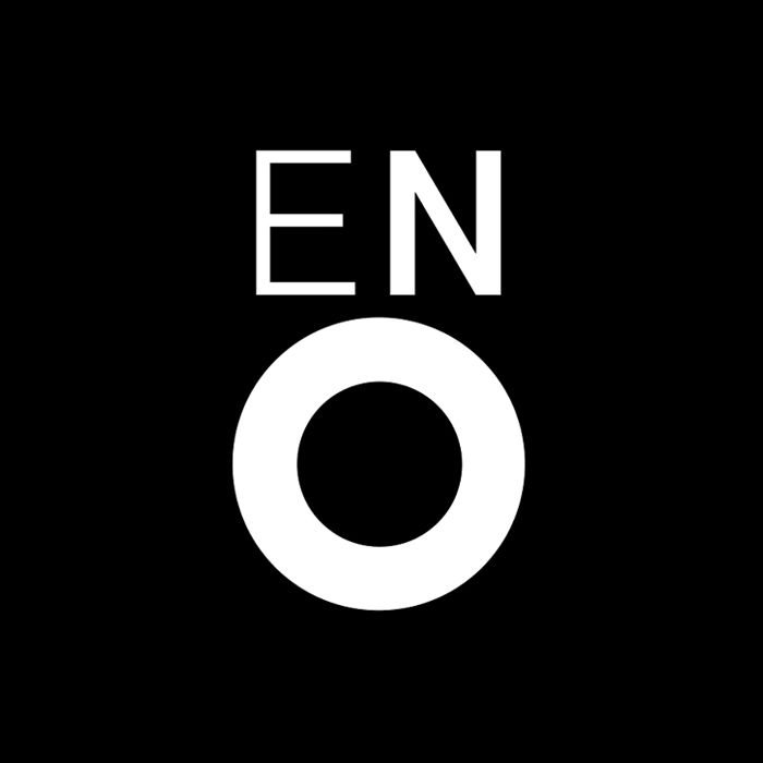
The story of the creation of the logo is worth a few lines. I used to live in Islington and travelled to work on the 38 bus. This is well before mobile phones. So it was a great place to think. And over the ensuing years I would clock up a lot of thinking on that bus. So there I was trundling down the Kingsland Road thinking about the essence of English National Opera. I started scribbling singers, arms out stretched, opened mouthed. I looked down at my drawing, zeroed in on the face and had one of those rare ‘eureka’ moments. The face turned into an E and an N for the eyes and a large O for the mouth. Later that day in the studio it became this…

That’s how things happen sometimes, quickly and effortlessly. And the art of looking beyond what is before you is crucial to capture the unexpected. I presented the above sole option to the client. I was so sure it was right, and it was. We went on to overhaul everything. For many years working for ENO was a real joy and I gained, and still have, a soft spot for opera…


—
Read more about this stage in Mike Dempsey’s career on Graphic Journey.


Comments
I’m glad you posted this,, it was groundbreaking at the time. A great idea, carried out with craft and emotion. CDT were one of the great design agencies when I was at college along with The Partners, Lewis Moberley, Michael Peters, Pentagram, Minale Tattersfield, Trickett & Webb…
Cool story, bro. No really, I liked it. Graphic design is great when it just hits you like that. You feel like Rain Man.
Great logo, I saw the open mouth right away, you got the scale just right.
Nice story but is by far too subjective and the resulting design looks empty to me.
Talking about emotions and feelings and effortless actions maybe will get some people wet in the eyes but is not enough for a good logo.
I do not get that feeling which is described in the story by looking at the drawing.
Just another logo pretending to be awesome.
I must be blind.
Check out the logo for “Opera de Montréal” done 10 years ago: same type getting bolder and bolder.