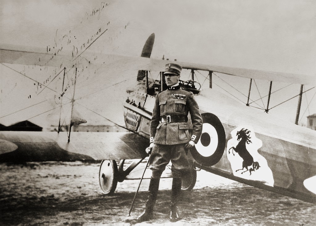
The original horse of the Ferrari logo was painted on the fuselage of the fighter plane of Francesco Baracca — a heroic airman of the first world war. “In ‘23, I met count Enrico Baracca, the hero’s father, and then his mother, countess Paulina, who said to me one day, ‘Ferrari, put my son’s prancing horse on your cars. It will bring you good luck’. The horse was, and still is black, and I added the canary yellow background which is the colour of Modena [Enzo Ferrari’s birthplace].”
In 1932, the Ferrari shield appeared for the first time on the Alfa Romeo cars of the Scuderia racing team at the Grand Prix of Spa. In 1947, on the 125S — the first car produced at Maranello, the prancing horse appeared on a yellow background, and always with the Italian flag at the top. However, no longer within a shield, with the letters S and F (Scuderia Ferrari) replaced by the word Ferrari. Thus the Ferrari brand was born, and since then has been on all the cars the company produces.
Quoted from the video below, courtesy of Ferrari.

Car-related from the archives are evolution posts for the BMW logo, Mercedes logo, and Volvo logo.


Comments
What a brilliant little piece of history! Makes me wonder how many other stories lie hidden beneath automakers logos.
Indeed James, and I have an excellent book for you that I recently put up for sale. Sirens of Chrome. Please send your email address to Hhemmes@yahoo.com
I’m also selling a bronze sculpture of a limited edition of 250.nr 174. It’s 18cm high and issued in The Netherlands in 1989. Also some press kits.
Awesome piece of Italian history. Will always keep it in my mind.
How cool! I’ve always loved the Ferrari logo and now I’ll always connect it with Modena, where great food (and balsamic vinegar) come from.
That’s interesting to know as most of the time you just assume that there is some real meaning to a logo but this was a case of simply being told to add it for luck. It still has deep meaning, just not in the typical sense that you would expect in that the symbol represents something about the brand name etc. It’s great that the history has been kept true but it’s not a favourite logo of mine despite what the cars represent.
Although the story is interesting, i wouldn’t give it much credit. He could have said, “Put my sons, telescope on there…” or really any object or thing and the logo would be just as meaningful.
I don’t think its a great logo, but a logo for ‘something’. The products make the ferrari logo. Unlike many other things where the logo really identifies the product.
If the story went along like oh this is my sons horse, its great and strong and fast just like your planes then i would buy it. But really, look at it. If today, a designer came up with that for a new car company… yikes.
It is amazing to understand the background on some of these iconic logos that have made waves across the globe. Plus the Ferrari logo is just an awesome logo to look at.
Did you know that there’s another motor company that share a similar story with the prancing horse?
http://www.ducati.com/history/editorials/ducati_and_the_prancing_horse/index.do
I think there was more than just a happy coincidence there – Enzo Ferrari might have been moved by his friend to use his son’s horse for the logo, but probably also had some sense for design – how perfectly does the ferrari horse convey the brand identity for the company?
The voice in the video clip, is that Alun Armstrong’s?
I agree with KevinN. Maybe they could have changed it a bit more over the years, like McLaren did with their logo (used to be a Kiwi which is a bird). Ferrari always seem to hang on to tradition more than McLaren and others. Not saying that Ferrari’s way is worse, just different. But that philosophy has been to their detriment in the past.
Precisely, if Ferrari had changed anything and followed the same steps of the others, then they would not be any different and that is their strength to be different and being great at it. Great business makers do not fellow trends but make them as this company clearly did in the past and still does today.
A pleasant day to all ;)
I recently started to examine logos and for the first time really looked at the Ferrari font logo. I’ve seen it so many times in my life and haven’t realized that the ‘F’ is prolonged to the point of the letter ‘i’, which is squeezed and actually represents a bullet!
I’d like to know is it just happy coincidence or a well known fact?
I used to be under the impression that the logo was an acronym for the wild strength of the horse power under the hood. But just recently it came under discusion again. I was surprised to find out that it was not. Oh well, facts are facts.
Fascinating. Now, the million dollar question: Why did Francesco Baracca paint a prancing black horse on the side of his plane? We know it was for luck, but what is the history behind the prancing horse?
Answer to Carlo Kaminiski:
The reason why Francesco Baracca painted a prancing black horse is that before becoming an aviator Francesco Baracca was an official in a regiment of military cavalry, and therefore the horses, above all, those more imbizzarritis were his passion.
Answer to pvc:
The reason why you find this logo on Ducati is because Ducati engaged engineer Fabio Taglioni to develop his bikes. Fabio Taglioni, who is the creator of the desmodronic system in Ducati engines, was born and lived in Lugo, and Francesco Baracca was the hero of Lugo, so Baracca was the hero of Taglioni. To pay homage to Baracca, he put the symbol of Baracca on the motorbikes of Ducati. To know more information about the connection between Baracca and Ferrari, check this link to the Baracca Museum of Lugo di Romagna.
http://eng.museobaracca.it/
Of course my town is Lugo di Romagna.
Thank you Luciano! A nice extension to the history of the Ferrari brand.
There is also a small artisan bicycle builder in Lugo named Somec (Societa Mechanica) that, since the 1970s, has used the Baracca prancing stallion logo on the head tube of their bikes. Ferrari supposedly met with them to discuss why they were using his logo and in the end was impressed by the owner and quality of his bikes so he allowed them to continue using it. But only the version with the tail pointing down, as Ferrari had modified the tail to be pointing up.
Man, it’s like every car company starts with planes.
Hi, I was wondering about changes to the logo like the one attached. Can anyone help me get info on these beauties please?
Sorry, seems I can’t post a pic but the shield is of a horse on a flag pattern.