
“As a British citizen after WWII, he designed publications, exhibitions, household products, interiors and jewellery, and in the 1960s he became the founding father of modern corporate identity in Europe.”
Henrion was awarded both the MBE (in 1951) and the OBE (in 1985).
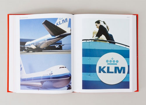
“His reputation was already established when he designed KLM’s identity in 1961, but it didn’t stop the Dutch airline questioning his design. Apparently, KLM accepted the design only after protracted deliberation, considering it too advanced. It is perhaps testament to KLM’s vision and courage that the symbol entered service at all, but the fact that it is still in use today — even following KLM’s merger with Air France in 2004 (to form Air France-KLM) — is testament to Henrion’s simple, bold and undeniably modern design.”
(Excerpted from Symbol.)
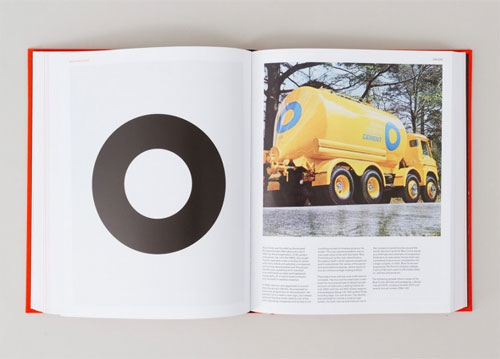
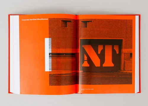
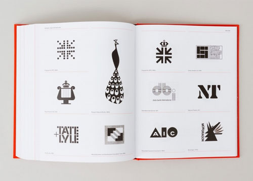
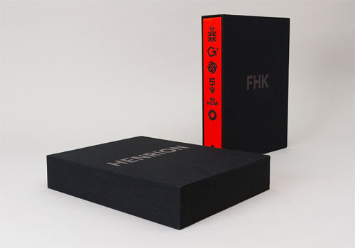
The book’s available for pre-order. Shipping in November 2013.
More info:
Design Coordination and Corporate Image, by FHK Henrion and Alan Parkin
FHK Henrion Flickr group
FHK Henrion on Designers Journal
FHK Henrion bio on AGI
Posted . Updated .
More on how marks like this are made in Logo Design Love, third edition.




Peggy,
I love this post! FHK Henrion… it’s amazing how many great graphic designers no one has heard of, or rather I have not.
Martin Bengtsson,
We read about a lot of war heroes and villians in history, it a pity schools do not spend more time teaching about giants such as Henrion and their legacy to the modern world.
I think “timeless” is the word missing from the paragraph from symbol about the KLM logo.
Ian Dennis,
Great to see this monograph being published. Henri deserves it.
Just a little footnote re NT:
See Creative Review April 2011
or
http://www.davidthedesigner.com/davidthedesigner/2011/04/question-nt-answer-number-10.html
Sorry Henri! Ian Dennis
David Airey,
Thanks a lot for the addendum, Ian. I’ve updated the post and linked back to your website.
Ian Dennis,
Thanks David
That’s very kind of you.
Henri doesn’t really need the NT logo – he has enough of his own to ensure his legacy!
Can still hear his voice discussing it with me after all the decades.
Ian
Rocky Roark,
Would love to get my hands on this book!