

Semiotics is the study of signs and significations, and as graphic designers we create visual signs (dubbed in the book as “FireSigns”) that are meant to elicit a certain effect in the mind.
From the preface:
“A sign of fire: smoke over a tree line, a charred smell in the air, a glow over the meadow at night far from the city. But there is also this: a petroglyph scratched into a rock in New Mexico, a graphic emblem on a grill starter, a warning label on a fuel truck. Or metaphorically further: a website that excites you, a poster that enflames the imagination, and advertisement that really makes you want to buy that dress, a book whose typography and composition so ennoble its contents that you display it in your entryway. This kind of fire sign is a piece of graphic communication that stirs heat in your soul. That’s the kind of fire sign this book is about: something in a visual display that ignites memory, intellect, engagement. How does this happen?”
The author Steven Skaggs has spent 25 years among people from two professions — graphic design and semiology. Designers manipulate visual elements in order to prompt a response, and semioticians study how things are able to influence people. The book’s content is much broader than logos, and is heavily theoretical rather than practical, but there are some interesting points on the cultural associations attached to letterforms and symbology.
Steven shared the following story about a rejected logo proposal.
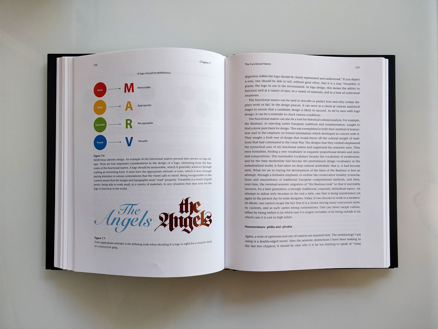
“I was once part of a team that designed a corporate identity program for a family-owned auto-servicing business. The company was having difficulty being visible in the marketplace, and our design research pointed to a solution that was minimal, bold, and (at the time) distinctive: a white “M” in a red diamond. The presentation of this proposed logo design was going fine until the youngest member of the family — a twenty-something Texan the matriarch introduced as “Baby Bill” — arrived (late) at the meeting, saw the proposed logo, and pronounced, “Them’s the Devil’s horns” to a stunned room.”
![]()
“The red diamond also reminded him of the deadly sin of gambling (playing cards), and this was confirmed for him by a red arrow that unmistakably pointed the way to Hell. There was no recovery: we packed up our materials and went back to the office to attempt to revise the mark. These were all conceptual connotations for Baby Bill, whose particular life experiences no doubt paved the way for his impressions. The point of this story is that it doesn’t matter how or why someone becomes primed for associate meanings or whether the connotations are logical or not. If a receiver interprets a display and has certain connotations, the connotations are real. There are no false connotations.”
There’s no telling what feedback our clients will give, and how that might affect the eventual outcome — one of those things that helps keep every project different. I’ve worked on plenty of designs where client feedback has led to a stronger result, so although your initial idea mightn’t hit the mark, sometimes going back to the drawing board is a necessary part of the job.
And speaking of appropriate results, that’s one of four considerations Steven applies to the design of a logo.
I’ve only had a chance to skim the content (as with most books I’m sent), but it’s clear from the theoretical writing that I’d need to take it in small chunks — it’s like a course in semiotics for designers. There could well be a few topics to help persuade during a client presentation, and I’ll highlight a summary if that’s the case.
Meanwhile…


The author Steven Skaggs is professor of design at the Hite Art Institute of the University of Louisville, and FireSigns is available from MIT Press, Amazon.com, Amazon.co.uk.
Comments
Good day! How can I get this book? I’m from the Philippines.
This looks terrific!
Thanks for announcing my book!
It’s widely available, but here’s how to order:
https://mitpress.mit.edu/books/firesigns
I’d enjoy a conversation with readers of FireSigns. You can contact me at:
S.Skaggs@louisville.edu
Put FireSigns in the subject line.
Hi, I’m from Italy, and I’ve just ordered it. Very curious about it!
C