![]()
Mark Sinclair at Creative Review asked me to nominate five of my favourite logos for the logo-specific issue in April 2011. My picks (and those of the other contributors, listed below) were tallied-up alongside some internal voting to represent CR’s “top 20 logos of all time.”
Having read the April issue it’s clear that most of the top 20 were designed a long time ago. As stated within, “Affection and respect build over time.”
My choices were based purely on the idea of the isolated marks, as opposed to recognition or flexibility, perhaps why none of my five made the top 20, so I’ll share them here instead.
Mother & Child

An idea that once seen is hard to forget. Superbly captures the essence of nurturing. Designed in 1966 by Herb Lubalin.
Martin Newcombe Property Maintenance

So simple it’ll make everyone think design is easy. Fantastic use of negative space. Designed in 2009 (I think) by Buddy Creative.
Swan Songs
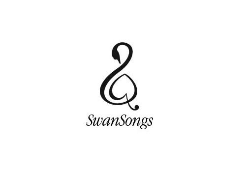
There’s no mistaking it’s a musical swan. Designed in 2001 by Maggie Macnab, author of Decoding Design.
Guild of Food Writers
They write about food. Brilliantly obvious. Designed in 2005 by 300million. The Guild design made an appearance on page 44 as a “personal favourite.”
Mouse
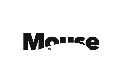
Can you find any better examples of cropping? Designed in 2008 by johnson banks, more about the Mouse design.
Others who contributed to the logo issue:
Marksteen Adamson, Arthur Steen Horne Adamson
Philippe Apeloig, Apeloig Design
John Bateson, Bateson Studio
Michael Bierut, Pentagram
Connie Birdsall, Lippincott
Tony Brook, Spin, co-editor of Studio Culture
Mike Dempsey, Studio Dempsey
Michael Evamy, author of the best-selling design book Logo
Bill Gardner, Gardner Design
Sagi Haviv, Chermayeff & Geismar, interviewed here
Angus Hyland, Pentagram
Michael Johnson, johnson banks
Peter Knapp, Landor
John Lloyd, John Lloyd Design
Miles Newlyn, Newlyn
Paula Scher, Pentagram
Tony Spaeth, Identityworks
Armin Vit and Bryony Gomez-Palacio, UnderConsideration
Marina Willer, Wolff Olins
Michael Wolff, a good talk of his about creativity
And me
Thank you, Mark, for including me in such esteemed company.
The April 2011 issue of Creative Review is available to buy for £5.90.

Comments
Mother and Child is a classic (although never actually used).
Some of those chosen for creative review were great but as with all these lists some choices were baffling.
The Woolmark and Michelin (my personal favourite) make sense. There are so many clever marks that it’s difficult to pick a definitive list. Interestingly nearly all the ones picks were huge brands. It’s the whole ‘A classic though exposure’ debate again!
Really simple, yet brilliant logos. Love the mouse one – the implied movement is wonderful.
It takes a lot of thought to create logos that take your design breath away.
Thanks! G.
Love the Guild of Food Writers logo, I know there are quite a few negative space logos out there but this is so simple yet it communicates exactly what it needs to – no copy required! A classic in my opinion.
Lee, at number 19 in the top 20, Montblanc was an odd one. You’re spot on about classic through exposure.
What are your thoughts on the overall number one David??
I’m with you on the Mont Blanc logo, really confused as to why that’s in there.
Hi Abbas, a strange story behind Woolmark. A shame that number one was created in a contest — especially one where the winning mark was potentially designed by a member of the jury (even if he was said to fight the decision).
I understand the choice based on CR’s criterion of longevity. The issue’s cover gives a glimpse into its flexibility (and equity), too.
That’s what I was getting at really when I tweeted you last week. I think it’s very disappointing that the logo chosen was, like you say, a contest winner. There could be an argument that times change, and a contest now is different to a contest then, but I don’t think that’s valid. The only difference is the amount of companies/organisations/people who require a logo these days.
As for the logo itself, the execution is perfect in every way. But it’s rarely seen these days, I couldn’t say the last time I actually saw it.
The British Rail logo however is everywhere. Personally i’d have placed it above Woolmark.
As for Mont Blanc. Strange.
David,
I’m thoroughly honored to be included in your top 5. Especially for Swansongs, a non-profit initiative whose musician members play favorite pieces for those at the end of their lives. When I get there, I’d love music to transition me. What could be a more human and generous service? Maggie
Hi David. Martin Newcombe and Food Writers (always the best) logos are two of my favourites too! I think that the best quality of a logo designer is the ability to synthesize. That’s why I love the use of negative space in logo design because without a doubt I think that less helps to communicate more.
Brilliant,
I love to see logos that are so simple yet so clever. My favorite has to the the Guild for Food Writers. Great collection.
Love the Gestalt stuff. Always loved the fed ex logo once I clicked about the arrow.
Mother & Child is my fav.
Great collection.
I always thought the big Brother Big Sister foundation logo had a great use of negative space…
http://give2network.files.wordpress.com/2011/01/bbbs.jpg