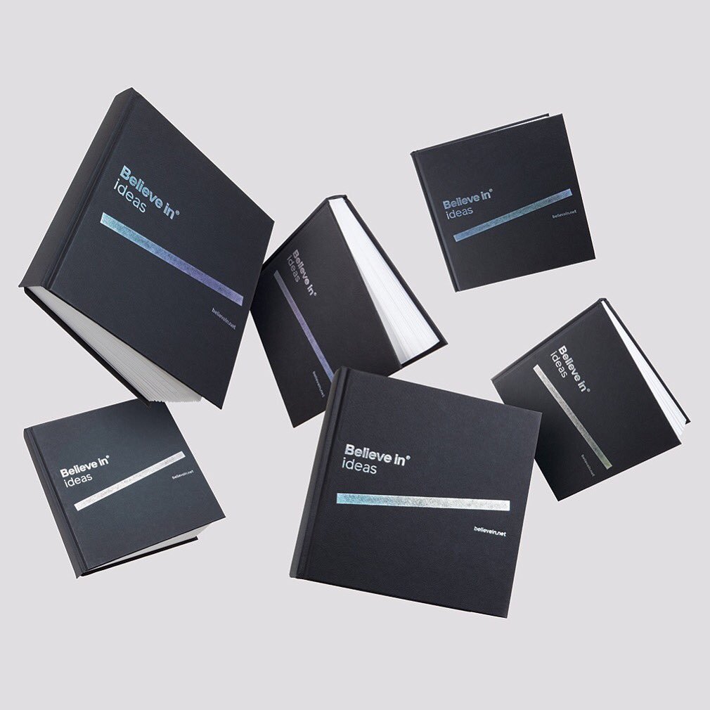
Sketchbook photo from Blair Thomson of Believe in. More collateral on Identity Designed.
These, too.

For Plymouth University, designed by Exeter-based Buddy.
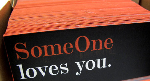
Business card photo courtesy of Simon Manchipp from SomeOne.
Or where the name can flex into different words.
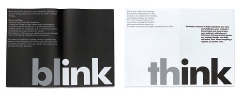

For Ink Copywriters, by Mytton Williams. More on Identity Designed.
Or on a slight logo tangent, when a symbol/monogram can be expanded like this.
![]()
![]()
For New Theatre, by the Sydney office of Interbrand.
Then there are companies like Us. “How to get in contact with Us,” and, “What do Us do exactly?” Or Glad, who say that, “Anyone who chooses to work with us will be Glad™ that they did.”

Proud is another example. “Our goal is to create work that makes our clients and everyone at the studio proud.”
Or what about having your next creative project designed by good people?
Even the much-maligned UAL identity holds some of that flexibility.
![]()
Original by Pentagram, adapted by D13904, a commentator on Brand New.
Just something I was thinking about.
—
Update:
Michael Johnson wrote a relevant piece for Creative Review.
What’s in a name? Just about everything.

Comments
In the Netherlands there are some good examples of flexible brand names. One of the most well known is a former telephone company called Ben (means ‘I am’ but is also a boys name). Made by DieTwee en KesselsKramer.
Also design agency Thonik has done similair designs. I will try to look them up and make a pinterest board and send you the URL.
Interesting article. At the heart, the prefix or extension is simply a campaign. With the right approach this concept can be applied to any name—old or new.
I actually find these really annoying. I find it harder to say the name of the company and more confusing. The ones that can go within a word, like ink and ual aren’t quite as bad, but the sentence ones…meh. IMO
These are excellent examples of how to keep a brand fresh, and I agree with Jonathan that this concept can be applied to any name with the right planning. The biggest issue that I see is that these executions can’t really cross language and possibly cultural barriers with the same impact.
The adaptation made by commenter D13904 on Brand New is quite smart, and would actually empower the awkward lowercase initials.
Also, after following the link, noticed a new comment worthwhile by Erik Spiekermann on Helvetica, among other things.
@Niek
Don’t forget I AMsterdam. Or rather, please do ;-)
Or this cheeky City of London rebrand for D&AD.
I ♥ it.
Can work very well if applied correctly. A local company for helping disabled people does the opposite and takes away from their name by removing DIS from DISABLED — giving ABLED — I think it works well.