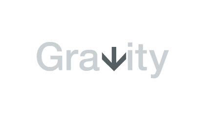


The flat logo (above) was lifted from the Gravity Flooring website. The kerning looks a little off either side of the arrow due to the animation shown on the site, but I’m not sure.

And I didn’t really want to see this, but I do love a bit of wit in design.
More from The Partners.


Comments
This is fantastic. An instant favourite of mine. Such a clever and appropriate use of what can be a very cliche image — the arrow.
You had me right up until the plumbers crack…then I lost my lunch!
Very clever and very nice. I’d adjust the letter-spacing around the arrow though if it were me. It seems a bit tight on the right side with the “i”.
Other than that though, simple and effective.
For a flooring company I guess this is a good logo, but it’s not exactly groundbreaking by any means.
Also, the kerning just looks off to me, specifically the space between the “a” and the arrow….I would love to move that arrow a smidge to the left I think.
Yeah, sorry Fabian!
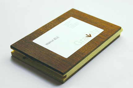
Nate, Andrew, I think the kerning has been changed because of the animated GIF on the website, and if you look closely at the contextual images, the characters do seem to fit together a lot better.
I have to agree, the kerning is lacking. And it’s the same in the contextual images as far as i can tell.
Since when did a logo have to be groundbreaking?
Sometimes I think people forget that a mark is like the cover of a book, or album: if the words or music fall flat then who gives a damn?
My criticism is the arrow itself. It should stop at the x height. The dot on the i is too high that I feel it competes for my attention with the arrow.
I agree with what appears to be the general consensus that the kerning is off. Clearly, this was done for the animation though I think the animation could be done in a manner that could incorporate the tail end of the ‘a’ so that it could visually move a little more left. Alternatively, I wonder if it might help to just balance things by leaving a little more space between the arrow and the ‘i’?
Sweet, another logotype set in Helvetica (I think)….clever concept but use a typeface we haven’t seen a bazillion times.
Hey at least they used Din (I think) for the arrow!
I agree – font choice isn’t exactly inspired. : )
I wonder if the V thingy would look better below the rest of the letters to really hammer the gravity idea? or is that not the idea. Does this flooring really stay down?
g.
I like how when anything is set in Helvetica people complain. I think that documentary did more bad than good. Its a fantastic typeface with endless possibilities. You should be complaining about the designers that use it poorly, not the typeface.
Blimey! It’s a great logo and a nice idea. It could be done any number of ways. It will still be a great idea (substitution). It’s been done before but here it’s relevant and memorable.
It doesn’t matter if it’s in din, helvetica or whatever.
Come on Alphonse, don’t be ridiculous. It’s getting to the point where it doesn’t matter if you use it properly or poor. It’s overused and there’s nothing more to say. It appears to be an easy “out”.
I was working there when the guy did this. He was fresh out of college if I remember. It’s the idea in the name that ignites this – What is an irresistible force that attracts you to floors? BOOM! Outta sight man. Genius.
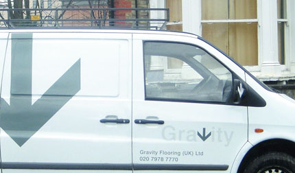
I like it… simple, but definitely gets the point across. Looks a little lost on the white van though; maybe a color to the arrow?
Helvetica = timeless.
Five, 10, 15 years from now this logo could remain unchanged and will still look totally relevant. Same as it would have 15 years ago. The same cannot be said for a huge variety of typefaces used in logos that date badly within two years. In a desperate need to appear cutting edge and ‘modern’, many discard Helvetica, playing the ‘overused’ card, ignorant of its history and dismissive of its adaptability and, let’s not forget, beauty. It is, after all, timeless for a reason.
As for the logo itself, it’s one of those where you can see how obvious it is yet that’s where its brilliance lies. The secret of almost all great logos is in the ‘I could have done that’ element. You could have, but you didn’t and it’s only now you see how obvious it is that you realise how simple it is. However I completely agree with Trevor with regards to its execution.
Very nice indeed though.
The hardest part about designing a great simple logo like Gravity is presenting it’s simplicity to clients. They usually have a look that says ‘i could have done that’ and feel we haven’t worked on it much.
@William – couldnt agree more.
This conversation got very design philosophical and I’ll just add that this is especially frustrating because:
If you were a sick patient, and you went to a doctor who knew immediately what was wrong and gave you a solution that made you better effortlessly, you wouldn’t complain that about having to pay for such a seemingly minimal effort.
We are professionals because of the skill, knowledge, and vision of what we do, and not the speed or effort in which we do it.
wow.
as someone who keeps on TRYING to design in between work hours, I get deeply overwhelmbed with great inventions like this. whenever i stop, and sit down, and start thinking about a design project on hand, i think of how brilliant people are in the design business… which makes me think: will i be given space?
haha great addition with the plumber crack (had me going there). Love the simplicity. I think the arrow could work without the line. That way, the letter ‘v’ is more convincing. Looks great nonetheless.
I love that flooring sample and apple photo. Absolutely gorgeous.
Simple but effective logo which is nicely executed.