The UK Government plans to go ahead with the airport expansion even though, according to Greenpeace, this means the UK will have “no hope of meeting its climate emission targets.” At full capacity Heathrow would become the largest single source of greenhouse gas emissions in the country.
The Airplot logo was designed by London-based Airside.


“As the project continued the idea of using type as a constructive device became the favoured route, however the design team were concerned that the concept of ideographic type would be hard to explain.”

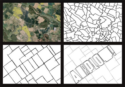
“After culling the directions considered unsuccessful, we approached Greenpeace with the above idea. From our point of view it was important to communicate how fields could be abstracted into an underlying grid.
“This point was crucial as it would allow us to use the field metaphor, but through a much more manageable form. To explain this point we presented the 4 sequential images featured in the above presentation to hammer the point home.”

“Acknowledging that land was central to Greenpeace’s protest, Airside created an identity based on the colours and shapes synonymous with the rural fields Airplot seeked to occupy.”


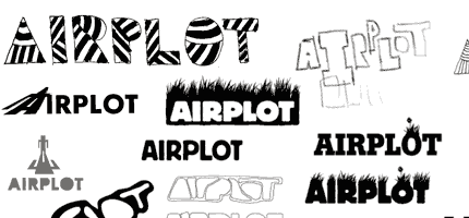
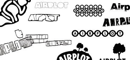
Airside published two logo development blog posts — the first shows how the design is being adapted for different campaign messages, and the second includes logo sketches and cardboard type cutouts. It’s interesting to read the accompanying commentary:
- New Work: Greenpeace Presents Airplot
- Process: Greenpeace Presents Airplot
Update:
Links removed after Airside closed its doors in 2012.


Comments
very expressive, and fits perfectly what it represents… it’s a protest logo, so i like the “grunge” feeling of it. And the weight of the characters is well done too :D
Animal Planet?
:-O
Brilliant. Beautifully done.
Yeah, serious Animal Planet color scheme going on! The font style is even a little jungle esque!
This logo kinda looks like what Animal Planet was trying to do but failed at. Good stuff.
It reminds me of animal planet too (obviously because of the colors and capital A leading the bunch), and although this one does look better, can we really say that Airside did not see Animal Planet logo last year? I mean, everybody else in the industry has. I did, and I’m a nobody.
Thank you for provide the logo sketches, I always love this stuff. Personally I think the sketch at the very bottom on the right corner, if it’s developed in that direction further can become very cool
Cool logo. Too bad it’s for an organization that supports eco-terrorism.
Like it. Nice to see the development work too. Great solution.
That’s great. Really great. I’d suggest any similarity to Animal Planet is coincidence. Colour aside, it’s as similar to that as it is to Scher’s Public Theater logo, it’s acres better and it couldn’t be anything other than green.
Really great stuff — thanks for the write up David :)
I think the similarities between this and the Animal Planet logo are almost coincidental.. I say almost because you can see the process they went through to get to their end result. All the elements of both logos make sense — it’s when a logo has similarities to an existing logo for no real reason other than style that you’d say it’s ripping it off..
All that aside, it’s a great looking logo that isn’t going to be used in a zillion applications, meaning scalability isn’t going to be a big issue.. And how much does the fat alphabet letters rock?
I was not at all suggesting that they ripped off Animal Planet. It just really reminds me of that logo because of the color, fat & thin characters and they both use the tilt. I was just saying, if I had done the animal planet logo and then saw this… i would have been upset because they captured what I was going for.
I understand what Animal Planet was trying to do, but they just didn’t have the rational to back it up – it was just a computer generated mess-it had no love. Unlike this tactile and well thought out logo above.
Scalability issues aside, I think it’s a great logo, no doubt. It gets the message across in an instant. Love it.
As other commenters have said, well executed – a recent favourite of mine, despite scalability problems.
i do agree that it’s “big” for scalability and amount of colors in it might pose a problem for printing costs, but i really love the concept and of course the execution is brilliant.
Good direction but IMHO there’s not enough of an ‘airport’ in the logo.
I also I support the Airplot cause, but…
I had to think a bit on why I didn’t like this logo.
The reason… grab a grunge font, type in some letters, fiddle it a bit (tops, 15 min)… Bob’s your uncle.
I really don’t see any ‘deep’ thought process going into this logo.
As for a 15 min angle, it also falls apart on the WOW tripping into something great right out of the gate.
Just my thoughts…
Also Airside should’t really show the sketches i.e. how their thinking process looks like i.e. very lame…
Final logo might seem attractive but it doesn’t say much about the action which is “to prevent the runway being built”.
Cat said “The reason… grab a grunge font, type in some letters, fiddle it a bit (tops, 15 min)… Bob’s your uncle.”
It sounds like you didn’t read the story behind the logo. This was a well thought out project. Fifteen minutes tops…sheesh.
Anyhoo, nice logo. I imagine this will be very well accepted just from an aesthetic standpoint. The collateral pieces will function flawlessly.
The only element I feel is missing is some semblance of an airplane. Whether it be an airplane’s shadow crossing over the fields or what-not.
The thought process alone that went into making this logo come to fruition is inspiring. Great, great post, dude! Now, everyone back away from the computer and start doodling.
I immediately saw a filed from above, exactly like what they were going for, when I looked at the logo. While it’s similar to the Animal Planet logo, I agree, they pulled it off *way* better.
Nate,
I did read all the way through. And in most logo cases I’ve read (and being in the business as long as I have, I’d read quite a few), I’ve admired the process. Not this one.
And I’m sorry if my opinion offends you, but it’s my opinion. And I’m sure if David wanted us all to post the same opinions, he wouldn’t have comments open…
On a tangent, do you guys have eminent domain laws? I don’t think Greenpeace’s tactic would work in the U.S. because the government is allowed to seize private land for public use (at market rate, of course…). Just curious about that, not saying whether I support the effort or not.
Back on topic, love the logo and love the conceptual route to it. I’d like more explanation from Cat about why this concept isn’t deep enough. Yes, I suppose someone typing in a grunge face could get something somewhat similar. I suppose someone playing with circles could end up with the CBS television logo rather quickly as well. Doesn’t make it less effective of a mark.
Cat, don’t worry about Nate. I don’t think this logo is that bad (albeit if it’s anyone favorite they haven’t been seeing many logos lately) if he thinks this logo with one of the biggest flaws being scalability, needs a shadow of an airplane on it, he obviously think this is a poster, not a logo.
Aesthetic opinions aside, it’s evident (and documented!) that this work is not the product of 15 minutes worth of commercial font tweaking.
Let’s give credit where’ it’s due.
The concept is great. Whether you support the cause or not is a different matter but the idea and the execution is very clever.
I can only really see this being used on large scale billboards and advertising anyway, so the scalability issue is irrelevent. The bods at Airside would have taken this into consideration when developing the mark.
Big fan of Airside’s work and when I looked through their initial sketches you can see which ones would almost have their style stamped all over it. This, however, doesn’t, which is a good thing I think.
I disagree with the whole Animal Planet case, the only real similarities there for me are the colours and if you’re working with the theme of ground and plots of land then surely greens are a no-brainer.
I’m more a fan of the plot panels rather than the typography. Its nice but the letter shapes are a bit odd for me, they just don’t look ‘right’ but that’s just a personal thing for me. I’d like to have seen the type within blocks to maintain the whole plot theme so everything was within a tiling system but perhaps that may have looked a little too square, I don’t know.
Great job though.
I’m pretty miffed as to the whole ‘use a grunge font to get the same look’ comment. Spending the time to create something from scratch is much more satisfying than going to dafont.com for an easy way out, that’s what separates designers who want to create something, from those that just want to do the job.
Saying that, I suppose design is only really about putting some letters and colours together isn’t it, maybe some shapes too if you feel really creative.
Hello everyone. Thanks very much for offering your thoughts.
There’ll always be similarities to other logos, and I prefer to judge a design on its own merits. Particularly as this one involves a custom-made font.
Alex,
I think you’re right to look over the scalability issue. The applications of this logo will most likely be limited to formats larger than an inch or two in width.
Cat,
Your input, as always, is more than welcome, and you’re right, it’s good to have a difference of opinion going on here. The comment section wouldn’t be anywhere near as interesting if everyone thought the same.
A little more rushed than usual today (viewing some houses around town), but thanks again to you all for reading / commenting.
this rocks! i love the process shown to get the end result. It’s so intriguing. This logo is an immediate get, and yet its so simple.
Really like this, a complete antidote to the horde of mac-culture identities. Animal Planet? I don’t think so, the whole feel is much more ‘earthy’, it has a farmer’s market, organic feel. Perfect for it’s target audience.
Don’t know what scaling issues some envisage?
Thanks for the post. It’s helpful to gain insight into the development of the logo. And for such a cool cause too. Whether or not you like the logo, you can still be impressed with the thorough process undertaken. Good work.
Very similar to the animal planet, most likely not in purpose, but way more effective and visually pleasant. Original approach too…
Not bad but doesn’t thrill me.
Maybe it’s just due to my twin biases against ultra bloated type and eco-terrorism.
Hey, great to see such an in-depth picking-apart of the designs.
I’m really enjoying working on a campaign with such great imagery – for me it evokes all of the things Airplot is about – a sense of connection to the land, and a bit of cheekiness.
Really interesting to read all of your thoughts.
Christian
Web Editor @ GPUK
Hello Christian,
I’m glad everyone’s comments are of interest, and thanks for letting us know. Good luck with the campaign!
I personally love eco-terrorism and this logo. Very different from 99% of the other logos out there. Only disappointing thing is that they ran through so many logo cliches in their design sketches. Fortunately they ended up in a creative place. Looks like the story here is that you have to shut off the computer if you want to do anything worth seeing.
I like it, and, while I see the Animal Planet comparisons as valid, think this stands on it’s own.
I disagree with those that think that the logo needs some sort of airplane related imagery. That is contrary to the point — keep the airport out.
As for scalability issues, the branding could contain a simplified version for small scale usage, no?
Talk about “late to the party”… ;-)
All good parties last at least four years, Steve.
A lovely idea, well executed.