
Few brands are as deeply tied to a national symbol as Guinness is to the harp. What began as a mark of authenticity on bottled stout in the 19th century has become one of the world’s most recognisable trademarks: a bridge between brand and nation.
Until the early 20th century, Guinness supplied its stout in bulk to bottling firms and publicans, who transferred it from wooden casks to bottles. Each bottler or pub owner used their own label, resulting in a patchwork of names and designs.
To protect the brand as Guinness expanded overseas, the company created its own trademark bottle label in 1862 — the now famous buff-coloured oval. It was the first step toward a unified visual identity. The label was printed and supplied directly to authorised bottlers, who agreed to sell “no other brown stout in a bottle.” This was early brand control in practice, ensuring no one could pass off another stout as Guinness.
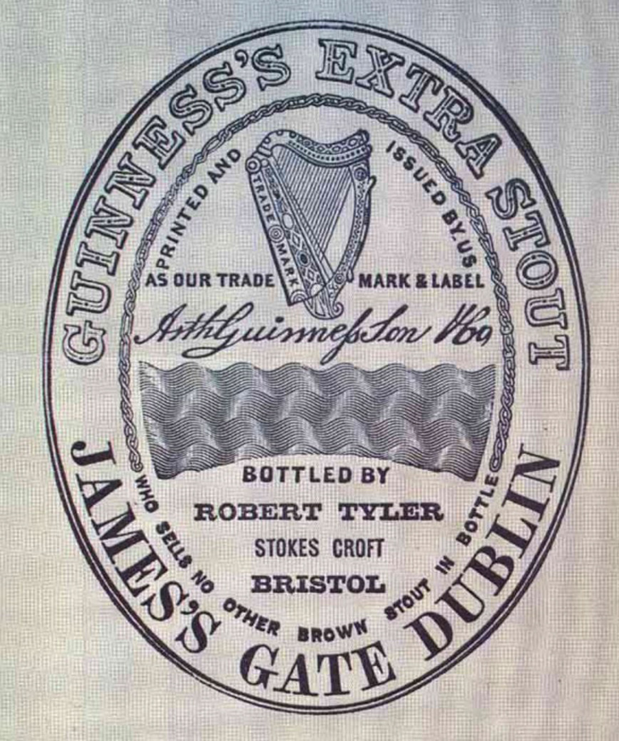
The trademark label featured three elements that still define the brand today: the harp, the Guinness name, and Arthur Guinness’s signature.
In 1876, fourteen years after that first label appeared, Guinness registered the harp as its trademark. The design was inspired by the 14th-century Brian Boru harp, preserved at Trinity College Dublin — one of Ireland’s most treasured artefacts.
Over the decades, the harp evolved in step with design sensibilities of the time. The 1968 version, drawn by Gerry Barney, marked a shift toward modernism: simplified lines, fewer strings, and a form that reproduced more consistently across print and packaging. Barney also designed the enduring British Rail double-arrow logo while working at the Design Research Unit, which was testament to his sharp eye for clarity and symbol-making.
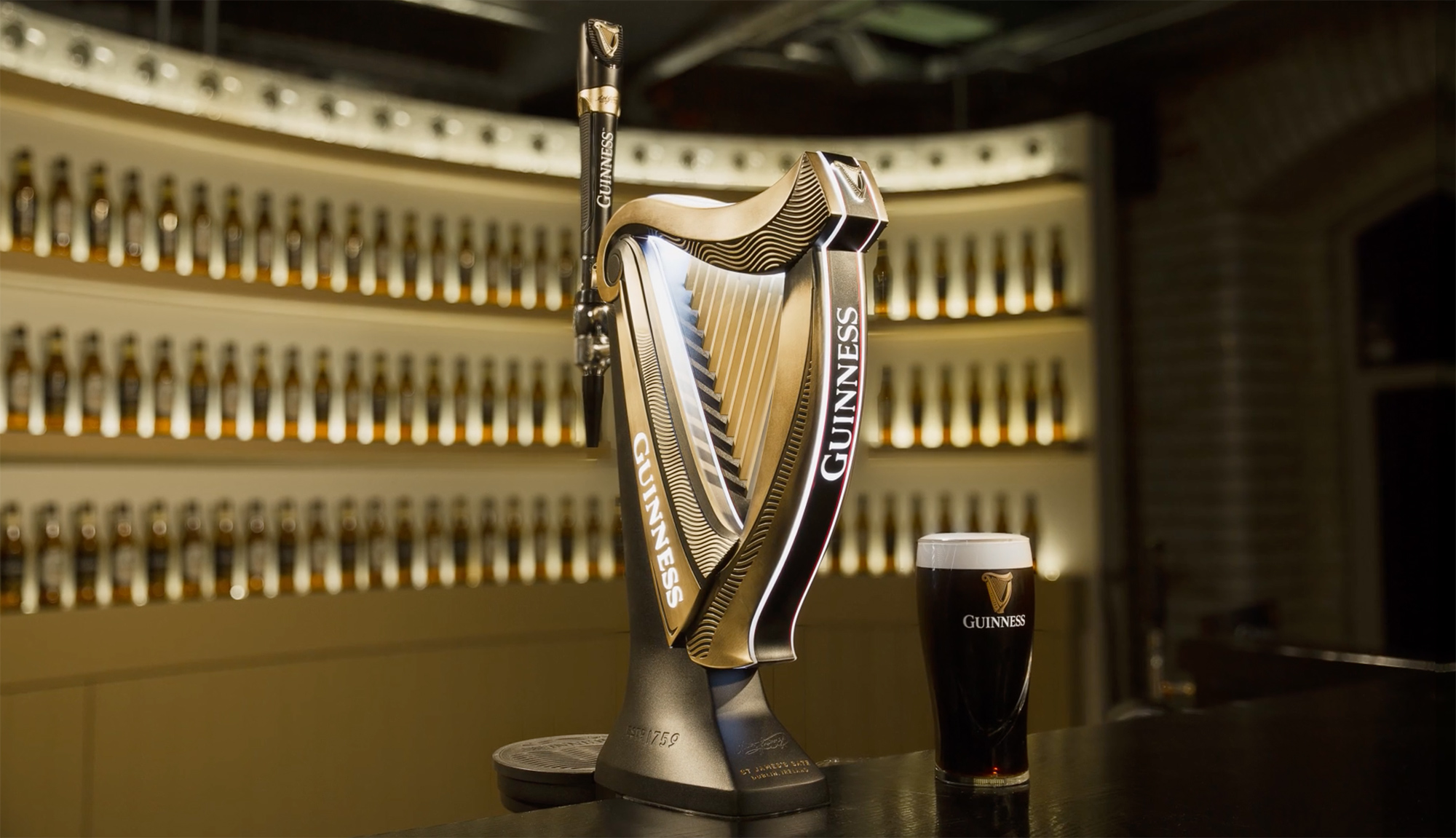
The most recent iteration was by London-based Design Bridge, working once again with Barney to craft a version that feels both sculptural and contemporary, echoing the precision and craft of Guinness brewing.

The harp holds deeper meaning still. It’s also the official emblem of the Republic of Ireland, seen on coins and passports. The distinction between the two symbols lies in the orientation: the straight edge of the Guinness harp faces left, while the national harp faces right — a small but deliberate difference that preserves each identity.
The harp has symbolised Ireland since at least the 13th century. References can be found on the Wikipedia page for Ireland’s coat of arms, and Old Moore’s Almanac even asks, “Did Ireland’s national symbol come from Guinness?”


More than a logo, the Guinness harp embodies craftsmanship, authenticity, and Irish pride: a timeless emblem that resonates far beyond the brewery gates.
Information via Guinness Storehouse, IrishCentral, and Reinhardt.edu. Head over to Hop Culture for more on the story of Guinness and its international appeal.


Comments
The original design is so intricate! Started getting perilously simple in the 90s and 2000s… glad they added back in some beautiful details.
A little harp… the smile of the whale.