With this year’s entry deadline at the end of the month, it’s a good time to look back at a few of the stronger winners from recent years.
Troll
The client name, Felix Trolldenier, was unusual. What seemed to him like a disadvantage, seemed to the designers at Pacifica to give added value. They abbreviated the name and used typography as a figurative element, giving it personality and expression. “A logo that is reactive, moody and charismatic. From the use of motion capture technology, it was possible to replicate actual movements and link them to the typography used in the identity, approaching the performance of an actor to a character. In studio and through a set of high-resolution infrared cameras, we recorded and and incorporated in the logo a series of actual behaviours, impossible to replicate in any other way.”


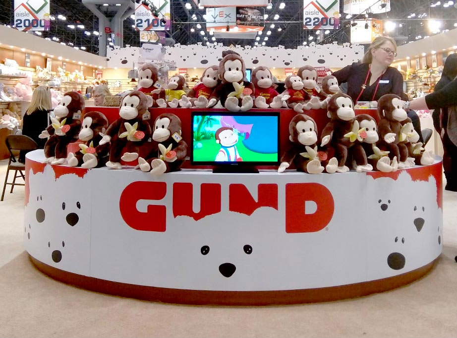
Gund
GUND is the oldest manufacturer of soft toys in America, and their logo, designed by Cynda Media Lab, pays homage to the company’s tradition of capturing facial expressions in their toys.

Lela Buttery
To match her unique name, Lela Buttery has a unique set of skills, too — biologist, food educator, and organic food sourcer. Her new company needed an identity that played off the Buttery name in a contemporary way while avoiding butter clichés. TRÜF in Santa Monica did the rest.

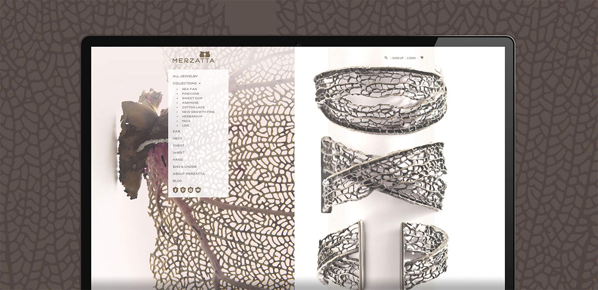
Merzatta
Merzatta is a husband and wife jewellery design team. Their work is inspired by elements in nature, but ones that aren’t immediately seen; finding joy in hidden treasures. Designed by Works Progress Design, the logo — a pair of squirrels facing each other — speaks to both the connection to nature, and to the warmth and love the couple put into each piece they make. The negative space between them forms the shape of an acorn, a nod to the little discoveries that only come to light when they come together. There’s a visual imbalance when the squirrels are shown in the lockup, but the symbol on its own is lovely.

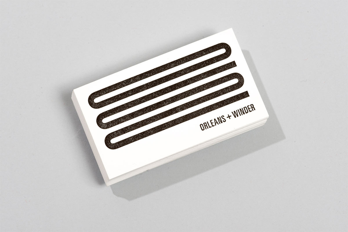
Orleans + Winder
Fashion and design purveyors Orleans + Winder are named for the cross-streets where their showroom resides, in the creative centre of Detroit. Taking the Orleans + Winder initials, Seattle-based Civilization crafted a monogram that gives the appearance of an uninterrupted winding road, paying homage to the intersecting streets. The designers took inspiration from the brand’s gritty, industrial noire looks, paired with their minimal, stripped-down aesthetic.

Cochon Dingue
Cochon Dingue (crazy pig) is a chain of French bistros in Québec, Canada. With vintage-French-poster–inspired typography and the bleu-blanc-rouge palette, the redesign by Québec-based LMG clearly shows the French roots while adding some contemporary fun. Full case study.


HOW Logo Awards
It costs $55 to register a logo entry, and $75 for entry into both the logo and identity applications categories. All entries to be in by October 30, 2017. More details on the HOW Awards website.




Comments
Lovely work