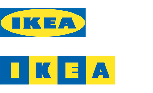
“We began by looking at the best parts of the exiting logo. Namely colour and bold type. We refined the type to more closely align with the original Futura Press font (avoiding Verdana at all cost). We felt this cleaner typographic treatment was more suited to the aesthetic of IKEA’s products. Similarly, by continuing to use the core brand colours we ensure that the logo remains instantly identifiable. Removing the oval was also a priority as it severely dated the logo and reduced it’s legibility at smaller scales (e.g. advertising / website etc.).”
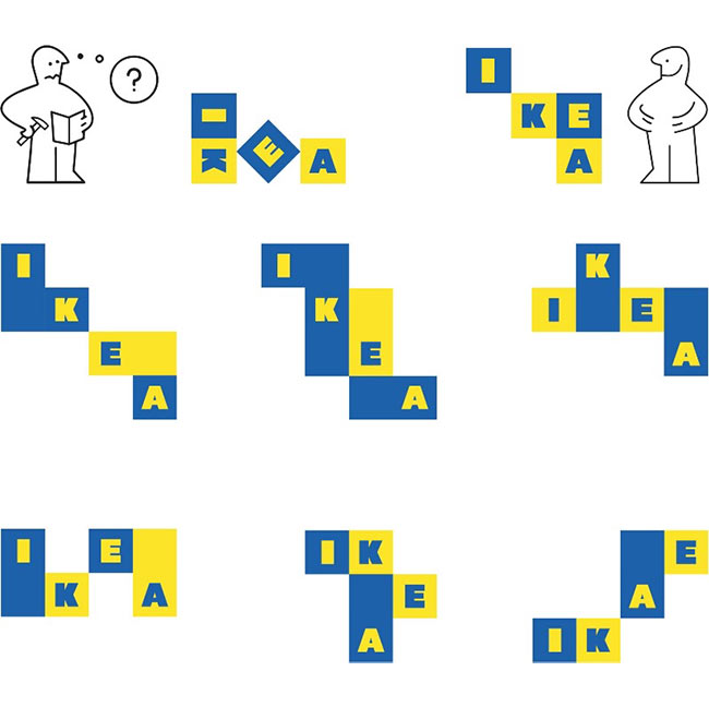
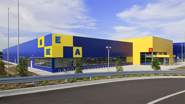
I’m undecided on applying the wraparound treatment to the building signage because you’ll only see EA from the store entrance, but overall this is a great improvement.
Some people say that “fake” projects don’t count for much because the client isn’t involved. I disagree. They can show how much more interesting a tired-looking design can become, at the same time as promoting the skills of the designer. Nothing wrong with that.
Read more rationale from Daniel Fretag on Medium.



Comments
fwiw: the history of the IDEO logo
The IKEA brand language is well known globally and memorable to its loyal followers, therefore the wrap-around signage is a brilliant solution.
Coca-Cola could do the same if they were only to use the memorable script.
I love the concept of turning the logo into “building blocks”, but I’m not blown away by the fact that some blocks are wider than the letter… Like “E” in the exterior wrap-around example. I much prefer the way it appears in the top two examples (with the little stick men).
Nice and creative but seen similar – http://www.sanoma.com (see bottom).
The wraparound might work online since it won’t really wrap around anything, but it’s a real issue on the building as you mentioned. Due to the all separate letters, it will also cause confusion for people that pass only one side and especially for the less gifted. Of course, it’s a known brand so the confusion will be limited but I can see a lot of backlash if this were to be implemented.
I would keep the horizontal version. The versions with the random squares looks disorganized and a little bit crazy.
It’s to Ikea’s advantage that their brand has such a following. Nice work leveraging that and tying in the experience of actually making ikea furniture!
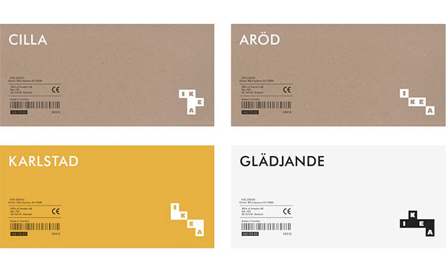
I really like the initial block logo on the cardboard box, but not some of the other block layouts. Probably my least favorite is the store logo. The ‘A’ seems too disconnected from the rest of the name.
This is a brilliant revamp! I am crazy about the modular element which is a huge aspect of Ikea’s brand. The colors and tribute font choice keeps it recognizable but completely updated in a refreshing way. Love this fantasy rebrand!
I prefer the horizontal and connecting blocks with smaller dowel-like squares forming positive and negative space. The packaging is great… this doesn’t need to stick to a horizontal layout and really reinforces the brand message.
The more recognizable and ubiquitous the brand, the more leeway you have with abstracting the logomark. Take a look at the abstraction going on right now with the Coca-Cola brand identity, which relies on the iconic bottle shape and pieces of the flowing logo script as stand-alone identifiers in advertising and packaging. Freytag Anderson’s reworking of the ikea identity similarly leverages the essential elements to create something fresh. I particularly like the way the new design (I pick the iteration on the upper right) connects the logomark to the brand experience.
To me it’s not clear enough and very confusing with the separate building blocks. Corporate design is like a friend that you recognize from afar just by the way he walks. This is somehow ineligible, sorry to say. :(
Nice work and thoughtful design in each step. At first glance the combination of the squares also emulates an open box/package which is integral to much of Ikea’s business model. With that said, I would be on the fence as to whether the Ikea logo/brand needs/warrants a redesign/facelift at all. Interestingly, with Coca-Cola mentioned, the classic lettering of the logotype is recognizable and ‘loved’ while the brand has remained relevant. Much like the Coca-Cola brand, in any color, version and size, the current Ikea logo, including the oval and typeface are recognizable and identify the connection we have to the brand.
In a real life scenario, studied client input and an authentic brief is essential. Whereas the tradition Ikea represents cannot be lost to novelty and a movement to change our environment to emulate current but not necessarily timeless type/design trends. We may understand said trends are influential in part due to the presence of design in a digital environment where depending on the industry/service an almost ominous if not nearly invisible identity can represent the successful progression of a brand and underlie some of its business models.
I would keep the blocks in the same color. Otherwise it would get too busy. The wrap-around is really cool! I feel like with the same colors you keep enough of the old identity to not lose your followers. Nice one!
The stacked blocks layout looks nice but it’s not functional because it won’t work well for smaller applications.
“Creativity is just connecting things. When you ask creative people how they did something, they feel a little guilty because they didn’t really do it, the just saw something. It seemed obvious to them after a while” – Steve Jobs
I really dislike the empty blocks in the wraparound…because they’re so noticeable, the eye instantly zeroes in on them. Nice to see the oval has disappeared and I also like the font choice.
It’s funny because I think the white/black version on the labels and the boxes look fabulous but the colour version I think looks awful haha. Just my opinion of course. I personally like the IKEA logo and believe it or not the Verdana type but nevertheless this is a nice idea!