
 The widely recognised “blue wheelie” design, photo by John Ott.
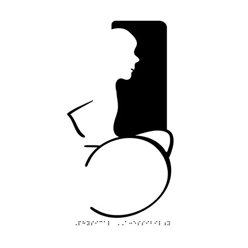
 Susanne Koefoed’s design (left), with head added by Karl Montan (right), via Sociological Images.
Ontario’s lieutenant governor David Onley said the symbol badly needed a revamp, so launched a student design contest with Toronto’s OCAD University to find alternatives.
“Fewer than three percent of people with disabilities use a wheelchair or, as I do, an electric scooter. [The wheelchair symbol] is neither welcoming nor inclusive. Let’s make the stick figure a real person and turn the symbol into a welcome sign.”
— David Onley
Tough brief — redesigning an internationally recognised symbol that clearly communicates its message. I’m not surprised there wasn’t a winner.
 One of two honourable mentions in the student design contest, winning $2,500 each.
 An OCAD student submission.
Related elsewhere:
Is it time for a new wheelchair access icon?
New York City adopts new International Symbol of Accessibility
The Accessible Icon Project

Comments
I think the “open door” icon is a bit vague, the blue is too soft. I wouldn’t see it adapting well. The second option is goofy. The person is still confined to a wheelchair, only now the lines are sloppy, the message less understandable. Besides, the original icon is universal. Was David Onley planning to campaign a global change? What would that cost…? I would think if it changed in Ontario (only) that people visiting would be confused.
The wheelchair (in my opinion) is a symbol of limitation, not to be taken literally. I was born with a disability (not one that requires a wheelchair, or the use of this sign) and I don’t find it offensive or misleading. EVERYONE knows this sign.
Those silly politicians… I bet it was fun for the students though.
Well, to be fair no winner was chosen. As deserved, neither of those are good. Student work, so cut them some slack, but definitely not ready.
Looks like a really interesting brief. I can see the need for an update but anything too different could cause a lot of confusion unless the change was well marketed. Interesting that the original logo was designed without a head!
Well being headless is definitely a disability. I understand the reason to want to redesign the logo, but I think the existing logo should be taken less literally.
The real equity is the level of existing public recognition that has been built up over the years, and if you’re headless or not I think changing the logo completely would cause headaches across the planet.
The “stick man” design is a well known “problem” and designers have been updating and redesigning this sign all over Planet Earth forever. I’m surprised they didn’t think of using one of hundreds of $10 off the shelf stock icons that look miles better than the above submissions… Well, at least a couple of designers got some change to pay for their CC subscriptions!
I recall at least one global contest to redesign this symbol, also without a winner. It’s a really tough task to create a universal sign that would include all kinds of disabilities and be globally understood, not to mention the Herculean effort of updating it everywhere.